
Tezos Rebrand
Branding, Campaing,
Art Direction and Motion
2026
A modular identity system built from the Tezos symbol translates the network’s principle of continuous evolution into a flexible visual language.
By dividing the Tezos logo into reusable geometric components, the identity creates patterns and structures that can be assembled and recombined across applications, reflecting the collective nature of the ecosystem.
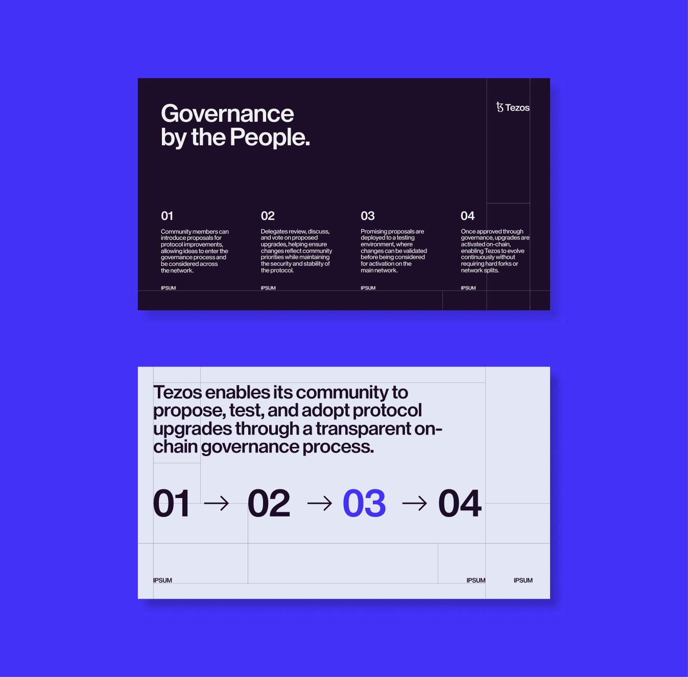
A grid constructed from simple square modules provides a consistent framework for typography, imagery, and content, balancing structure with the flexibility needed for a constantly evolving network.

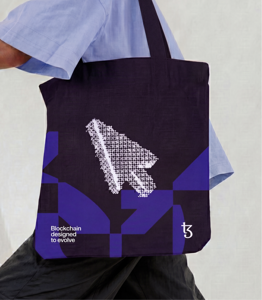

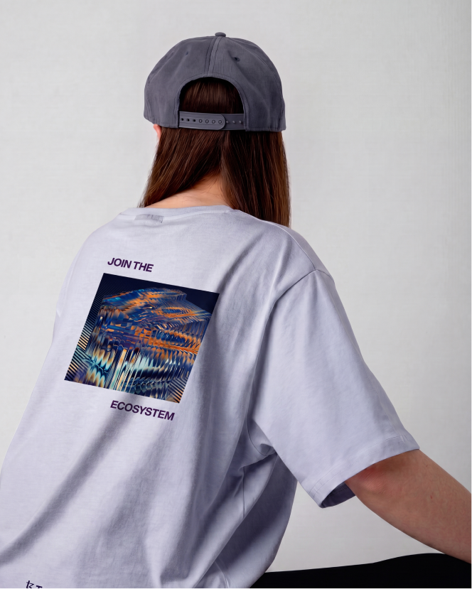
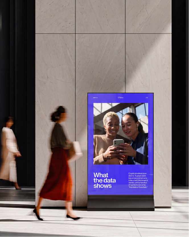
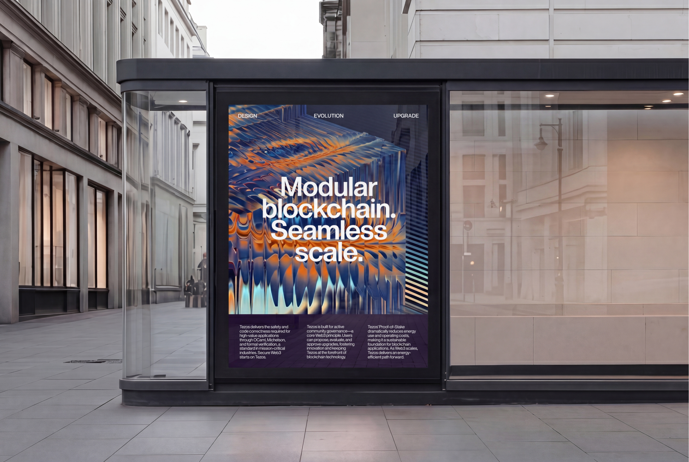
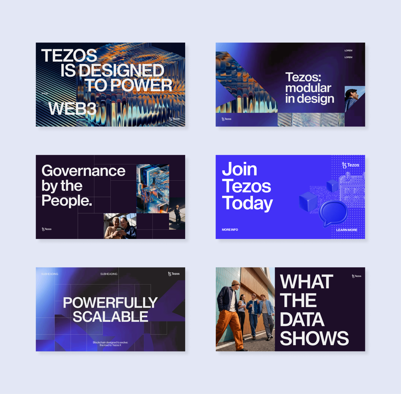
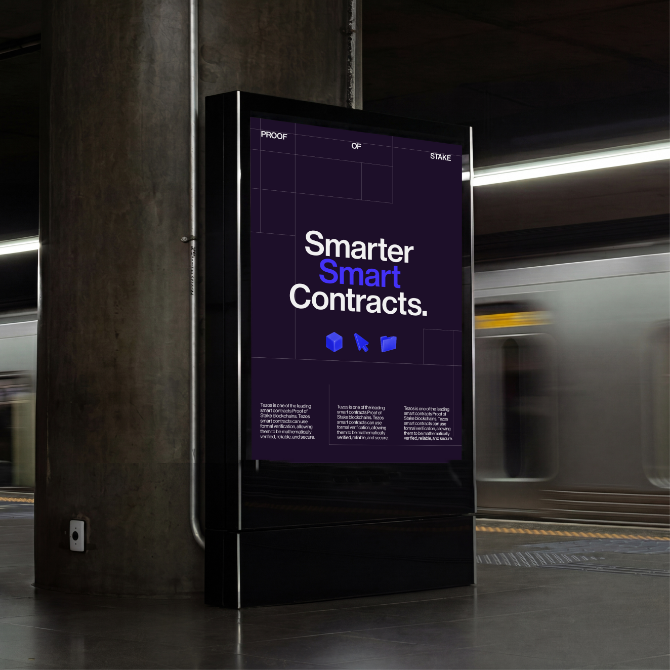
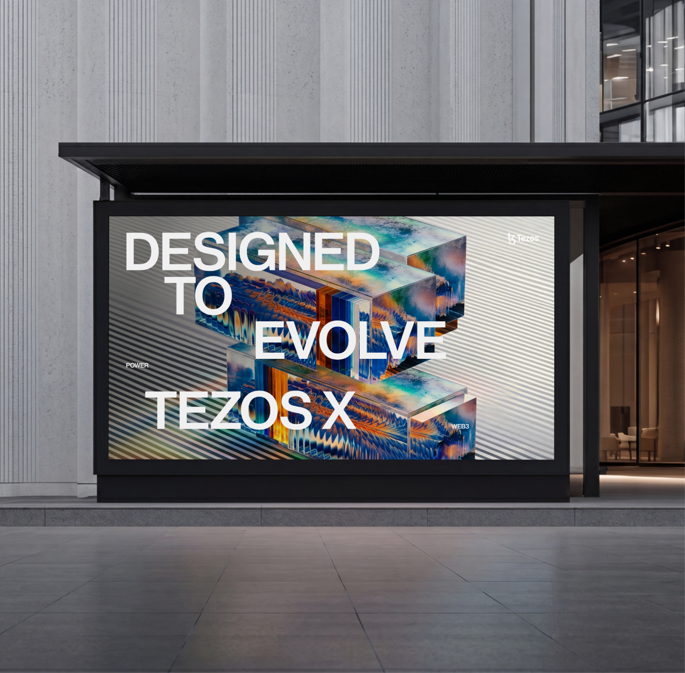
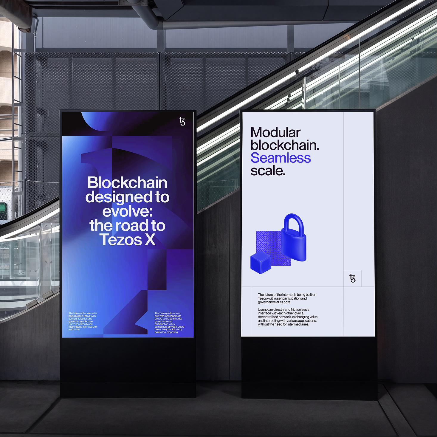
Illustration and photography help communicate complex technologies through purposeful and accessible visual narratives.
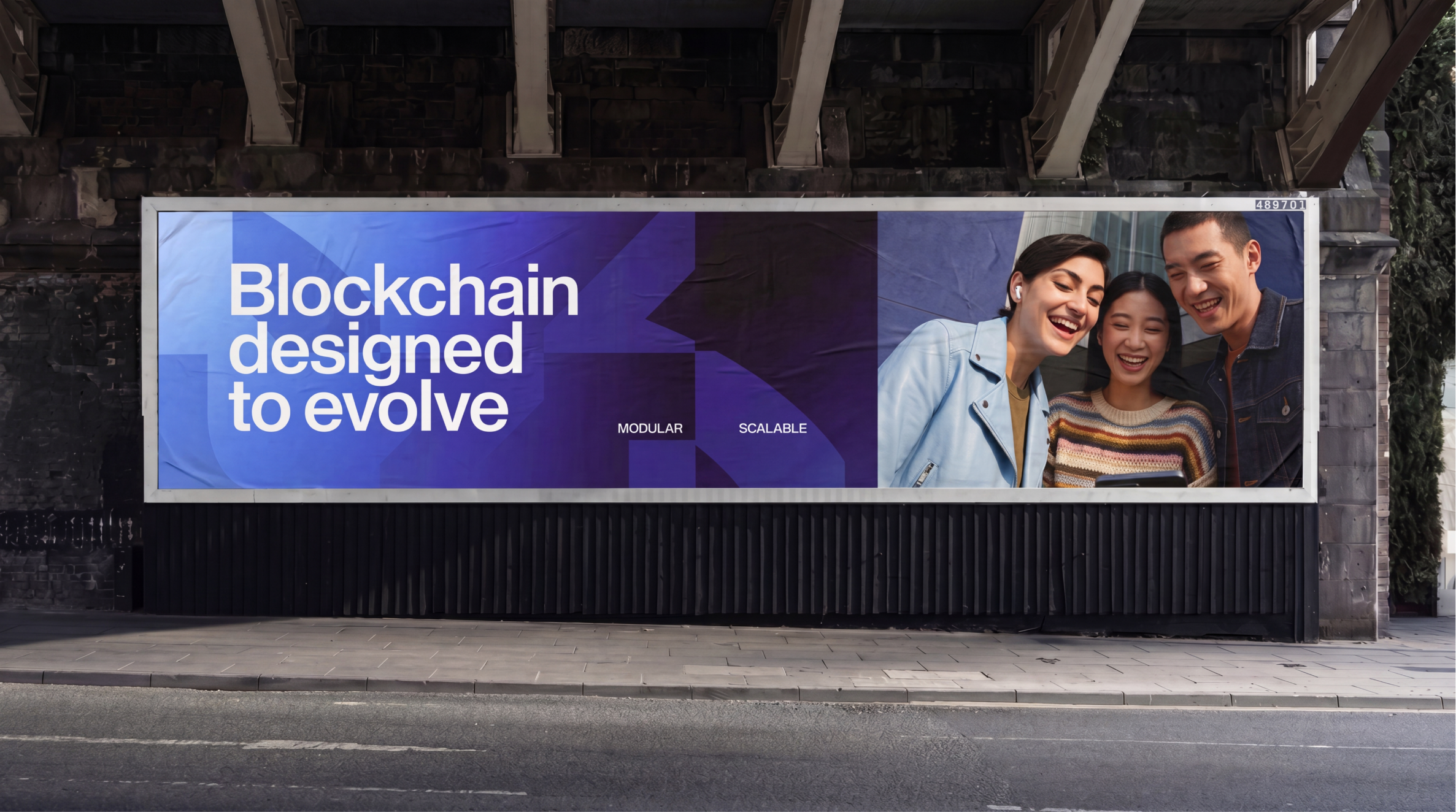

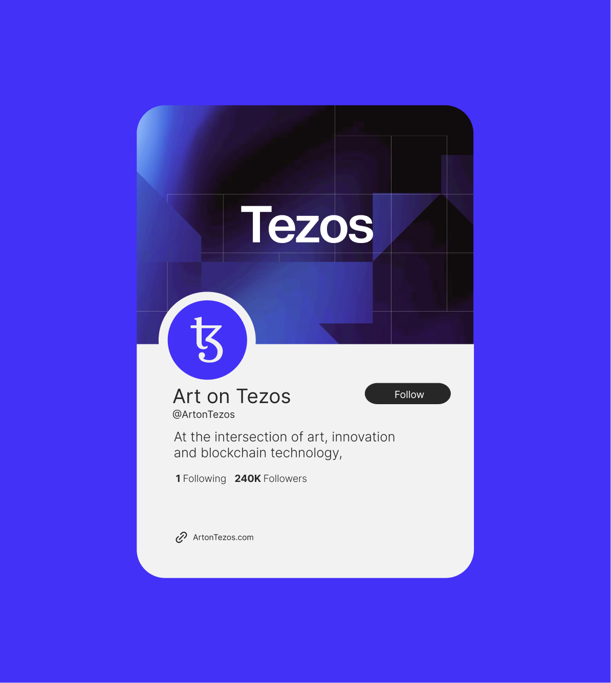
A palette of black, white, and Tezos blue creates a clear and recognisable foundation, allowing the modular system to adapt across digital products, events, and communications.
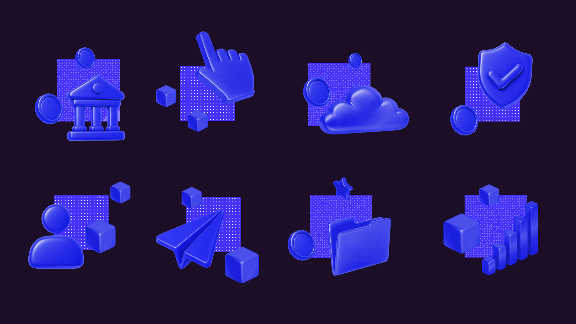

Illustration and photography help communicate complex technologies through purposeful visual narratives, positioning Tezos as a network that is both accessible and continually evolving.
The visual language positions Metals.io as a modern forge for future investing.
About the project
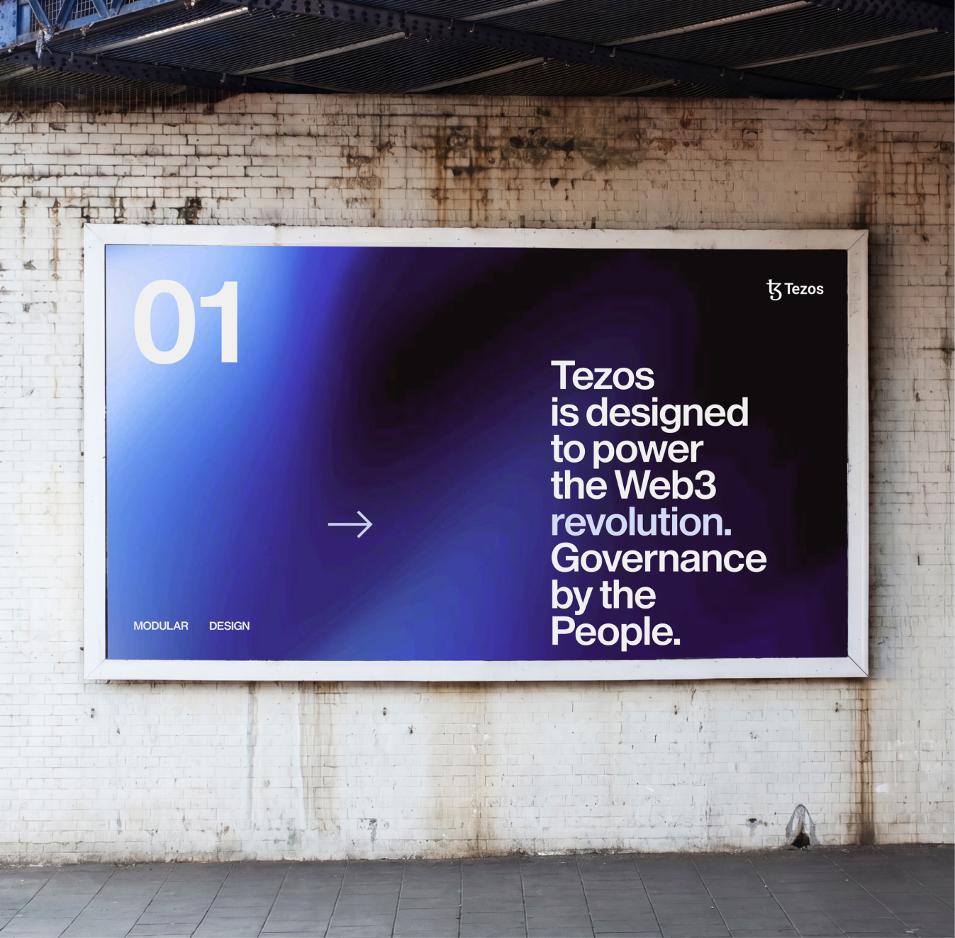
Tezos is a blockchain designed to evolve. Its ability to adapt through self-amendment has made continuous development a defining characteristic of the network. The new identity translates this principle into a visual system that is both stable and flexible—anchored by a recognizable symbol while creating space for growth, experimentation, and change.
The identity is built from the Tezos logo itself. By dividing the mark into modular components, a graphic language emerges that can be assembled and recombined across applications. These elements form patterns, structures, and compositions that reflect the nature of the ecosystem: independent contributors, projects, and ideas coming together to create a unified network.
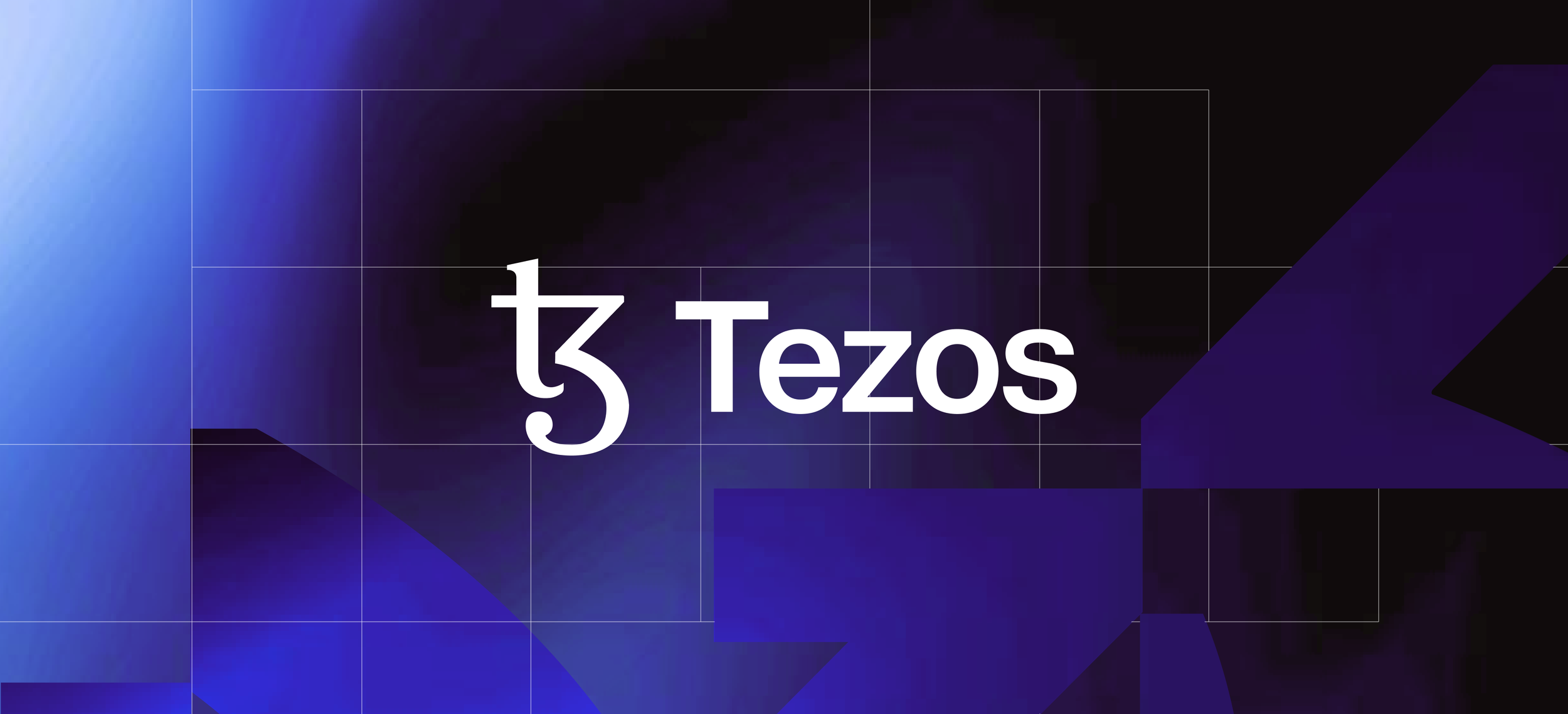
At the center of the system is the Tezos symbol, retained as a constant. The icon remains unchanged, preserving the recognition and trust it has accumulated over time. The accompanying wordmark has been refined for greater clarity, balance, and legibility, creating a more confident presence while maintaining continuity with the past.
A grid-based framework brings order to the identity. Constructed from simple square modules, the grid provides structure without rigidity, allowing content, imagery, and patterns to coexist within a coherent visual system. This balance between consistency and adaptability mirrors the protocol itself: designed on structure, built for flexibility.
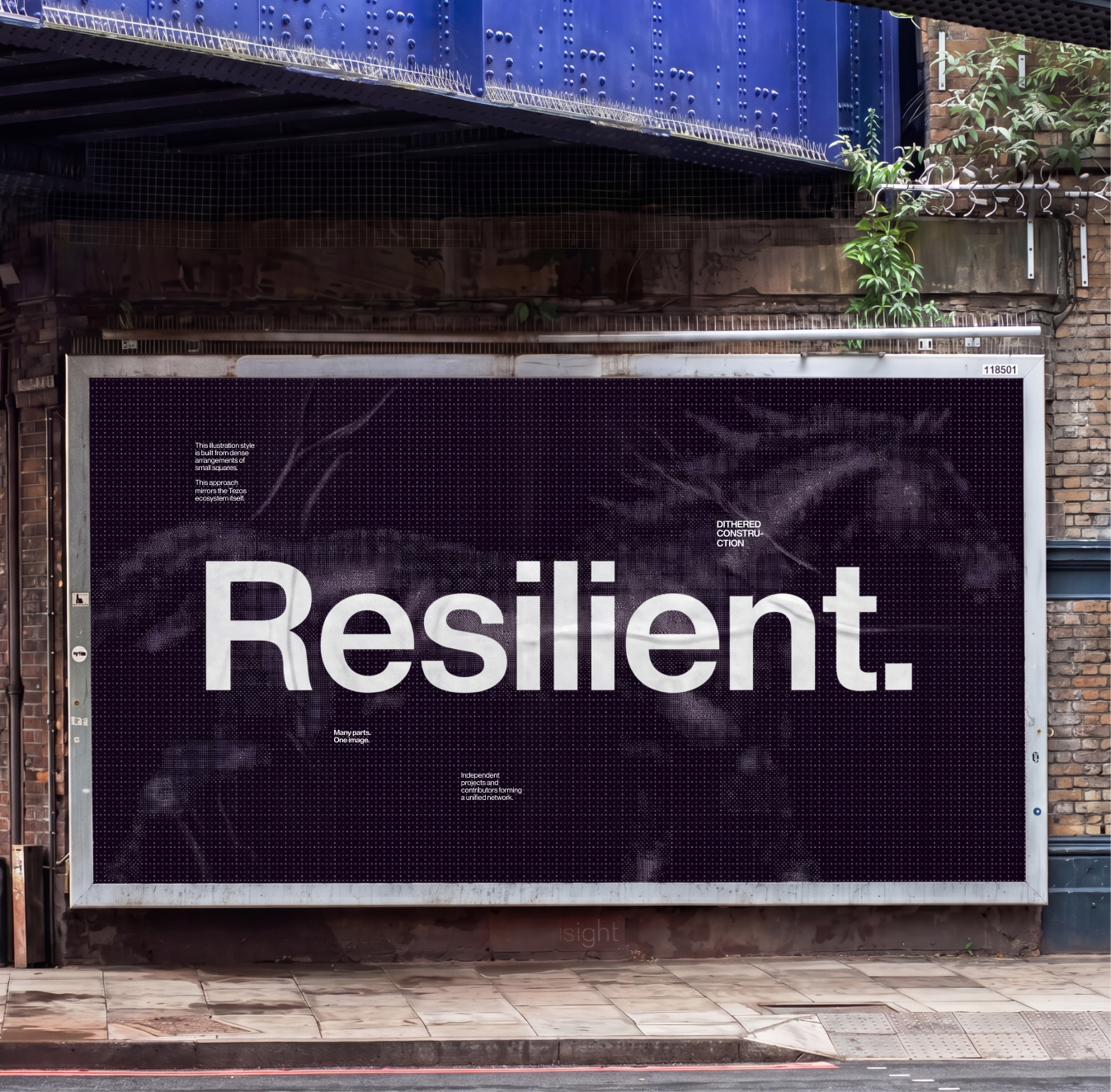
Illustration and photography extend the same philosophy. Visual assets are intended to clarify rather than decorate, helping explain complex technologies through purposeful, accessible imagery. Whether through modular assemblies, network-inspired constructions, or documentary-style photography, every element reinforces the collective nature of the Tezos ecosystem and its capacity for continual evolution.
The result is an identity system that expresses Tezos as a living network: stable at its core, adaptable in its application, and designed to evolve alongside the community that shapes it.
Credits
Creative Director
Ilaria Antolini
Motion Design
Rafael Irimie
Design
Ilaria Antolini
Naomi Strinati