
Bento
Branding, Campaign,
Motion and Product Design
2026
Brand identity and product design for a next-generation crypto wallet, transforming a complex technical product into a clear and cohesive experience built around structure, usability,
and discovery.
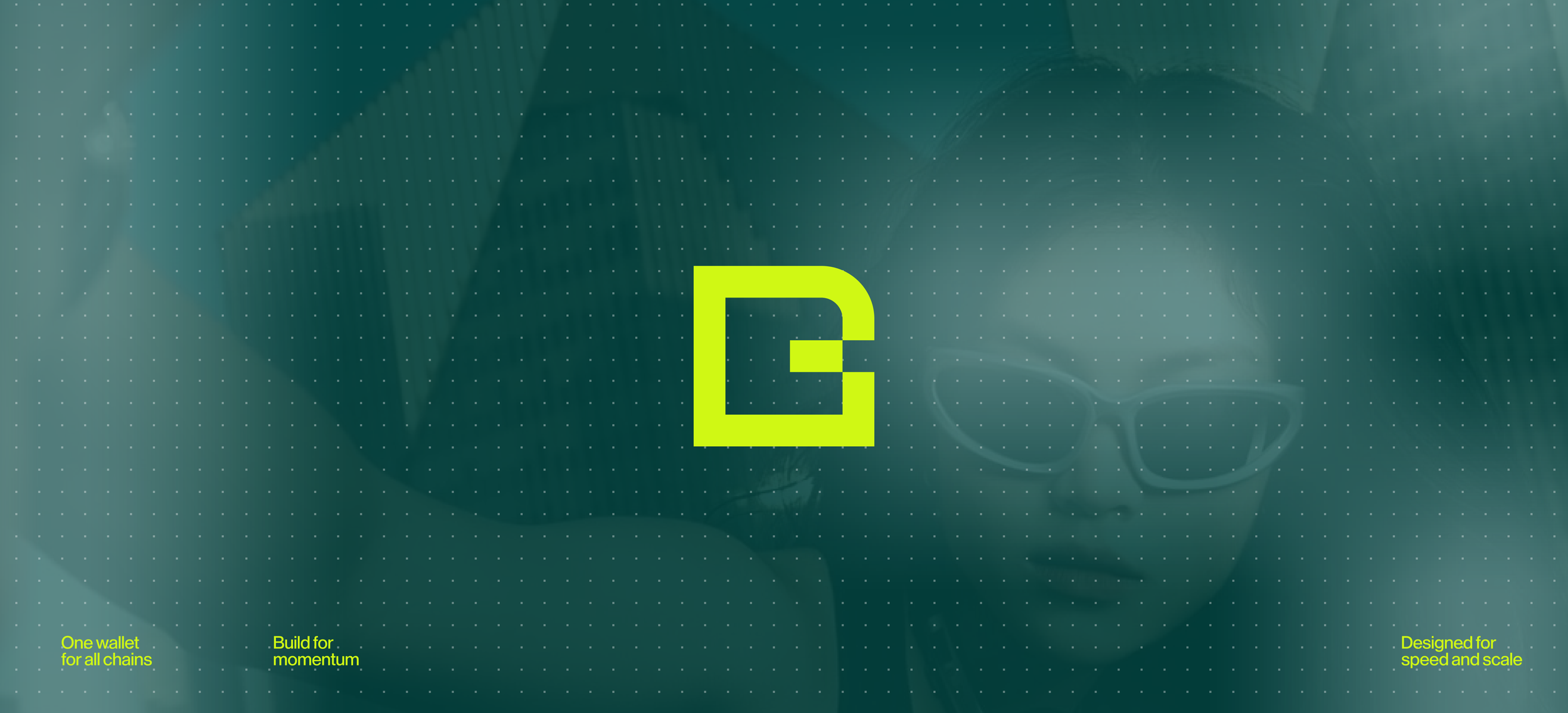
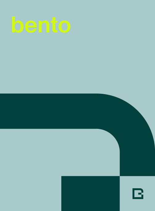
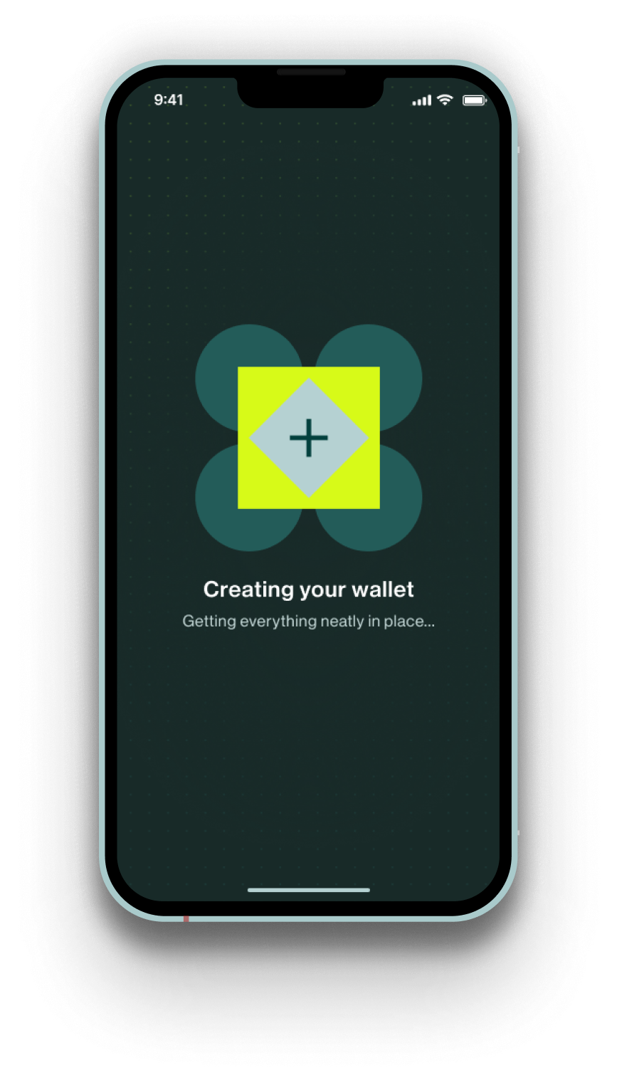
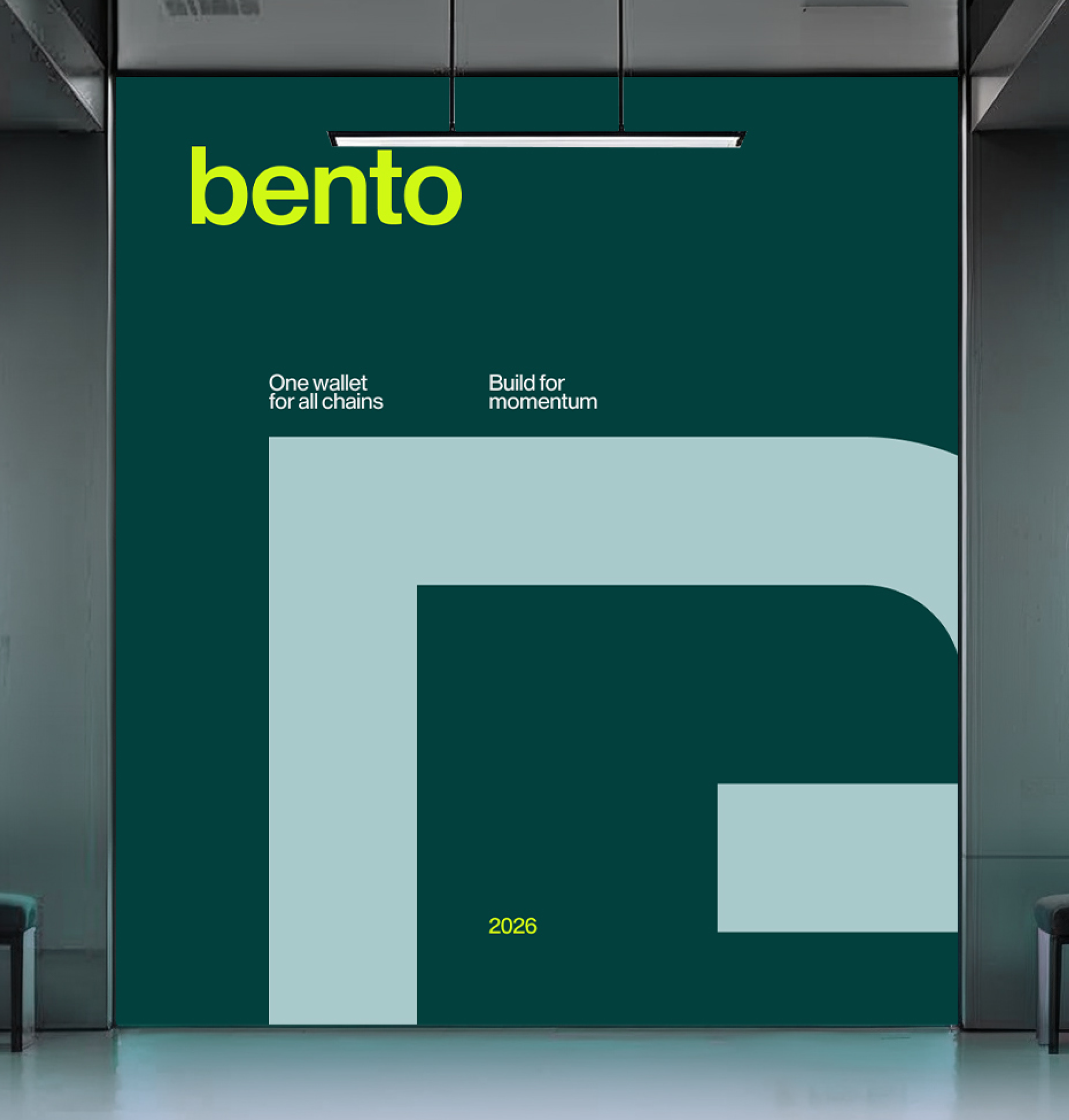
The logo merges the letter “B” with the silhouette of a wallet, creating a symbol that represents both function and discovery. Deep green anchors the identity with a sense of trust and stability, while bright yellow introduces energy and exploration.
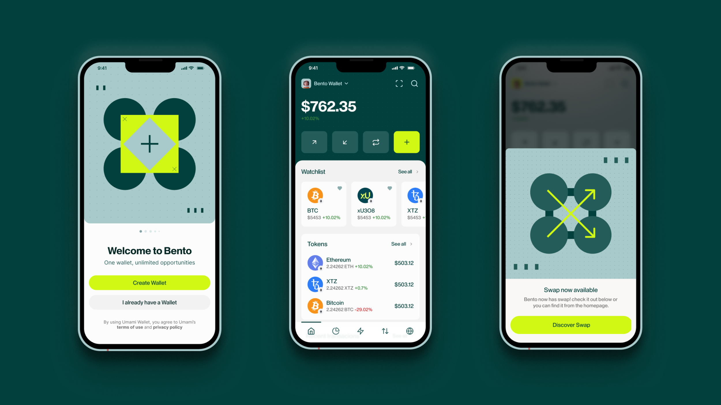


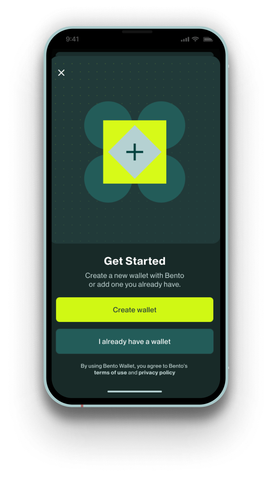
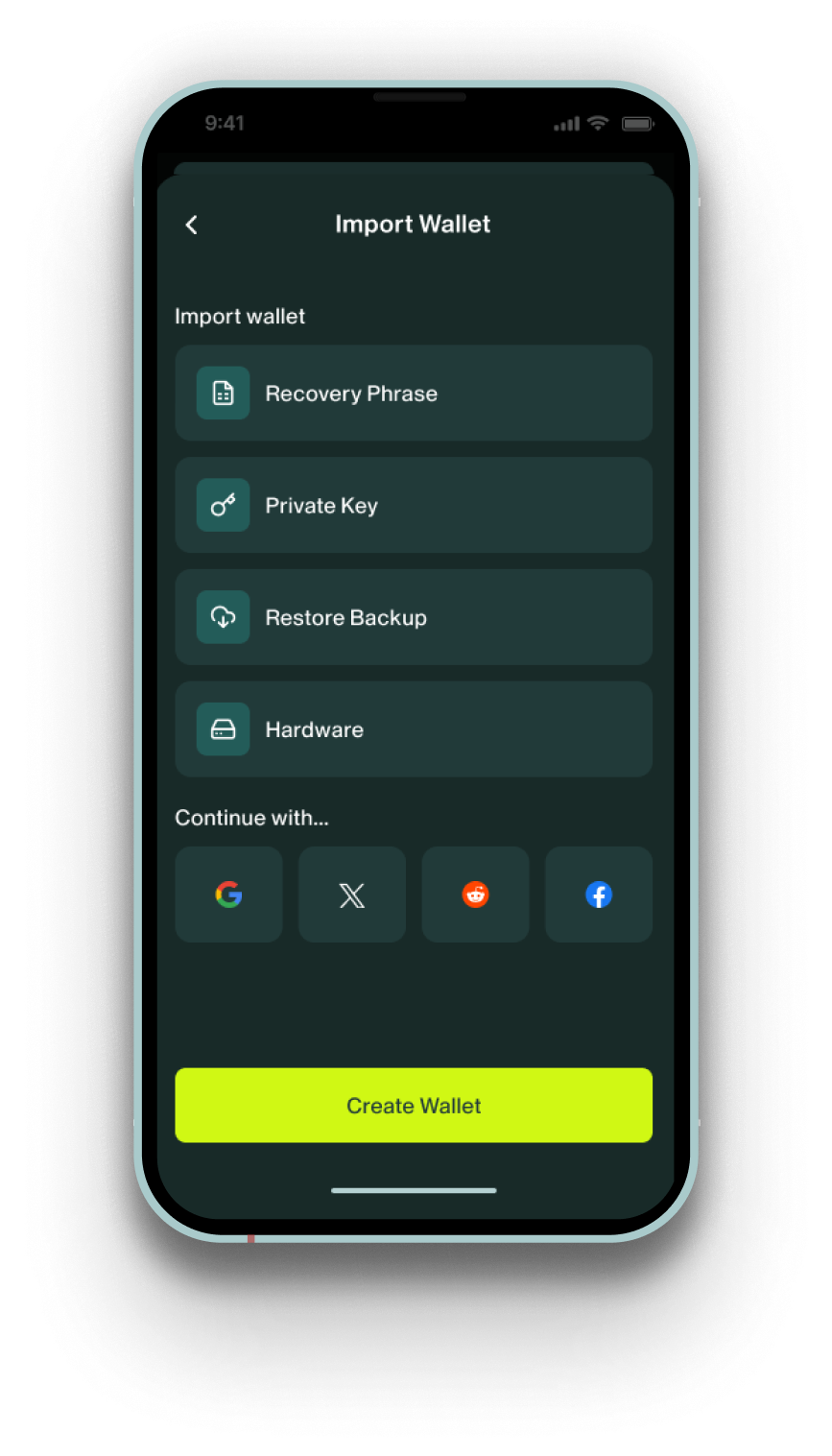
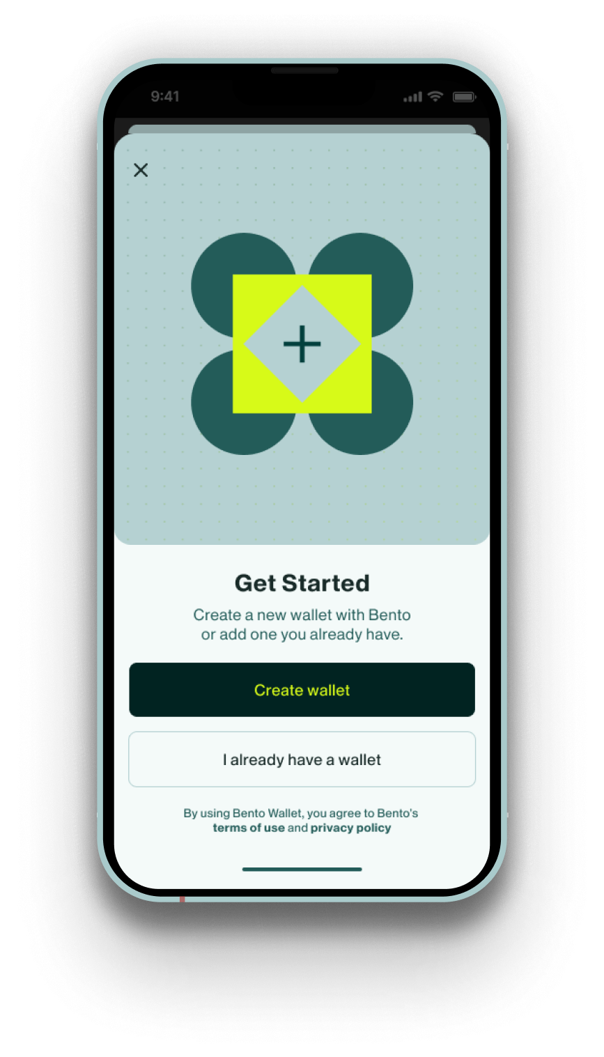
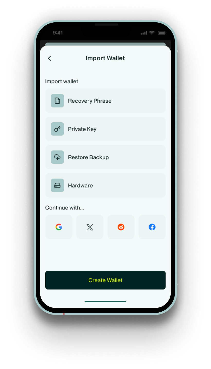
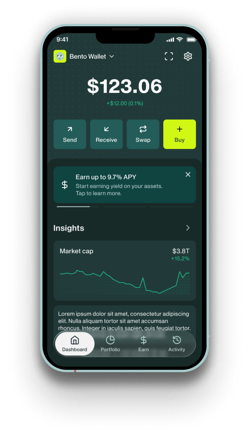
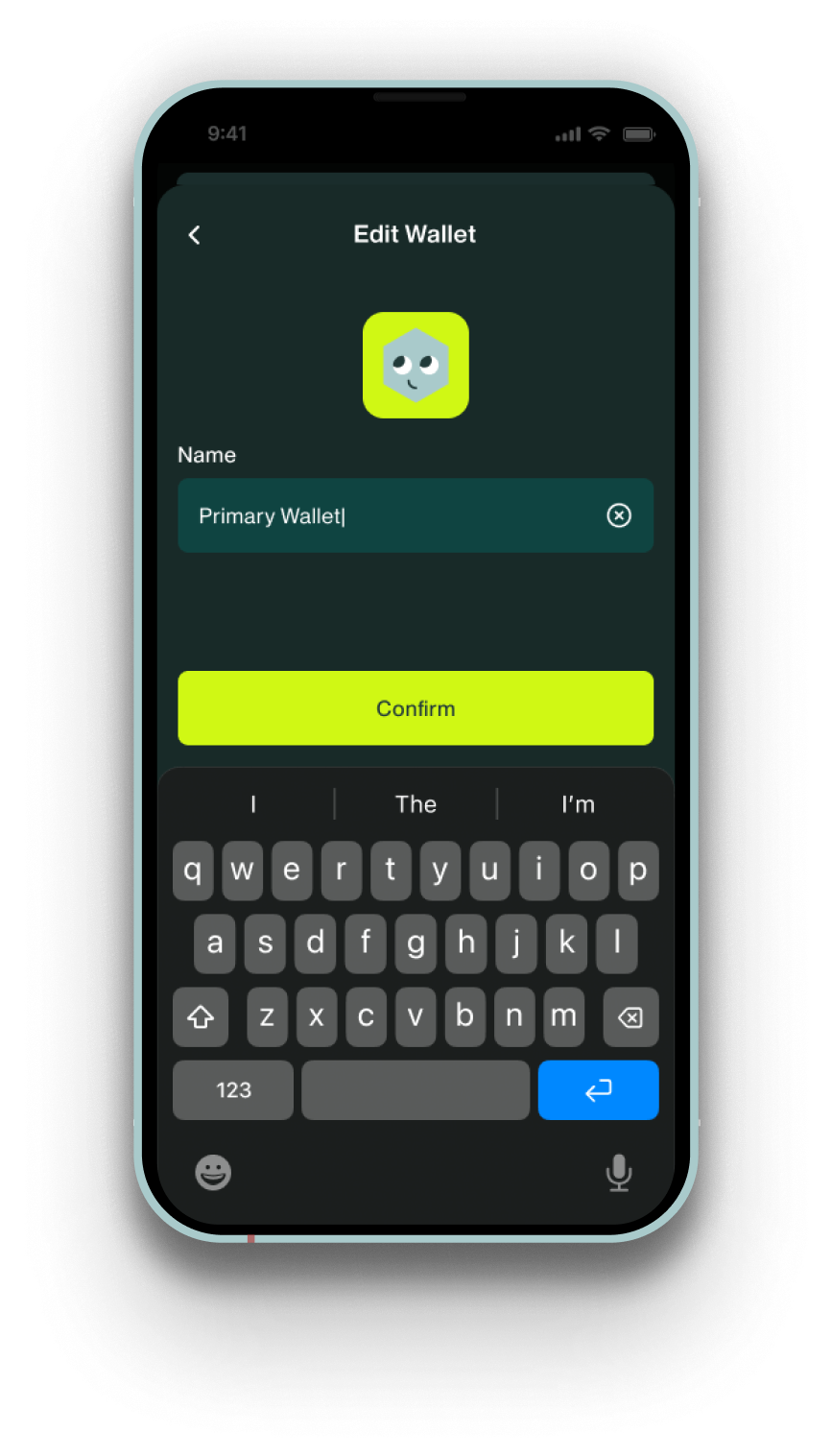
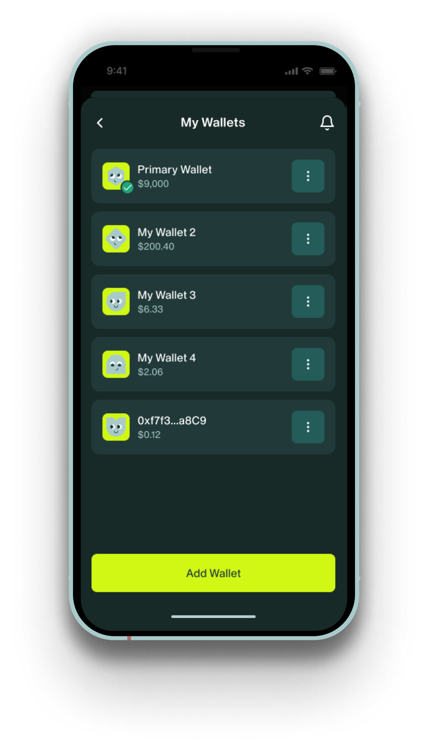
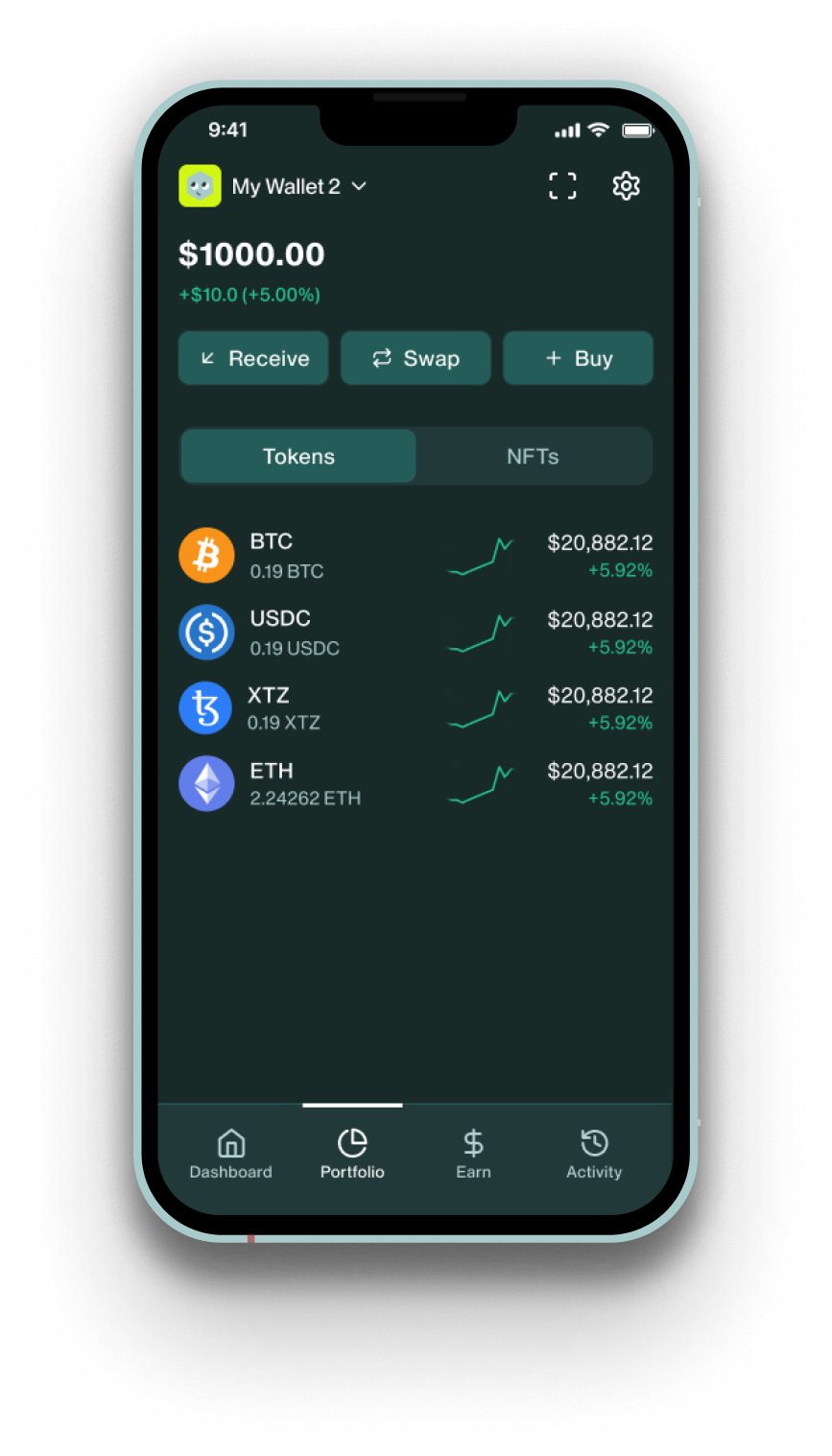
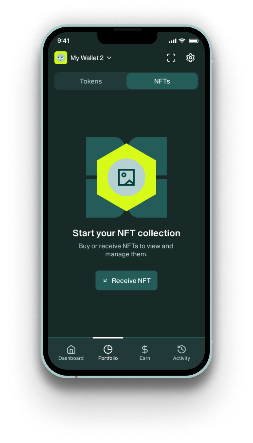
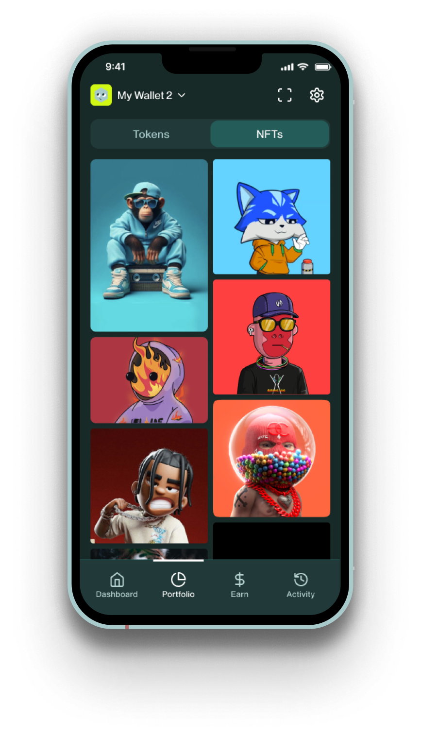
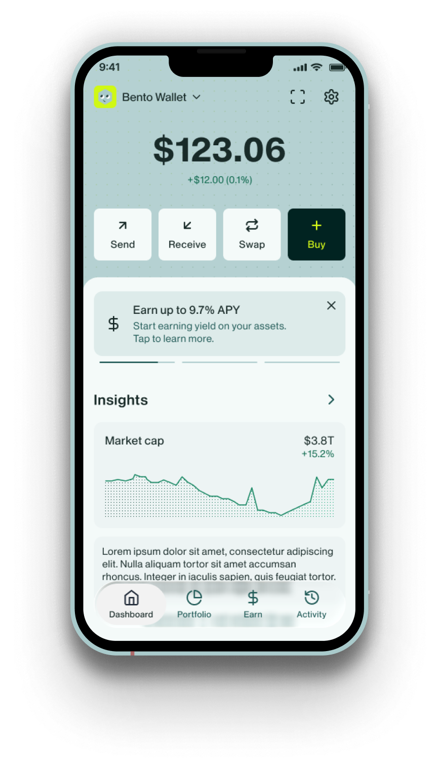
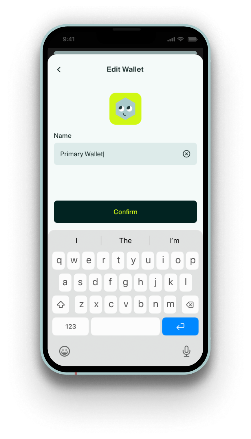
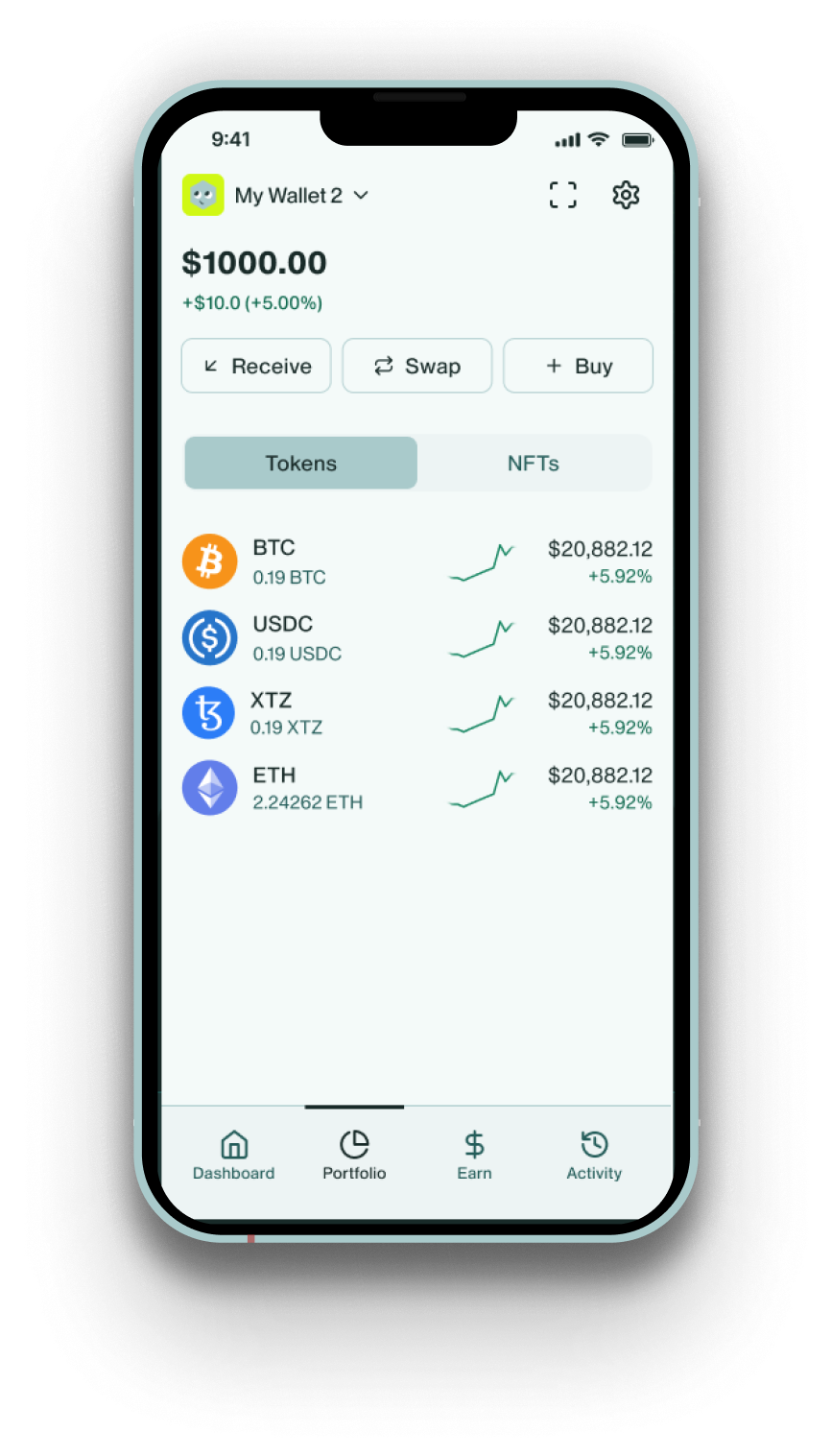
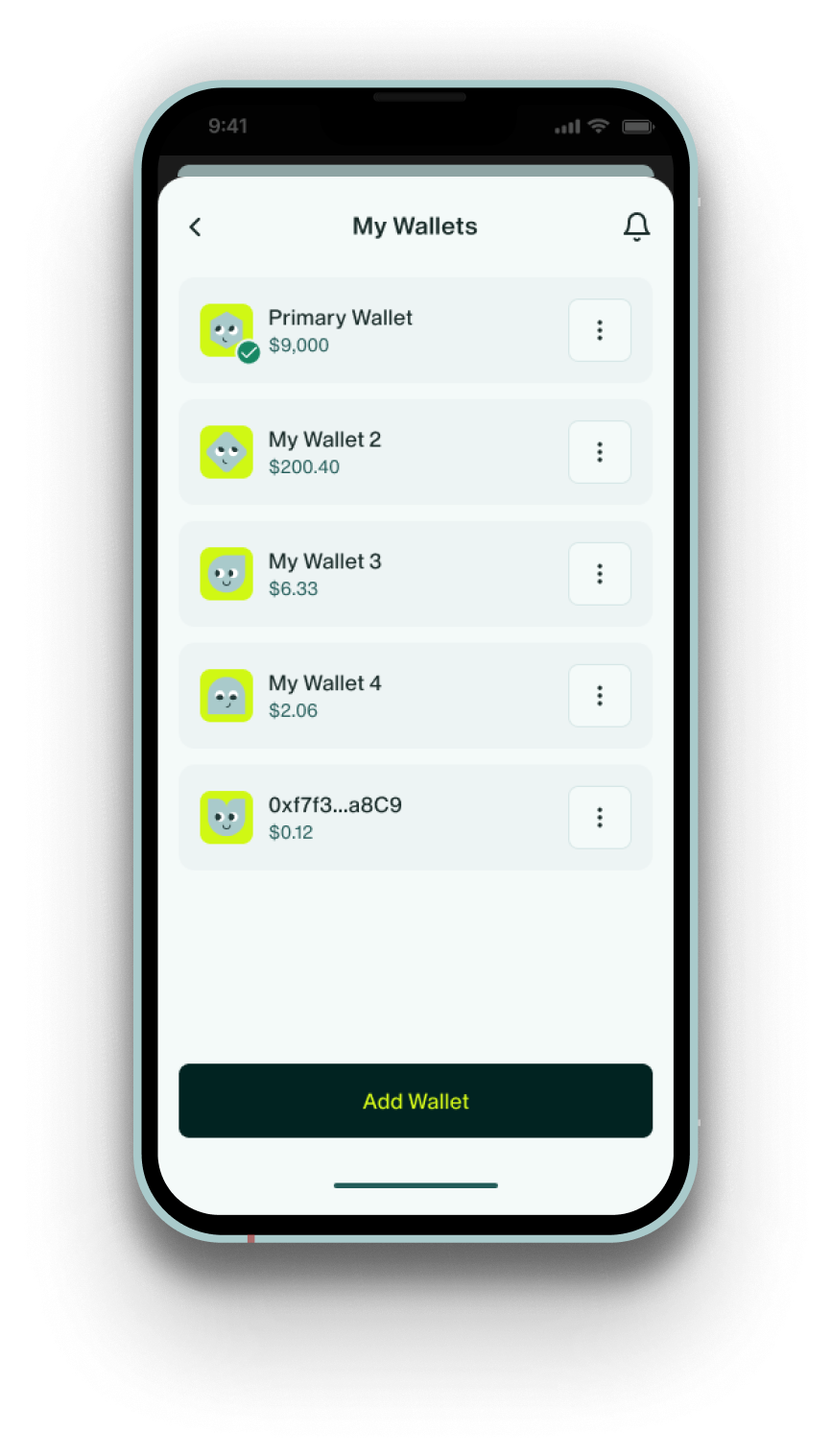

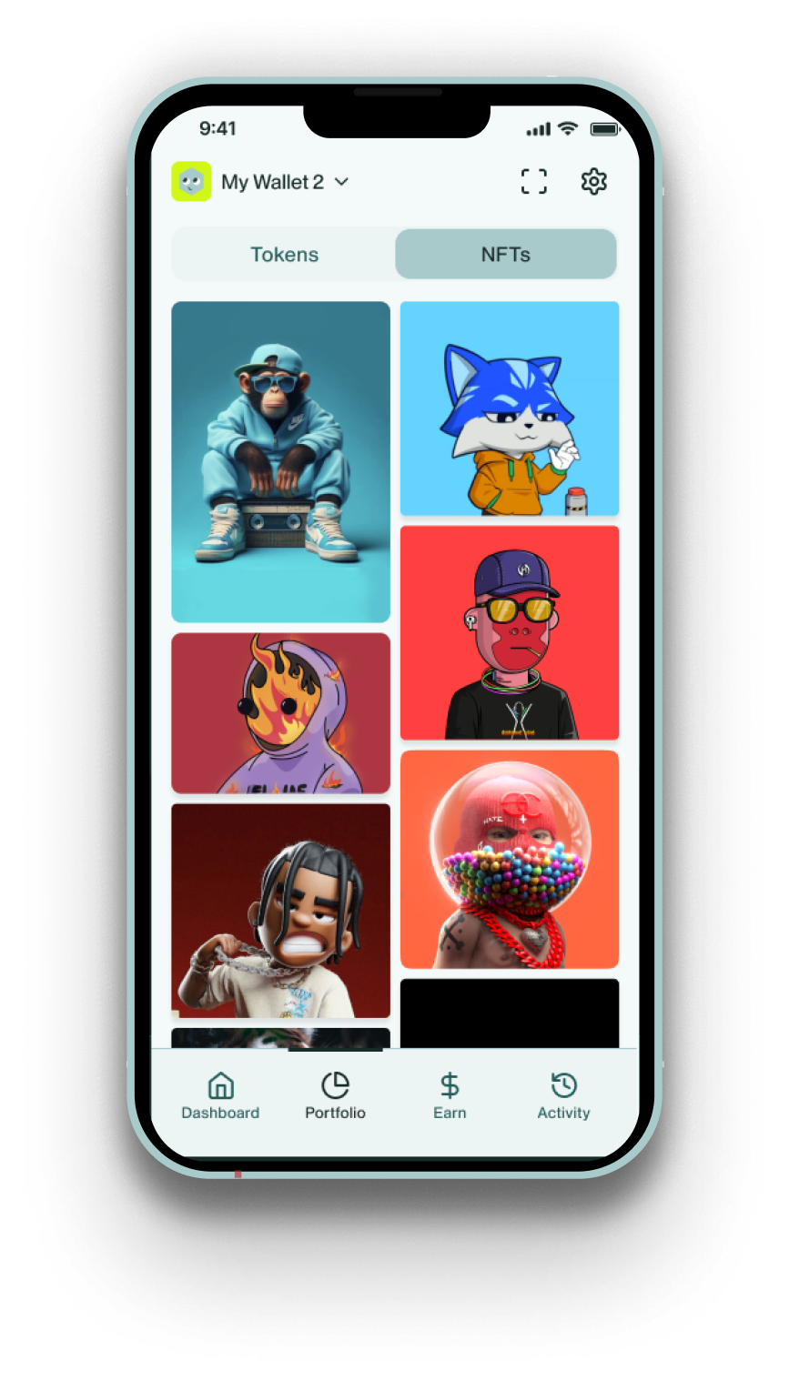
The interface organizes assets, networks, and features into modular components, creating a product experience built around clarity, structure, and discovery.


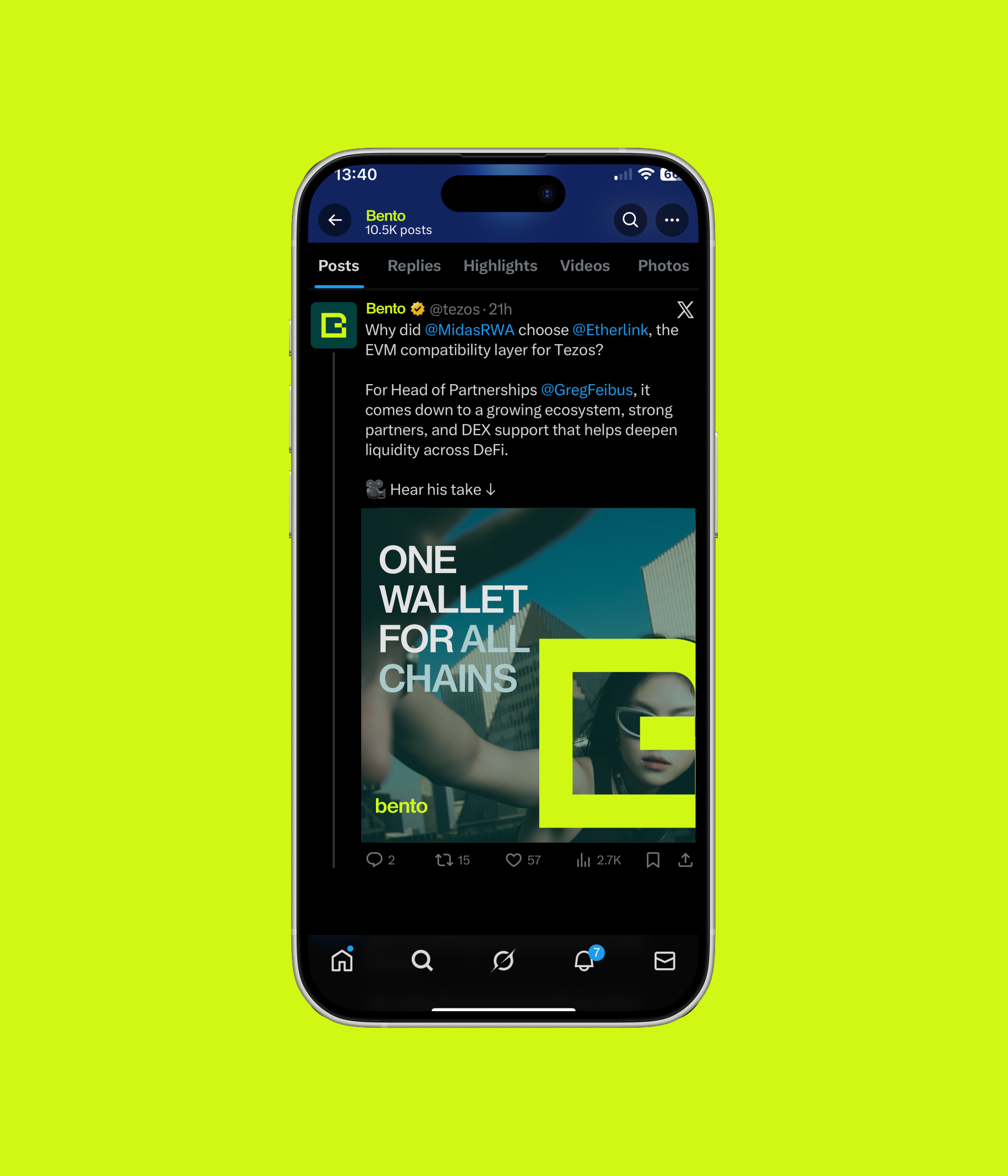
Modular layouts and structured grids organize assets, networks, and features into a clear and approachable product experience.


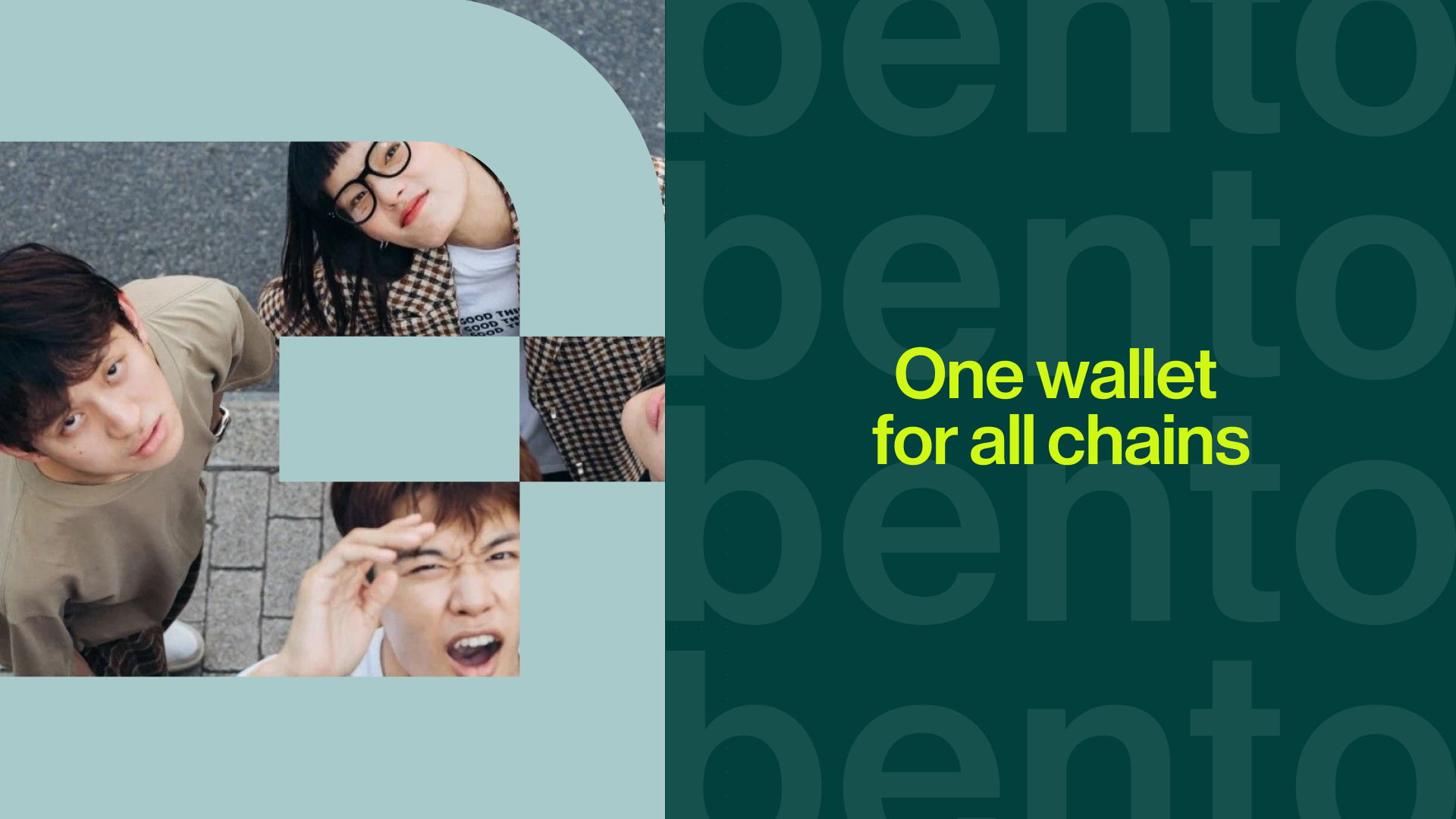


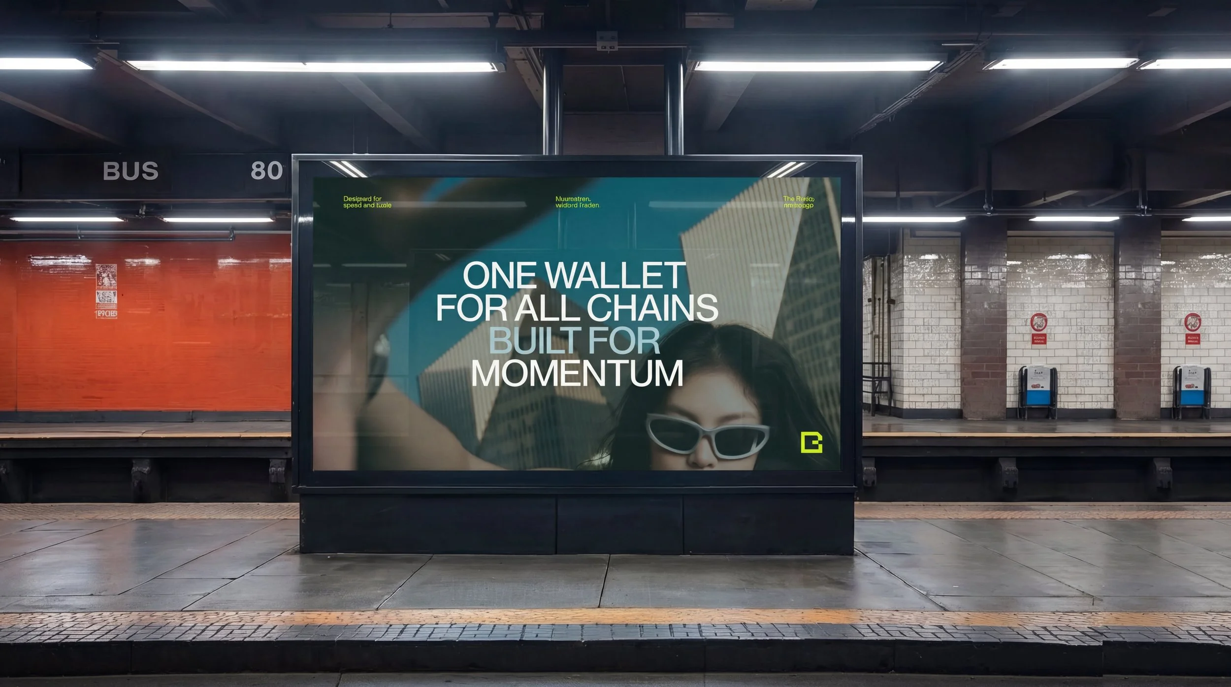
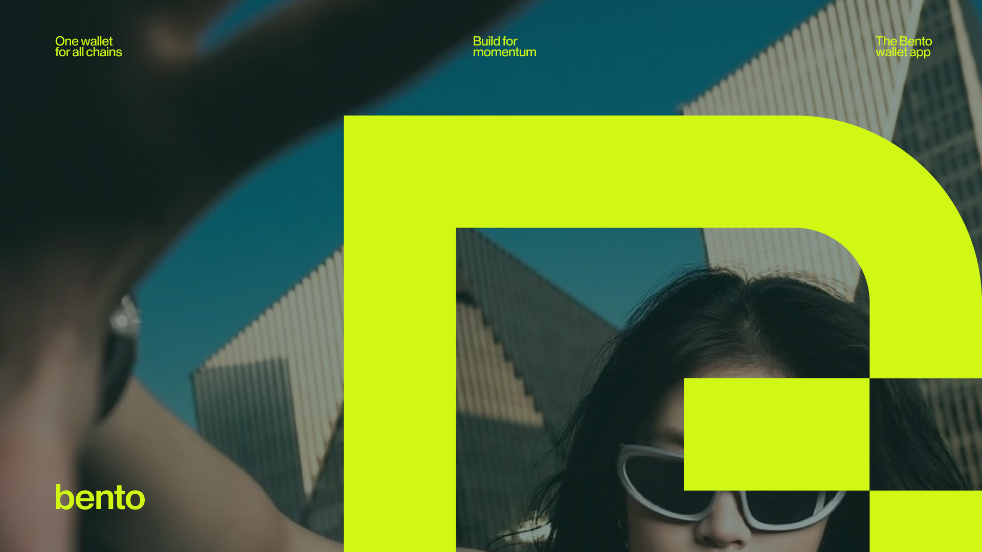
Photography places the Bento symbol at the center of dynamic compositions, creating a visual language that connects the identity to people and environments.


Together, these elements create a modular design system that brings structure, clarity, and intention to the crypto experience.
About the project
Bento is a multi-chain crypto wallet designed to help users explore the forefront of Web3. Originally launched as Umami by Nomadic Labs in 2021, the wallet entered a new chapter when Trilitech took over development and reimagined it as a flagship product for the Tezos and Etherlink ecosystems.
The challenge was to design an identity and product system capable of organizing complex blockchain functionality into a clear and approachable experience. The redesign introduced a new name, visual identity, and product experience aimed at expanding the wallet’s reach. The goal was to transform a highly technical tool into an accessible platform for discovery, allowing users to seamlessly explore emerging networks, assets, and applications.
The name Bento, developed by the creative team, takes inspiration from the Japanese tradition of carefully arranged lunchboxes. Each element is organized into compartments, creating a sense of balance, order, and clarity. This metaphor became the foundation of the design system, suggesting a wallet that organizes complexity into distinct, harmonious parts.
This principle informed both the interface and the brand language: modular layouts, clear hierarchy, and components that fit together within a structured grid.
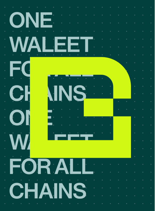
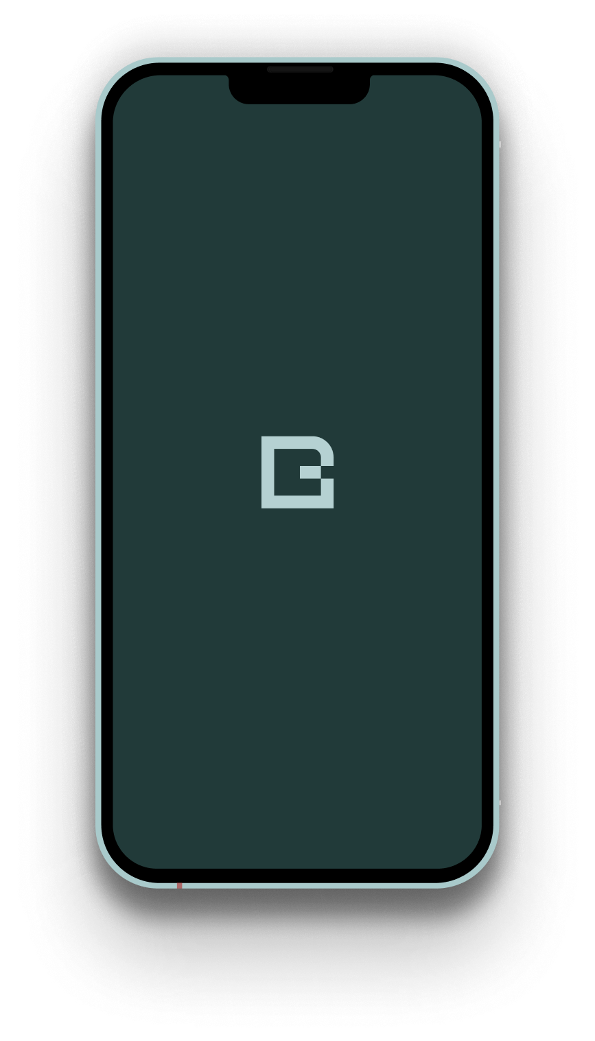
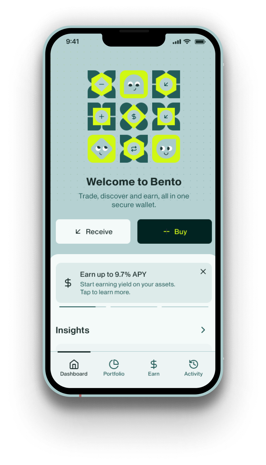
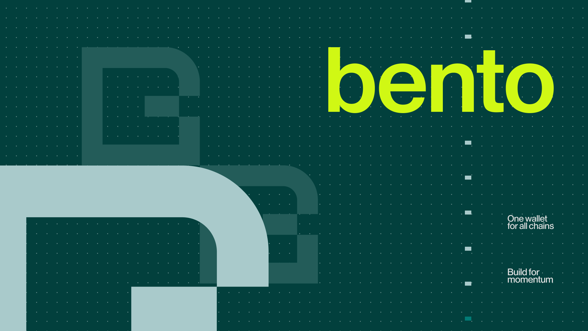
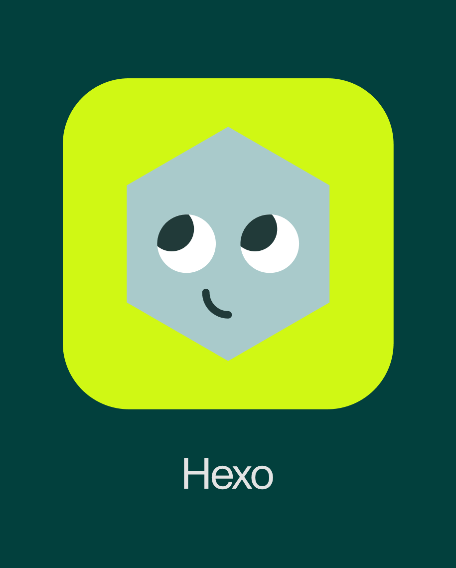
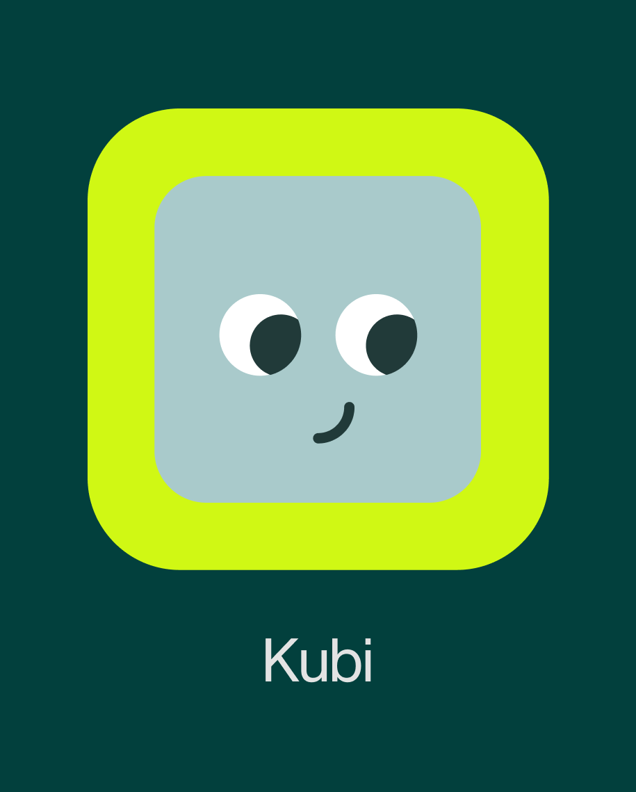
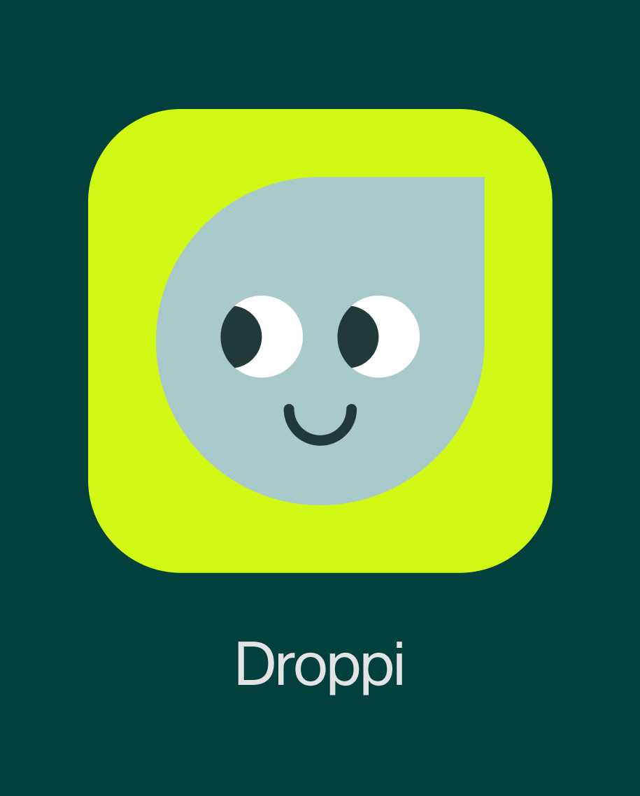
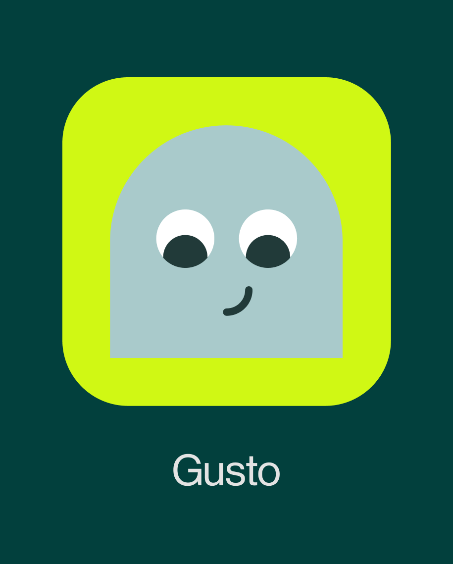
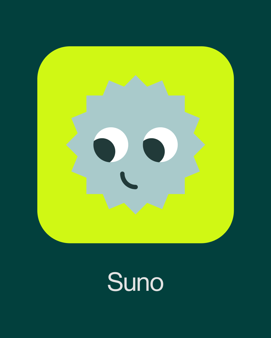
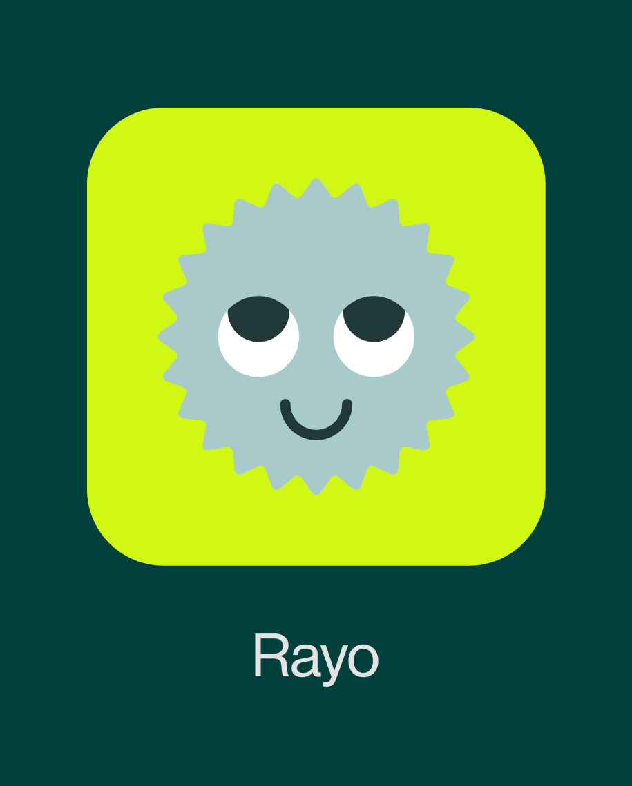
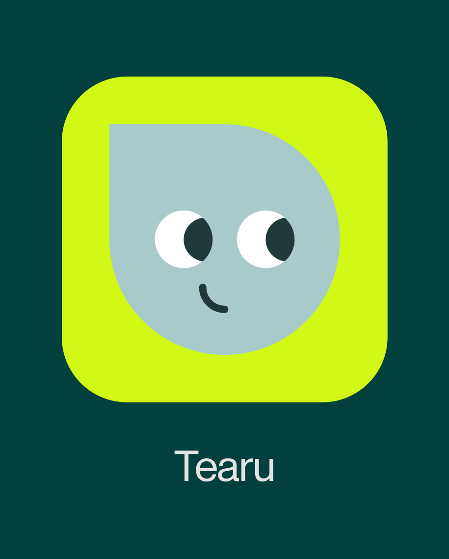
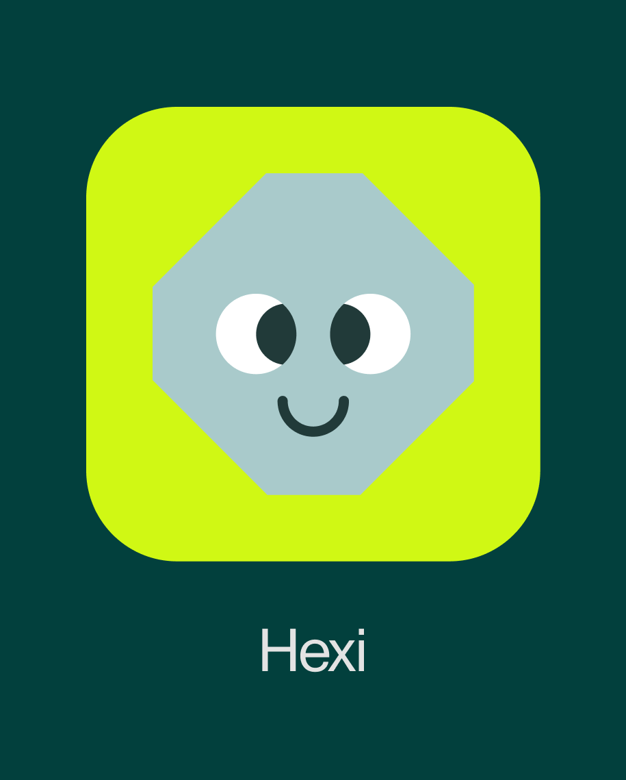
At the center of the identity is the logo, which combines the letter “B” with the silhouette of a wallet. The mark is both functional and symbolic, representing Bento as a gateway to new crypto experiences. Its geometric construction allows it to work beyond a traditional logo, serving as a framing device across layouts, imagery, and interface elements.
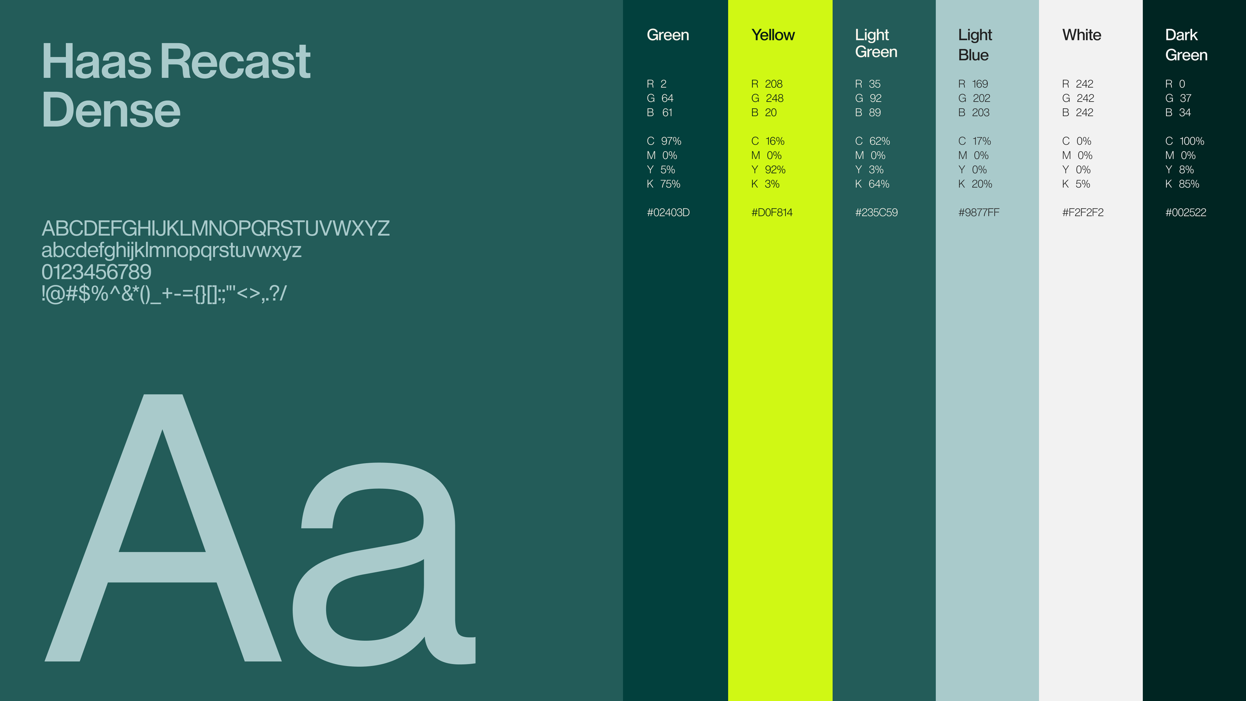
The colour palette reinforces this balance of clarity and energy. Deep green acts as the brand’s anchor, representing stability and trust, while a vibrant yellow introduces a sense of exploration and momentum. Supporting colours extend the palette while maintaining visual harmony.
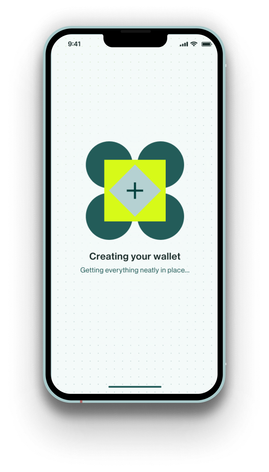
A subtle dot pattern reinforces the underlying grid structure, adding texture while reflecting the modular logic of the Bento concept.
Typography uses Haas Recast Dense, a revival of a mid-century grotesque typeface. Its compact geometry and distinctive forms give the brand a confident voice while maintaining strong legibility across both product and marketing environments.
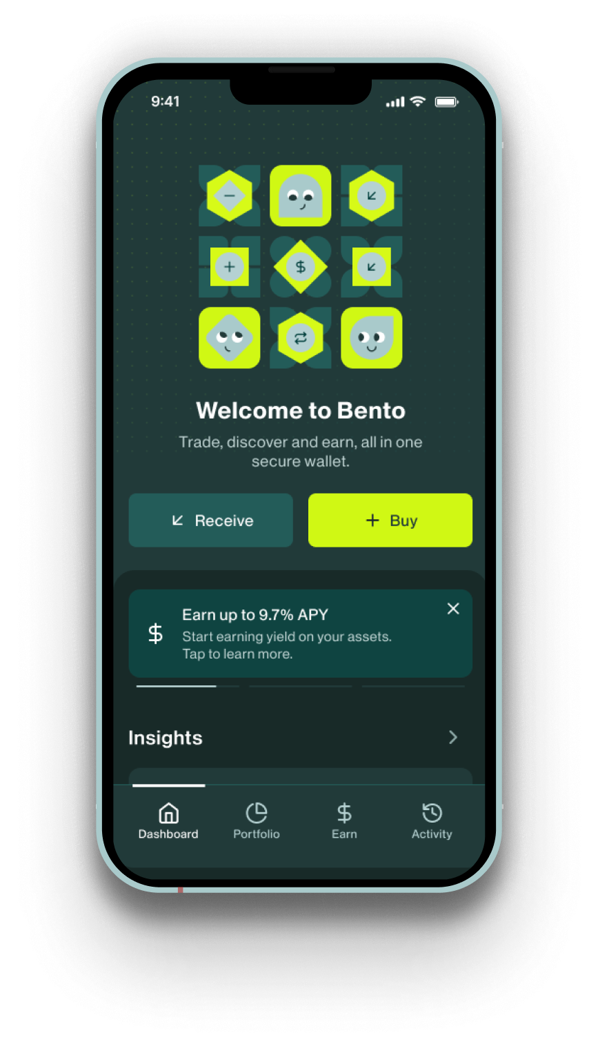
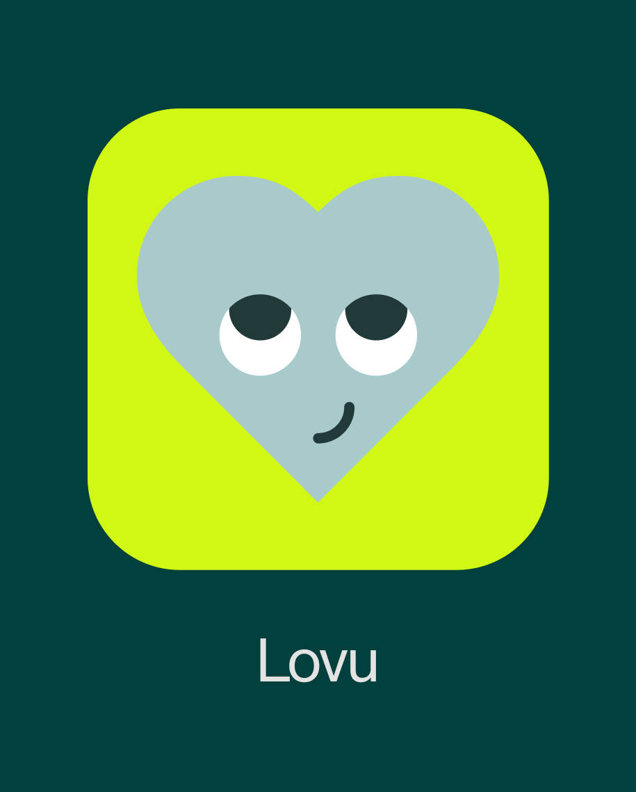
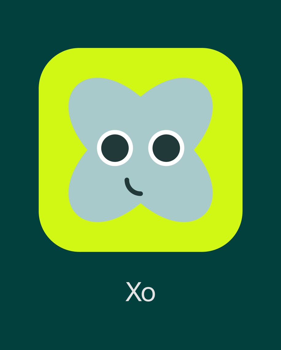
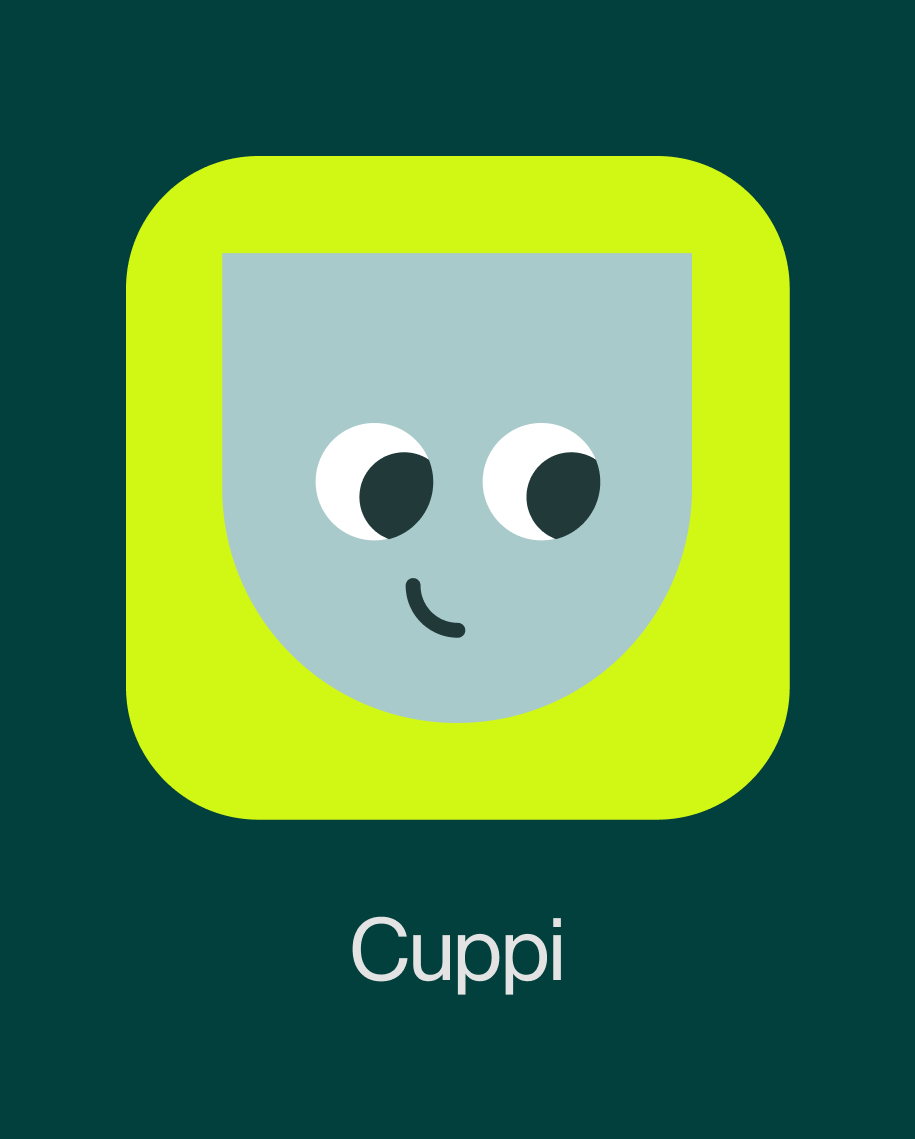
Illustrations built from flat vector shapes help translate complex blockchain concepts into clear visual narratives, while photography places the logo at the center of dynamic compositions, often interacting with people and environments.
Together, these elements form a modular design system that reflects Bento’s core idea: bringing structure, clarity, and intention to the crypto experience.
Credits
Creative Director
Ilaria Antolini
Animation
Rafael Irimie
Art Director
UI Animation
Ilaria Antolini
Rafael Irimie
Design
Product Design
Ilaria Antolini
Naomi Strinati
Bahador Katouzian
Calvin Power
Mana Majboor
Motion Design
Rafael Irimie