

Kanvas
Branding
2025
A brand identity for a customizable fan engagement platform designed for global sports and entertainment brands.
The identity reflects flexibility, creativity, and reliability, key qualities of a platform built for customizable fan experiences.

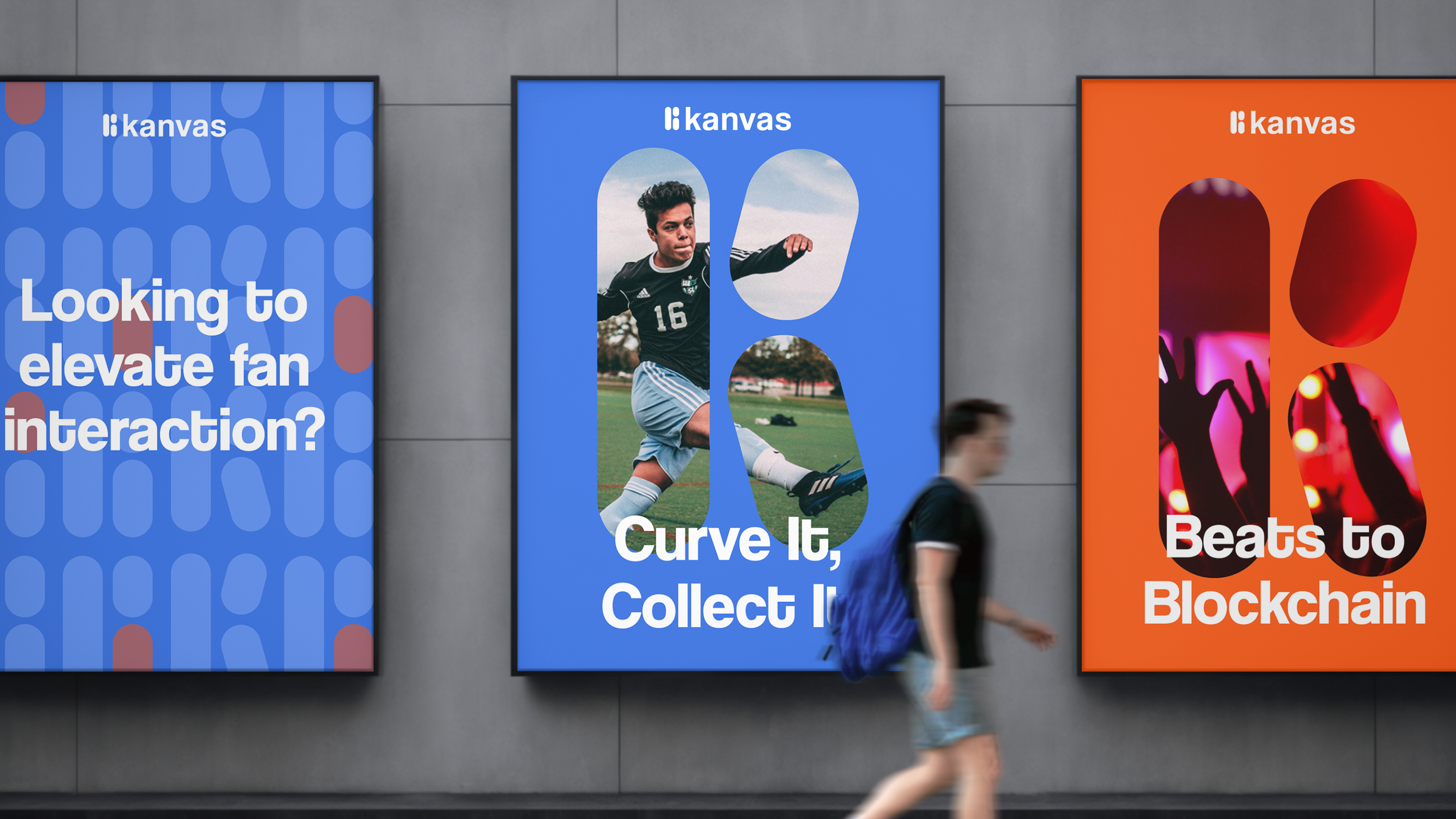
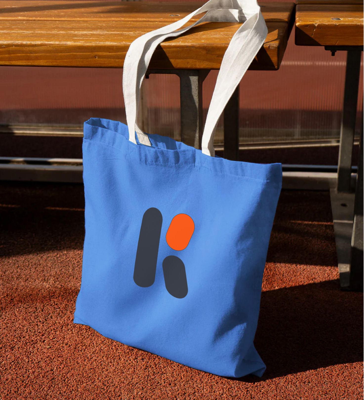
The identity centers on a rounded “K” symbol that expresses customization while acting as a versatile graphic element.
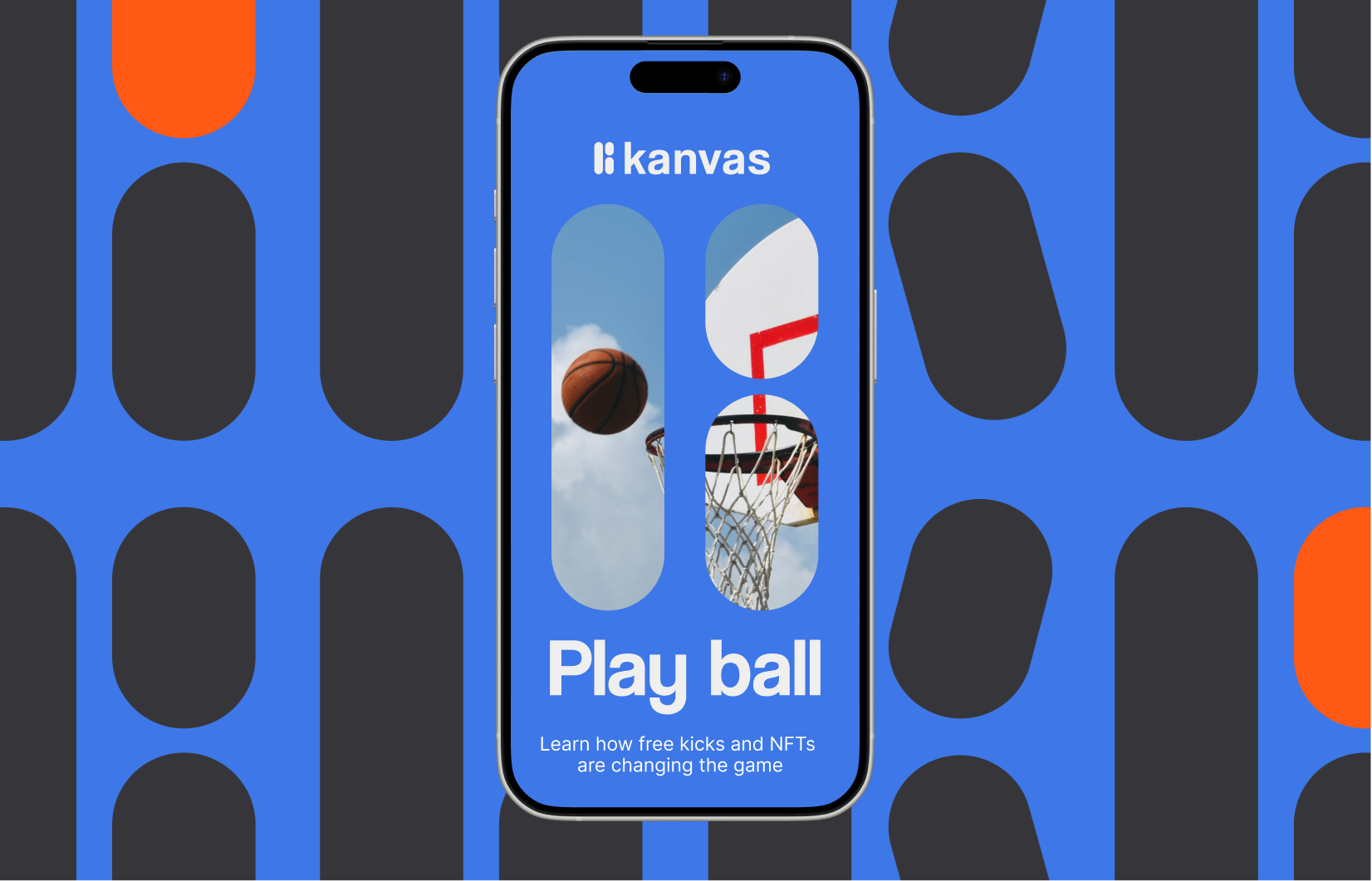


The “K” shape evolves into modular patterns that create rhythm and movement across the brand.


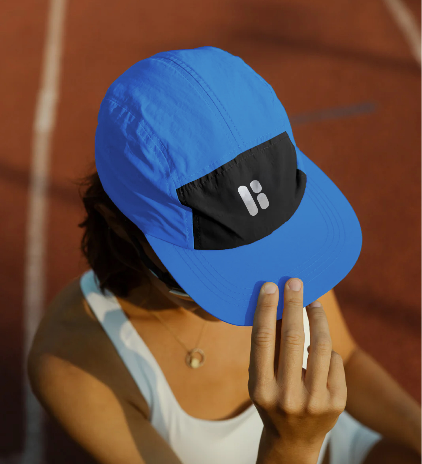
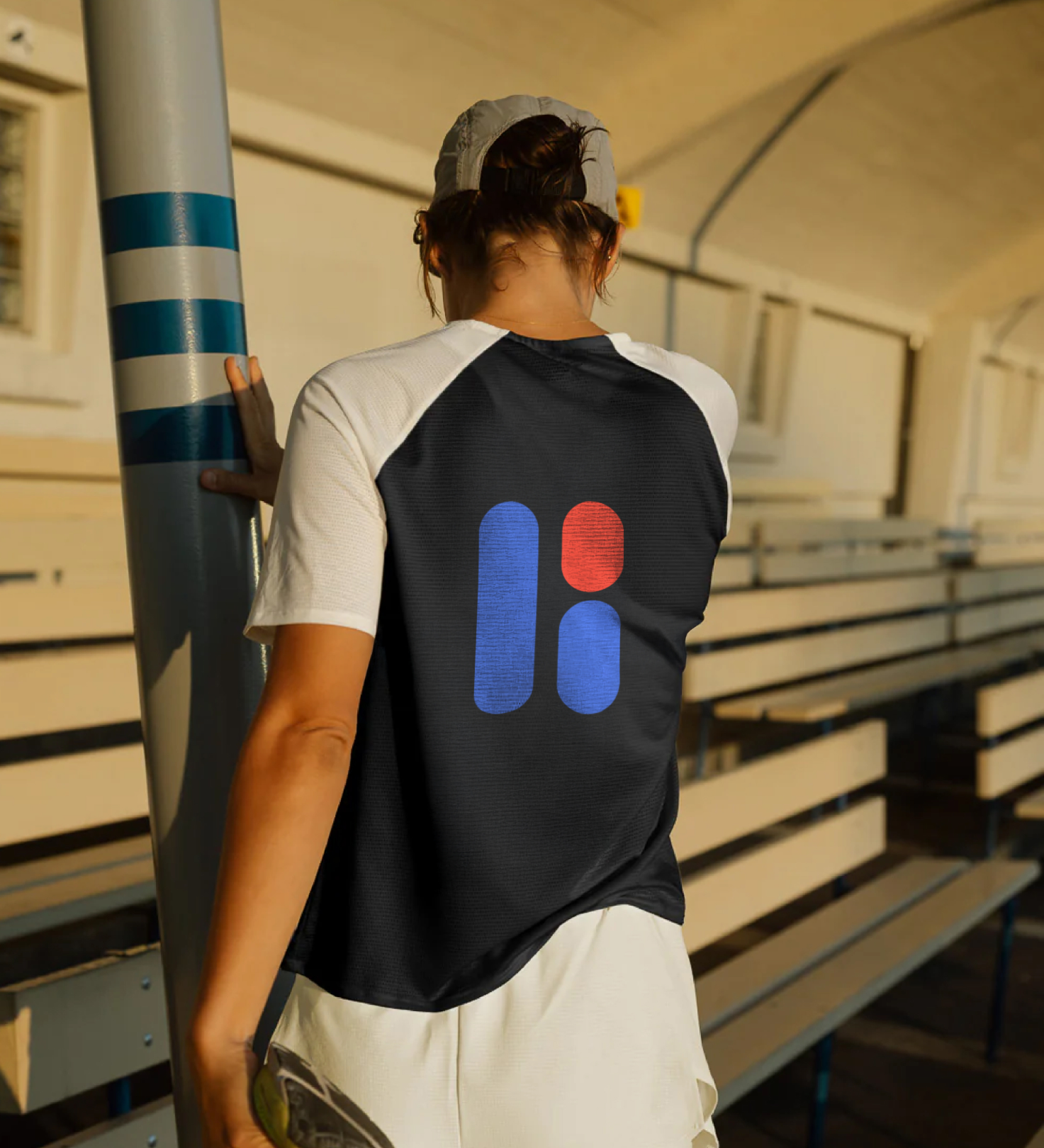
Deep blue and dark grey establish trust and stability, accented by orange and pink, while Coolvetica headlines pair with Inter for clear, legible text.


Together, these elements create a flexible identity designed for digital fan engagement platforms.
About the project
Kanvas is a fully customizable fan engagement platform designed for global sports and entertainment brands seeking to deepen their connection with audiences. By integrating directly into the digital platforms fans already use, Kanvas enables brands to create tailored experiences that transform passive viewers into active participants.
The challenge was to design a brand identity that could communicate flexibility, creativity, and reliability, qualities essential for a platform built around customization and dynamic fan interaction.
At the center of the identity is the Kanvas logo, a custom wordmark built around a distinctive rounded “K” shape. The form reflects the platform’s core idea of customization, acting both as a recognizable symbol and as a versatile graphic element that adapts across different contexts. Its soft geometry creates a sense of approachability while maintaining a confident and contemporary presence.
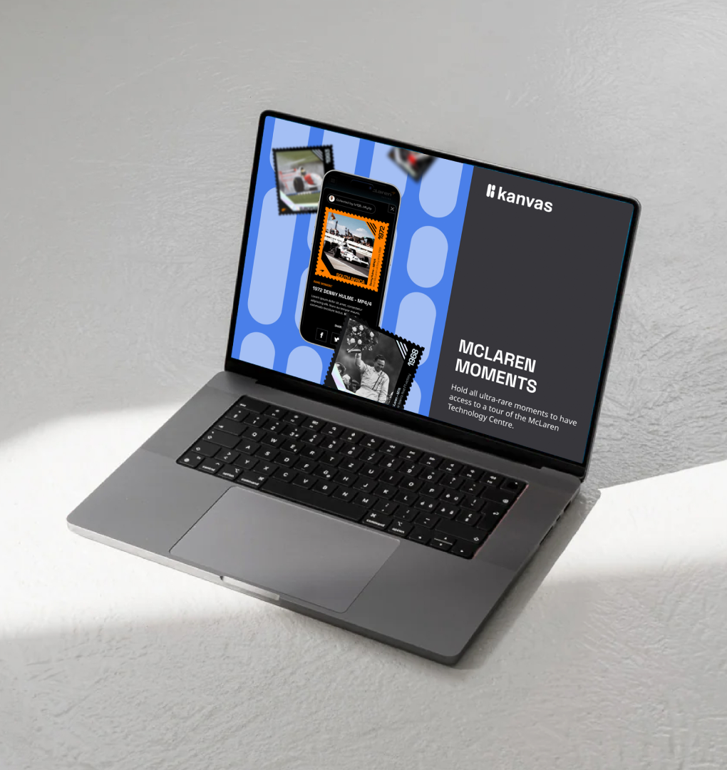
The “K” shape expands into a modular graphic system that can function as a frame, pattern, or compositional device. Repetition of the form introduces rhythm and movement across layouts, reinforcing the energy and momentum associated with fan communities and live events.
Colour plays an important role in shaping the brand’s tone. Deep blue and dark grey provide a stable foundation that communicates trust and experience, while orange and pink accents introduce moments of energy and modernity, reflecting the excitement of sports and entertainment culture.
Typography pairs Coolvetica, used for bold headlines, with Inter for body text, creating a clear hierarchy that maintains legibility across digital platforms and product interfaces.
Imagery further anchors the brand narrative. Strong sports photography connects the platform to its roots in fan culture and live events, while stylised portraits introduce a contemporary aesthetic that appeals to new audiences.
Together, these elements create a flexible visual identity designed to scale across product interfaces, marketing communications, and fan engagement experiences, supporting Kanvas’s mission to help brands build deeper and more meaningful relationships with their audiences.
Credits
Creative Direction
Design
Ilaria Antolini
Ilaria Antolini
Naomi Strinati