
xU3o8
Brand Identity, Motion Design
and Product Design
2026
A brand identity for a platform pioneering the tokenization of uranium at the intersection of energy and blockchain technology.
The challenge was to design a brand identity that makes uranium tokenization feel credible, accessible, and future-focused.

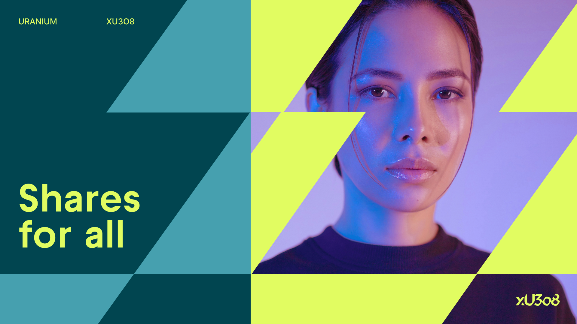
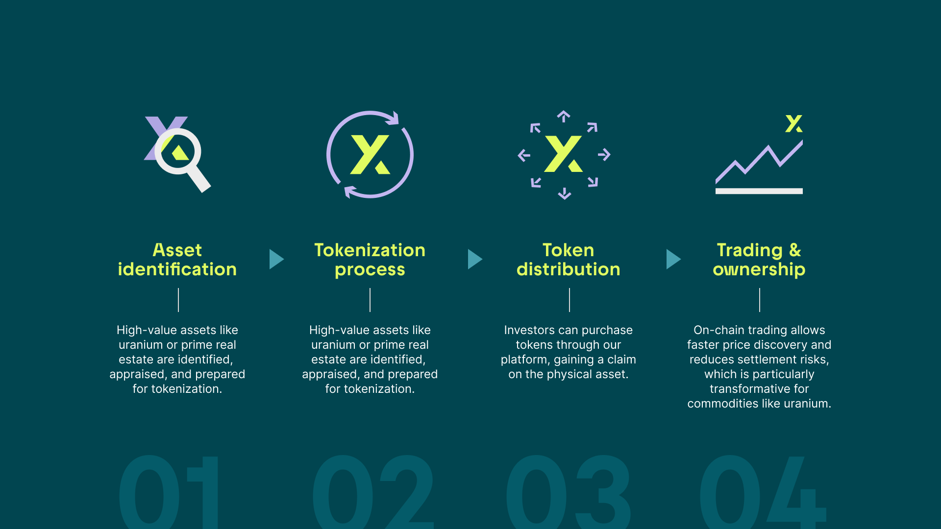
The concept draws on the idea of fractional ownership, visualizing uranium as a digitally accessible asset.


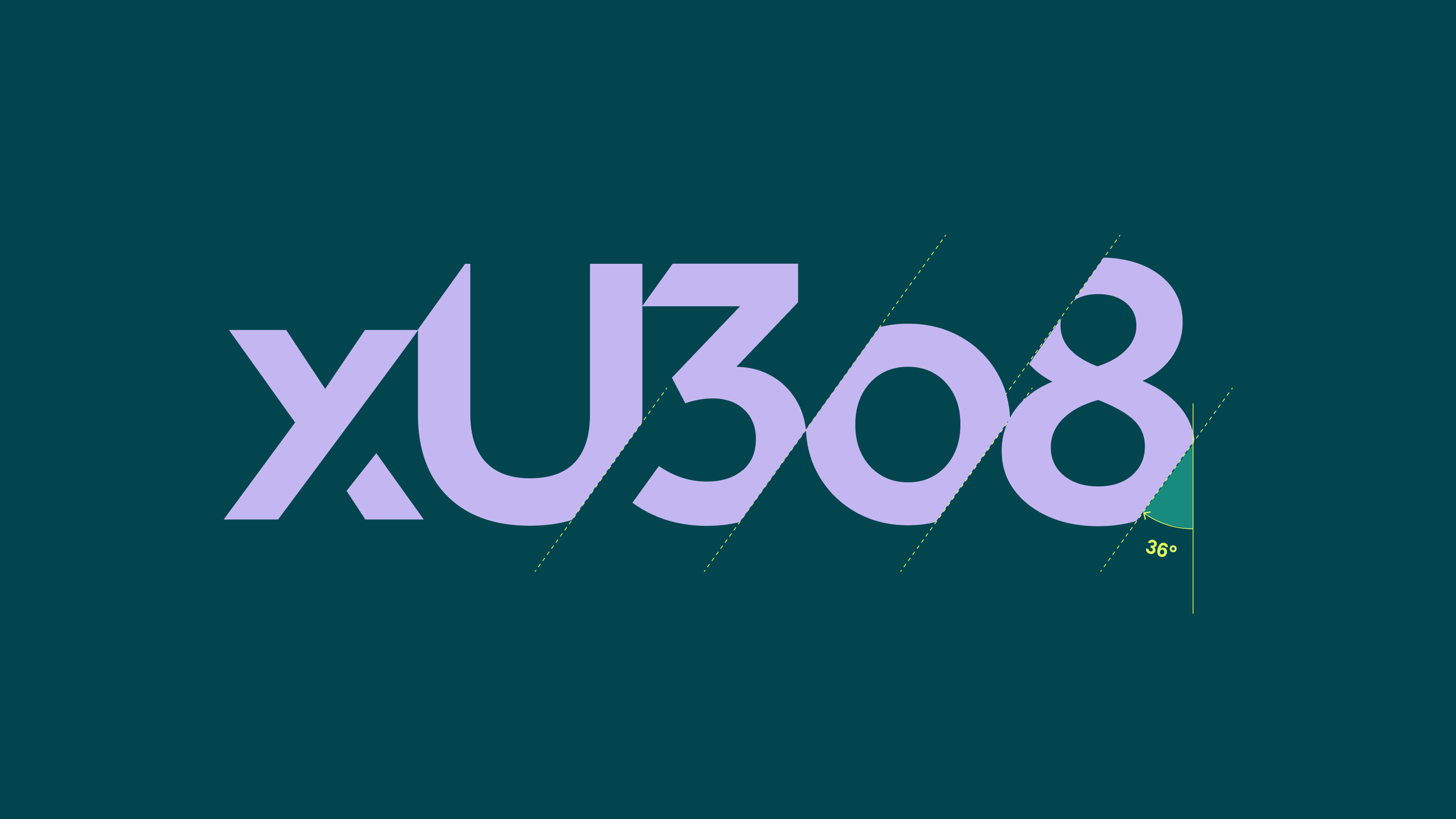
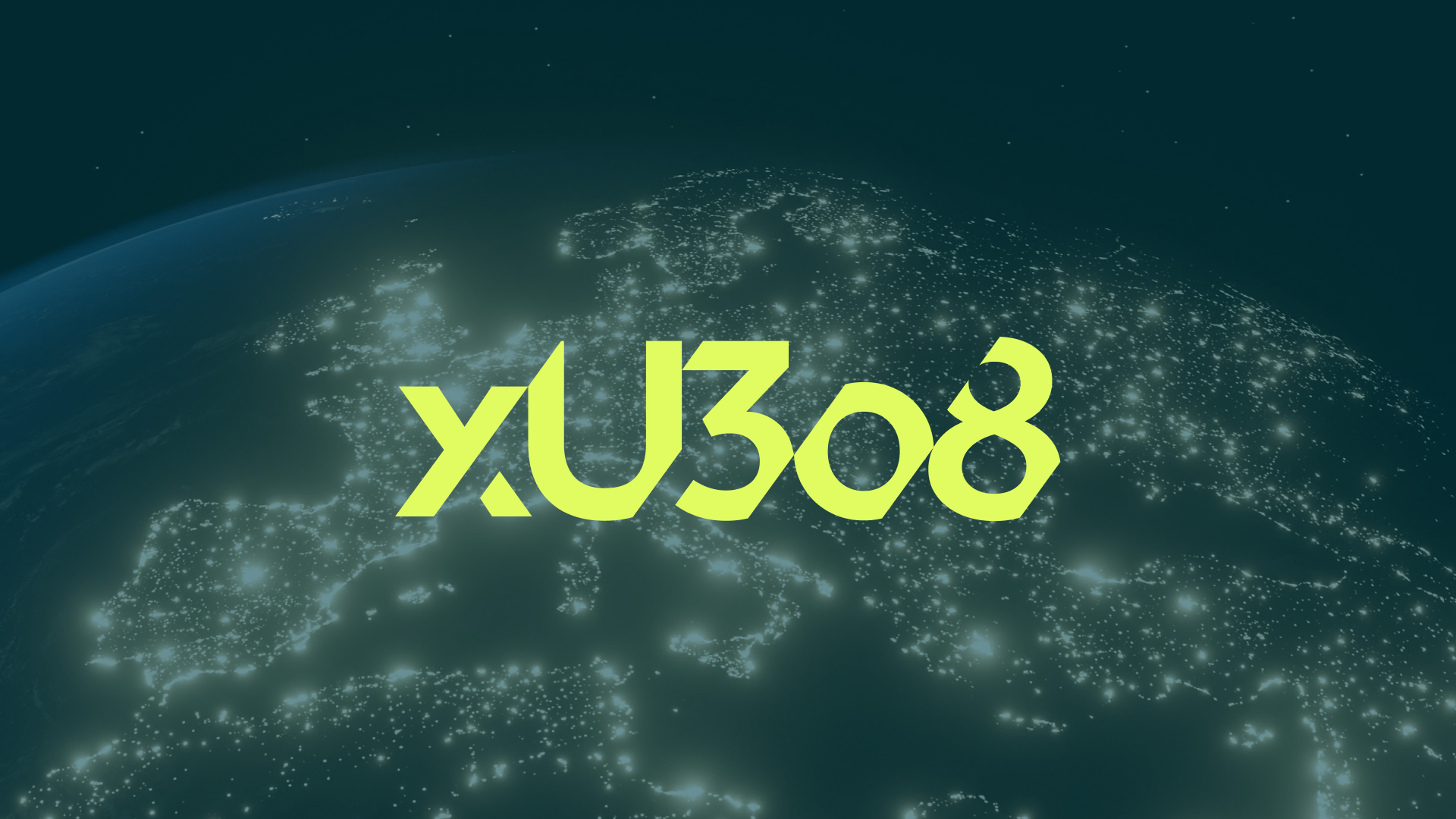
A custom wordmark features angular cuts that symbolise investors owning a fraction of the asset.
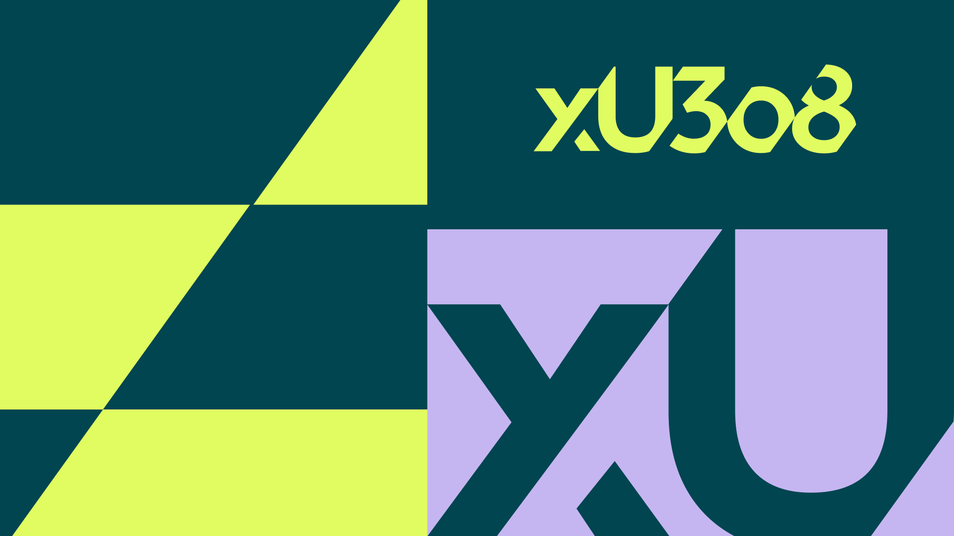
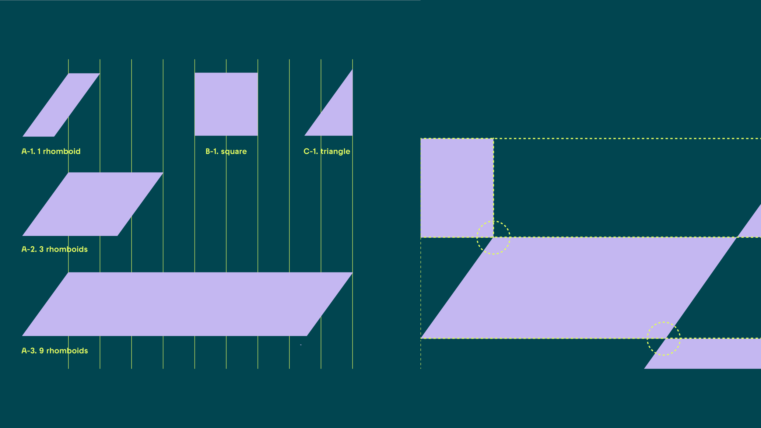
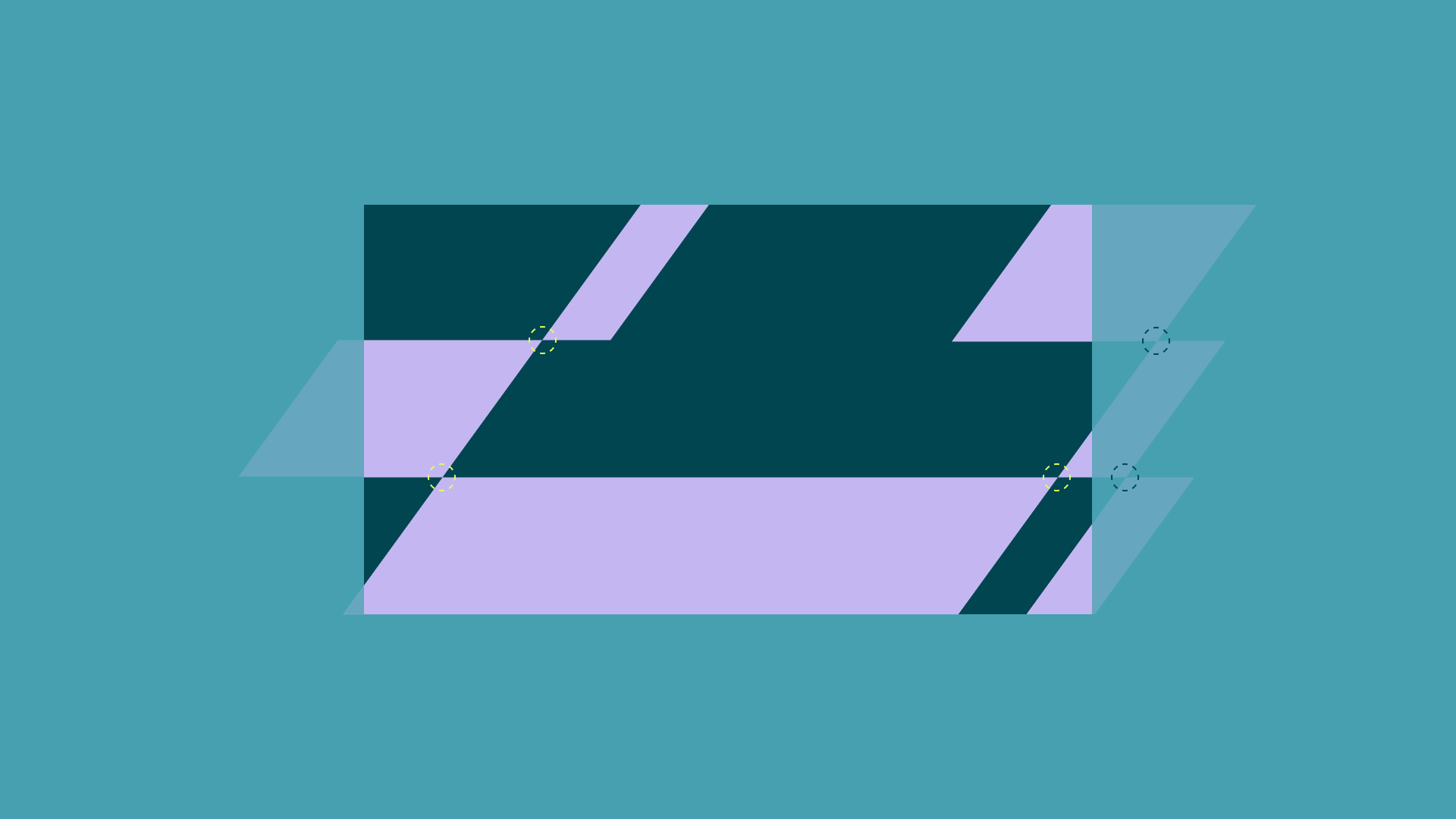
Modular geometric patterns extend this idea, referencing both tokenized ownership and the structured systems of blockchain technology.

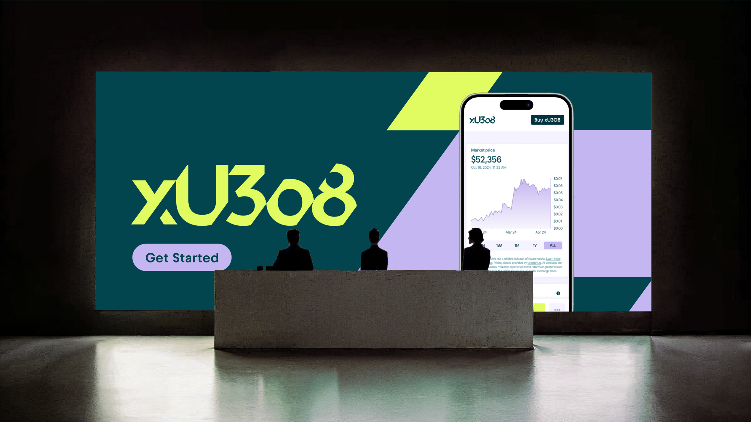
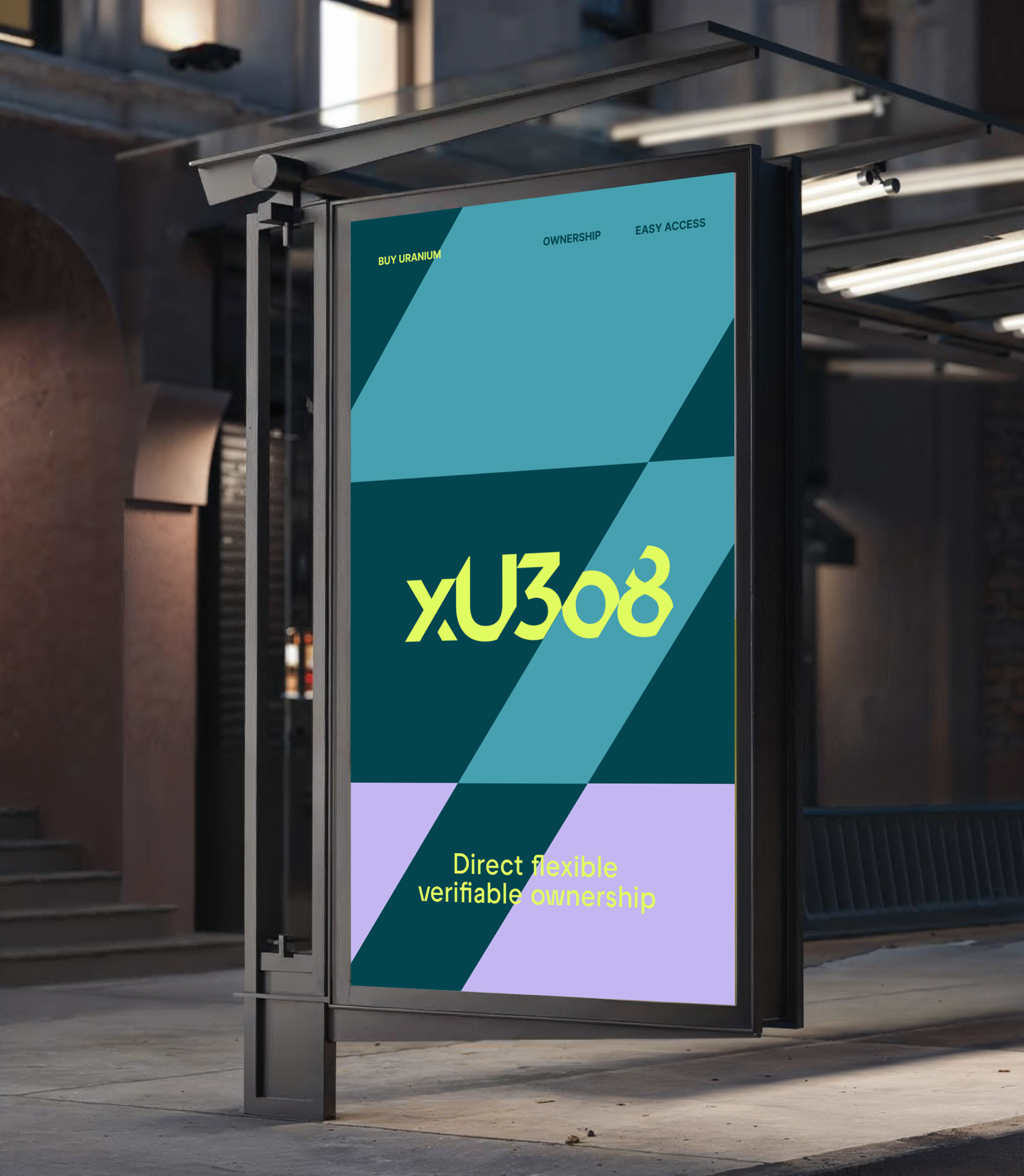
A palette of deep teals and mint greens communicates trust and stability, while the geometric typeface Raptor V2 is paired with Inter to ensure clarity across digital platforms.

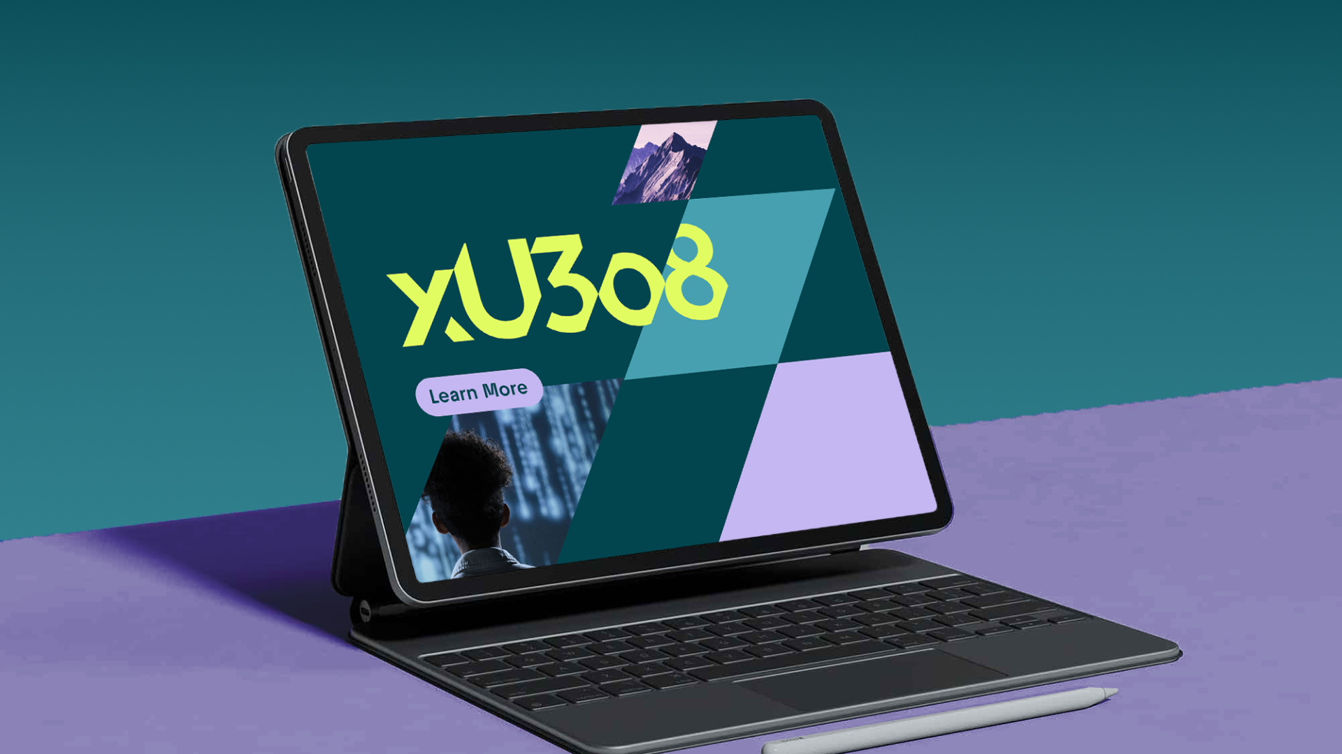
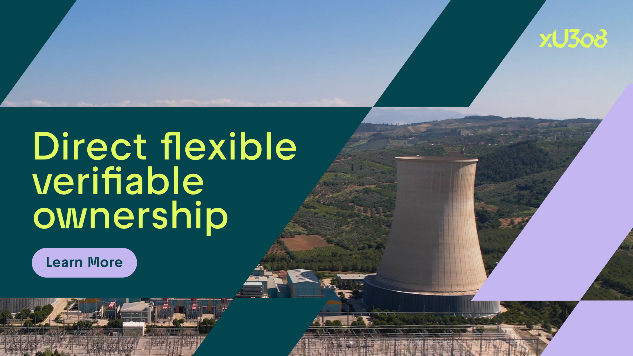
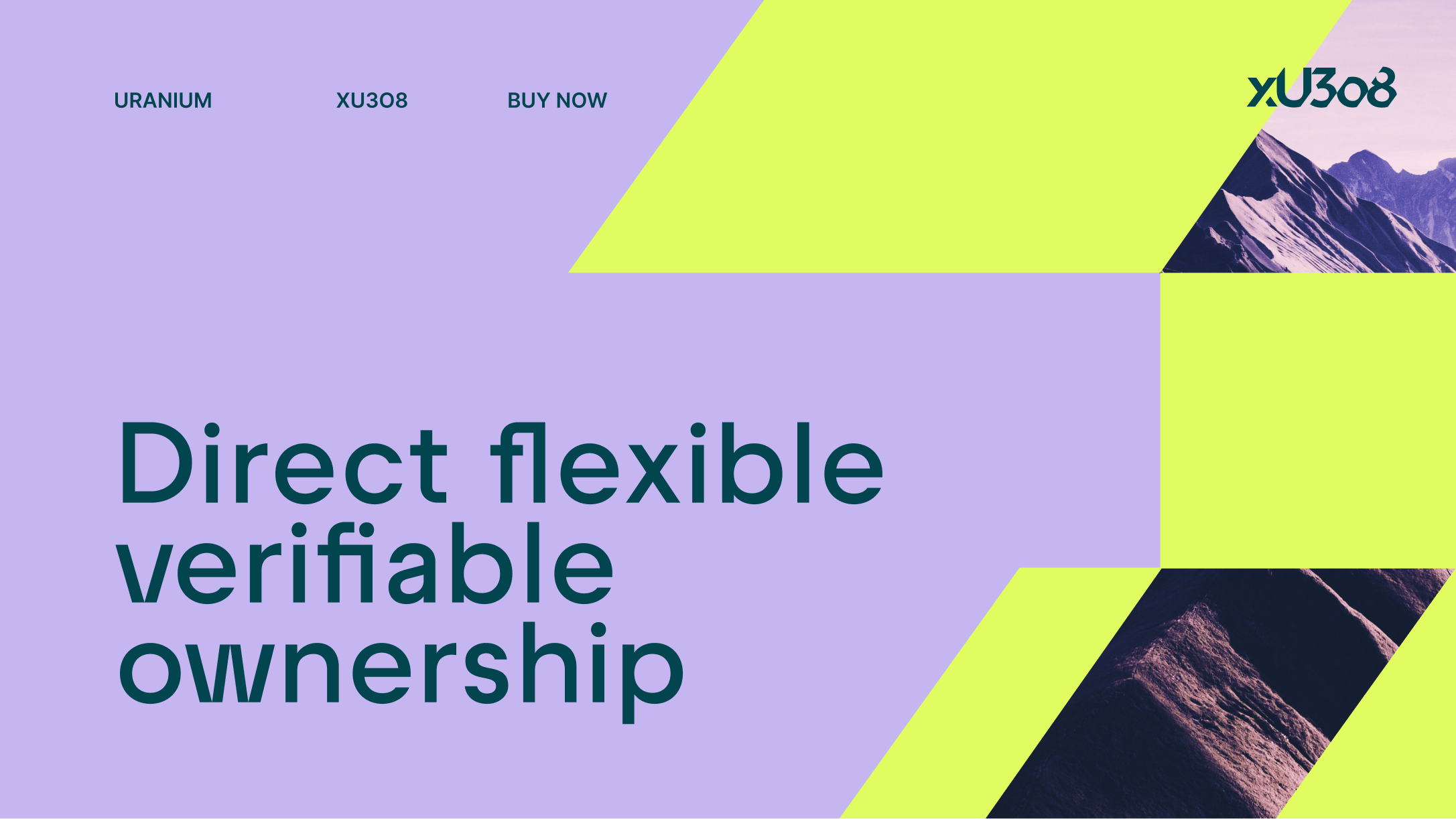
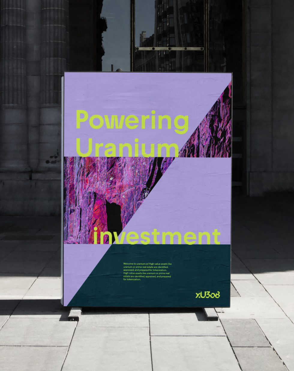
Rock textures, portraits, and landscapes connect the brand to uranium’s geological and human context.


Together, these elements create a flexible identity system designed to scale across digital platforms, communications, and educational content.

About the Project
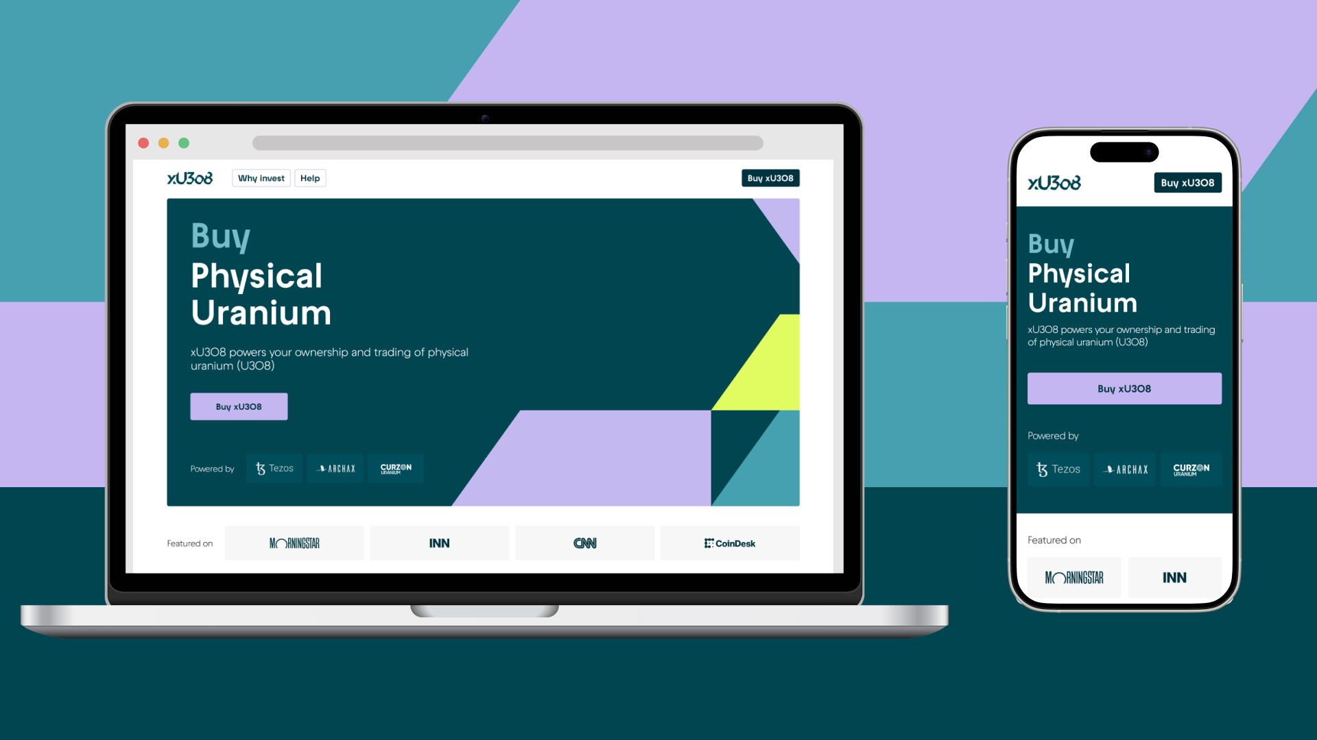
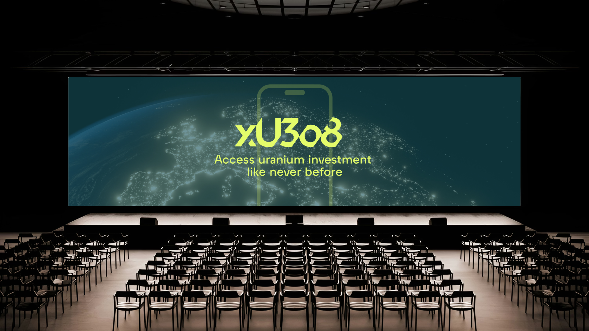
xU3o8 is a blockchain-based platform pioneering the tokenization of uranium, transforming a critical energy resource into a liquid and accessible digital asset. Positioned at the intersection of energy innovation and blockchain technology, the project introduces a new model of fractional ownership, allowing investors to gain exposure to physical uranium through a transparent and future-focused financial system.
The challenge was to develop a brand identity capable of communicating both technological innovation and long-term stability, balancing the futuristic nature of blockchain with the grounded reality of a physical resource.
At the core of the identity is the xU3o8 logo, a custom wordmark designed to reflect the idea of fractional ownership. Distinctive angular cuts within the letterforms represent investors owning a piece of the asset, symbolising direct ownership of physical uranium. The forward-angled geometry introduces a sense of movement and progress, reinforcing the platform’s forward-thinking investment model.
The visual language extends this concept through modular geometric patterns built from rhomboid shapes, squares, and triangles. These elements reference both the fragmentation of ownership and the structured systems underlying blockchain technology. When combined, the shapes form dynamic compositions that suggest security, scalability, and technological precision.
A carefully balanced colour palette of deep teals, mint greens, and neutral greys communicates trust and stability, while subtle accents of yellow and purple introduce moments of energy and innovation.
Typography pairs Raptor V2, a geometric sans-serif with distinctive angular cuts used for headlines, with Inter, a highly legible typeface optimized for body text across digital platforms.
Photography and imagery play an important role in grounding the brand narrative. Colourised rock textures reference the geological origins of uranium, while stylised portraits introduce a human dimension to the platform. Natural landscape photography further connects the brand to the raw environmental context of energy resources.
Together, these elements form a flexible identity system designed to scale across digital platforms, communications, and educational content, supporting xU3o8’s mission to redefine how critical energy resources can be accessed and invested in.
Credits
Creative Direction
Product Design
Ilaria Antolini
Bahador Katouzian
Design
Mat Brewer
Ilaria Antolini
Naomi Strinati
George Dent
Marta Cubeddu
Calvin Power