
WMN
Branding
2025
A bold visual identity for WMN token powering the World of Women ecosystem and its global community.

The identity needed to capture the energy of a decentralized movement while expressing empowerment, voice, and collective participation.
The design draws inspiration from DIY graphic culture, transforming voice and expression into a bold visual language.
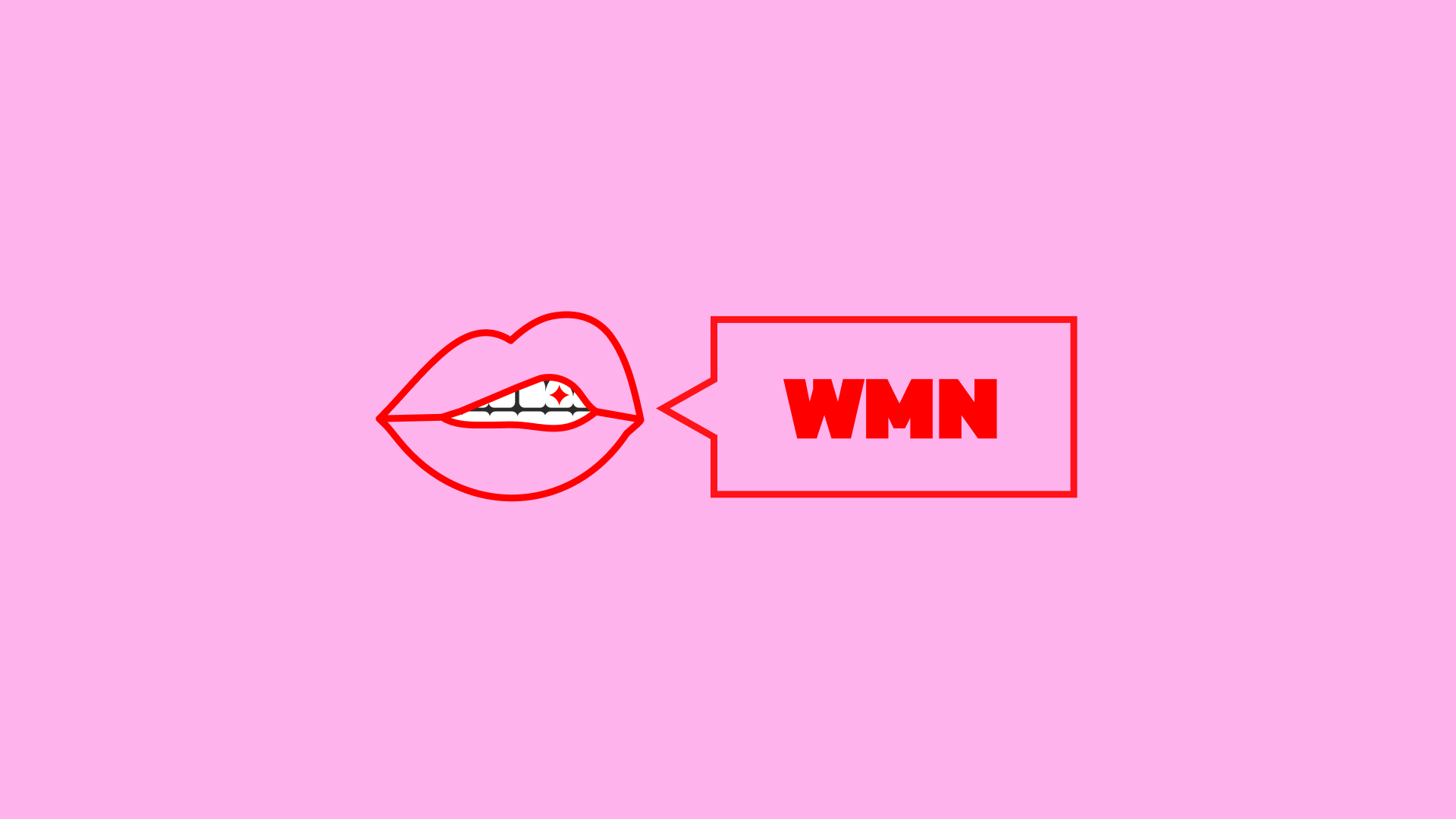
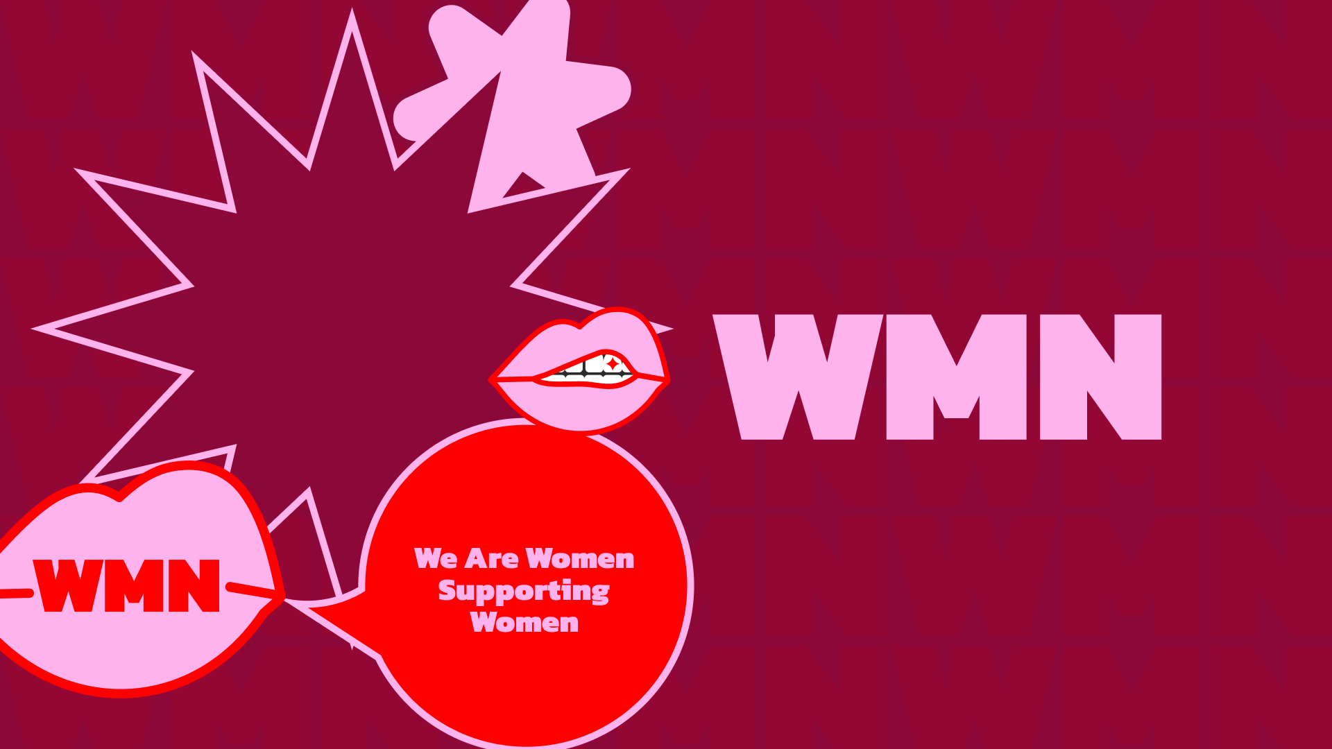
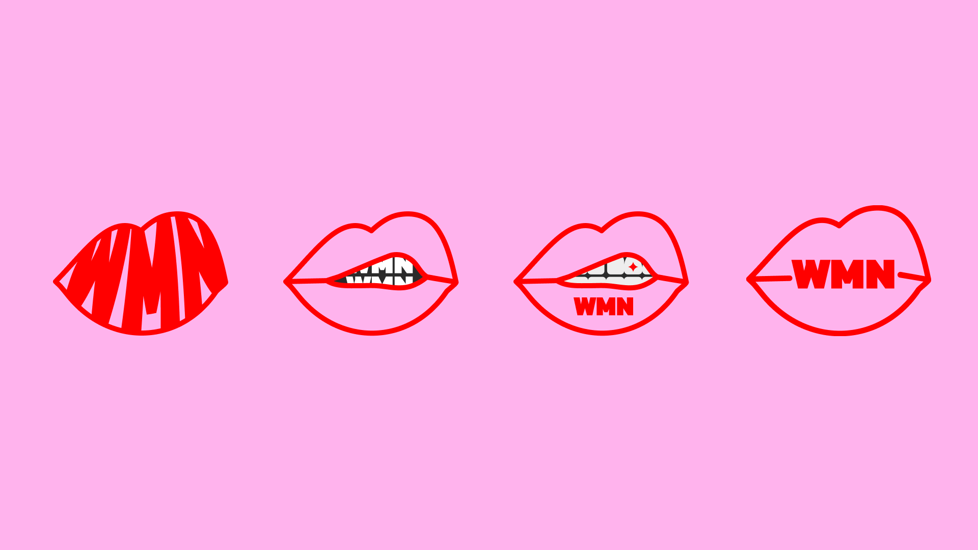
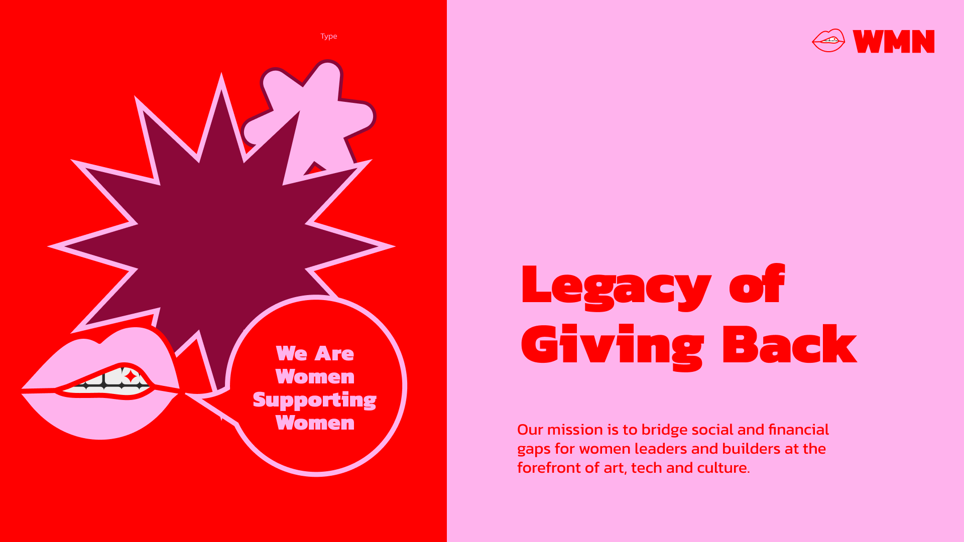
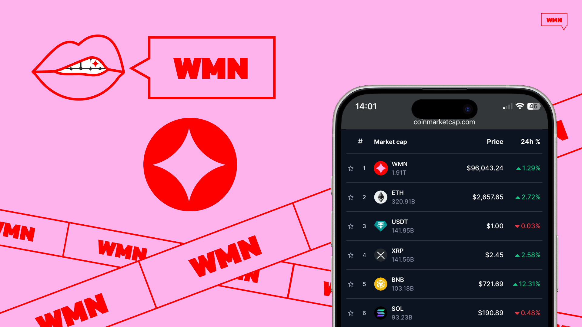
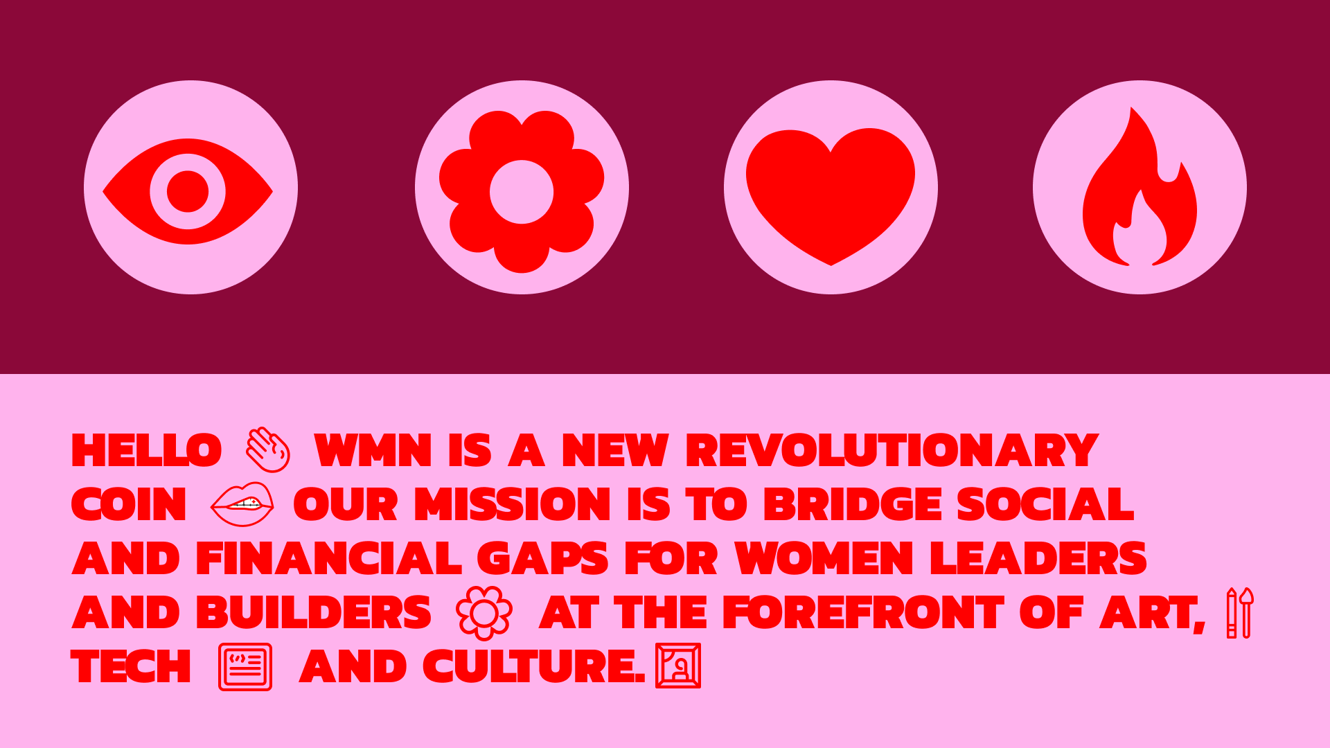
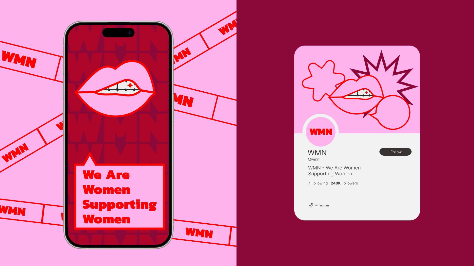
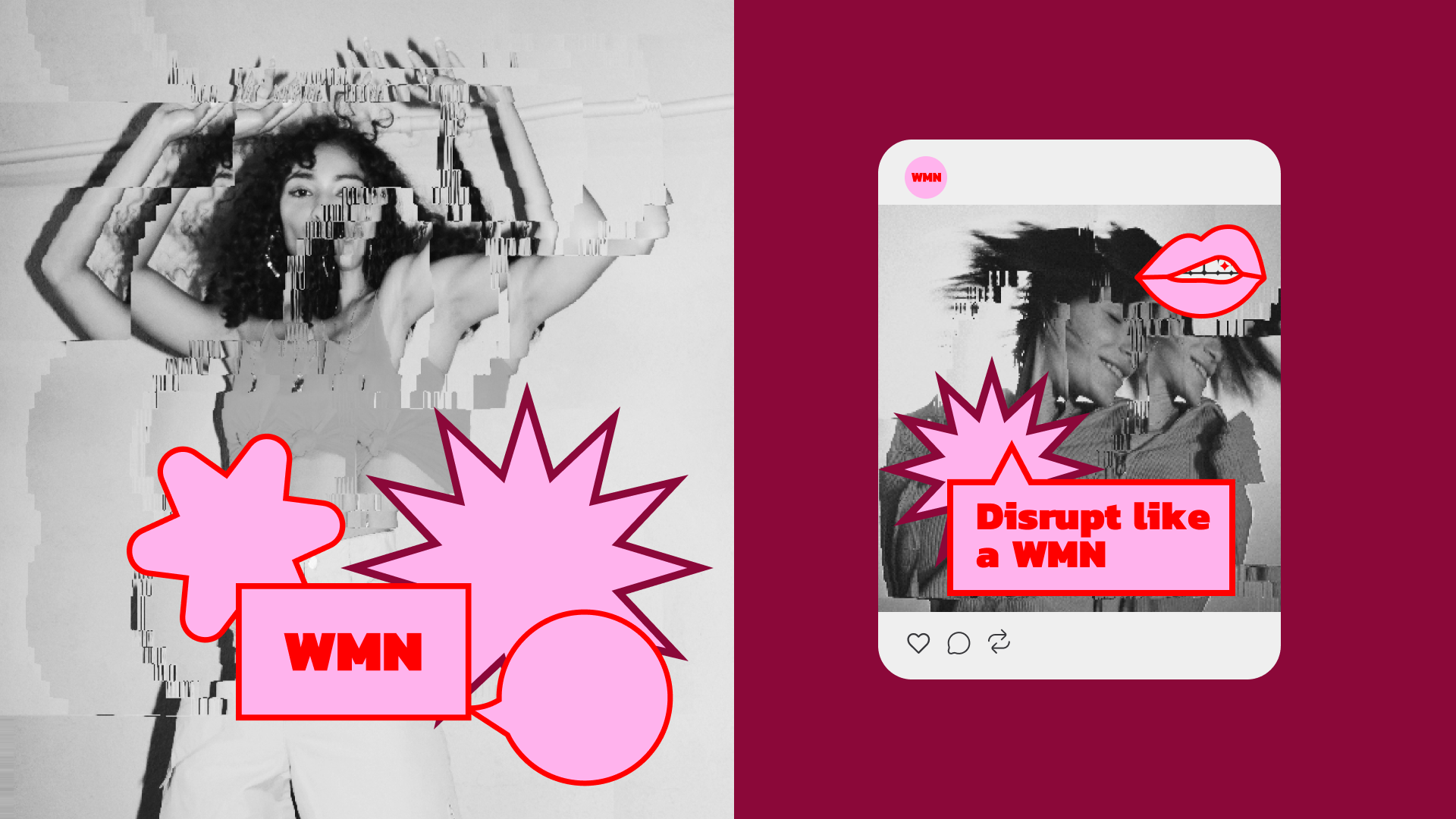
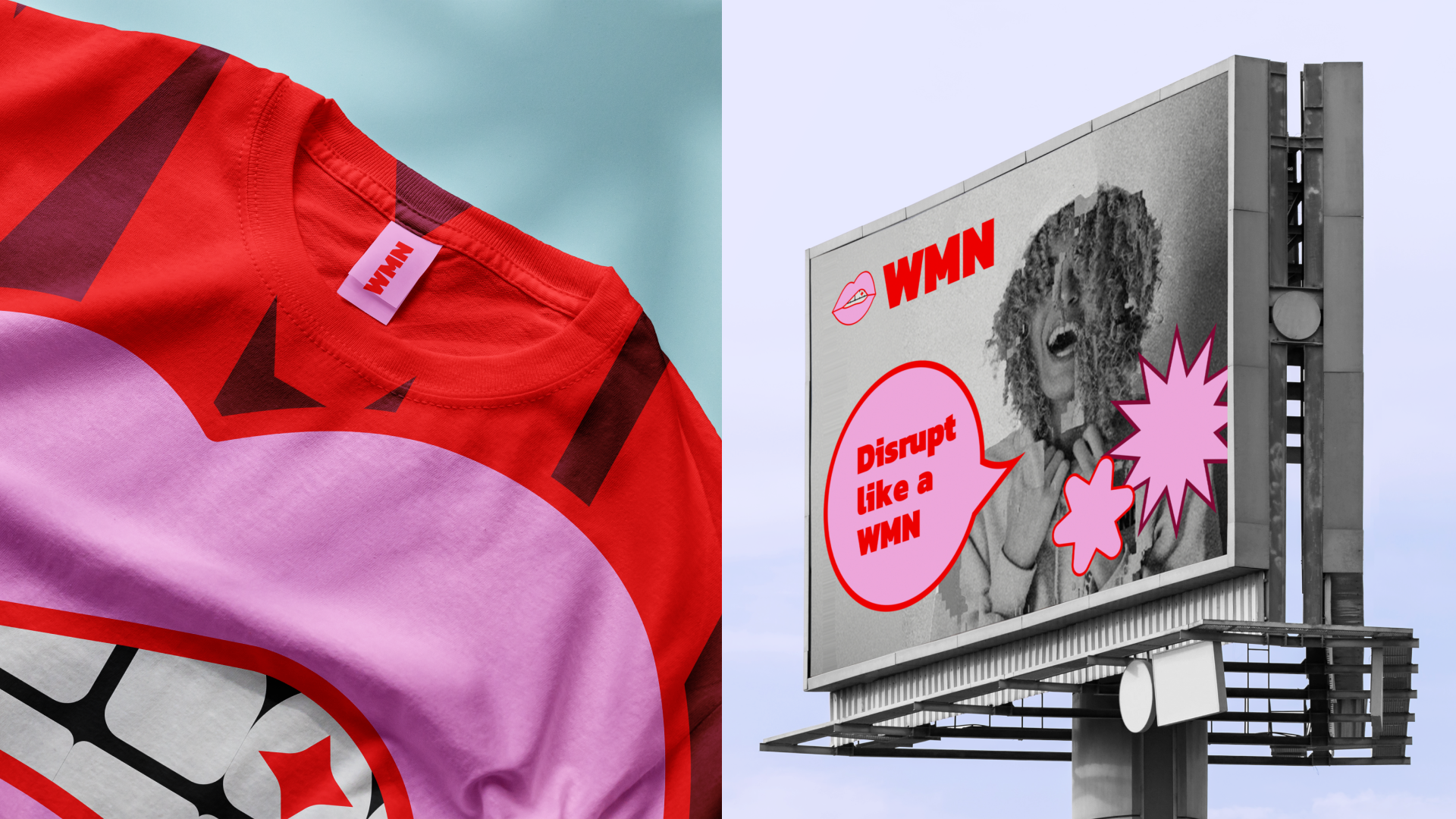
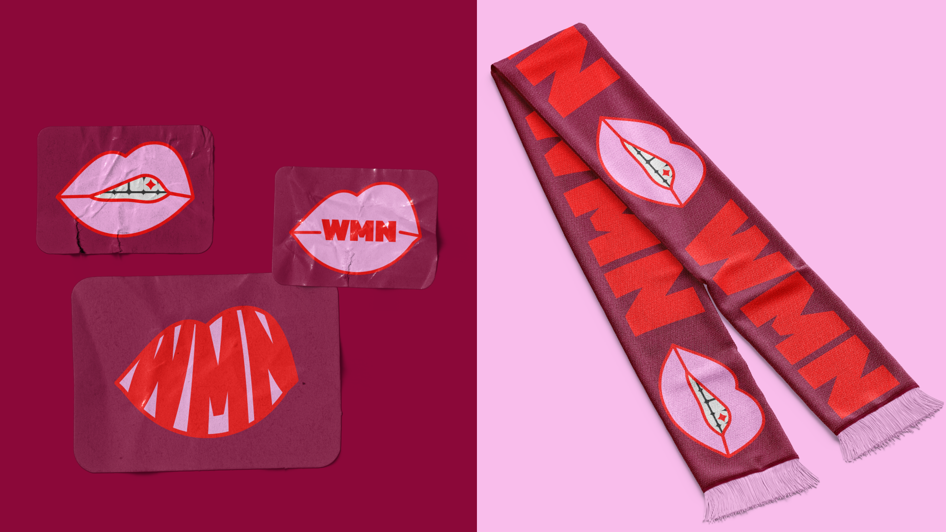
A bold sticker-outlined logo references punk and activist graphics. A mouth icon with a subtle sparkle represents voice and expression.
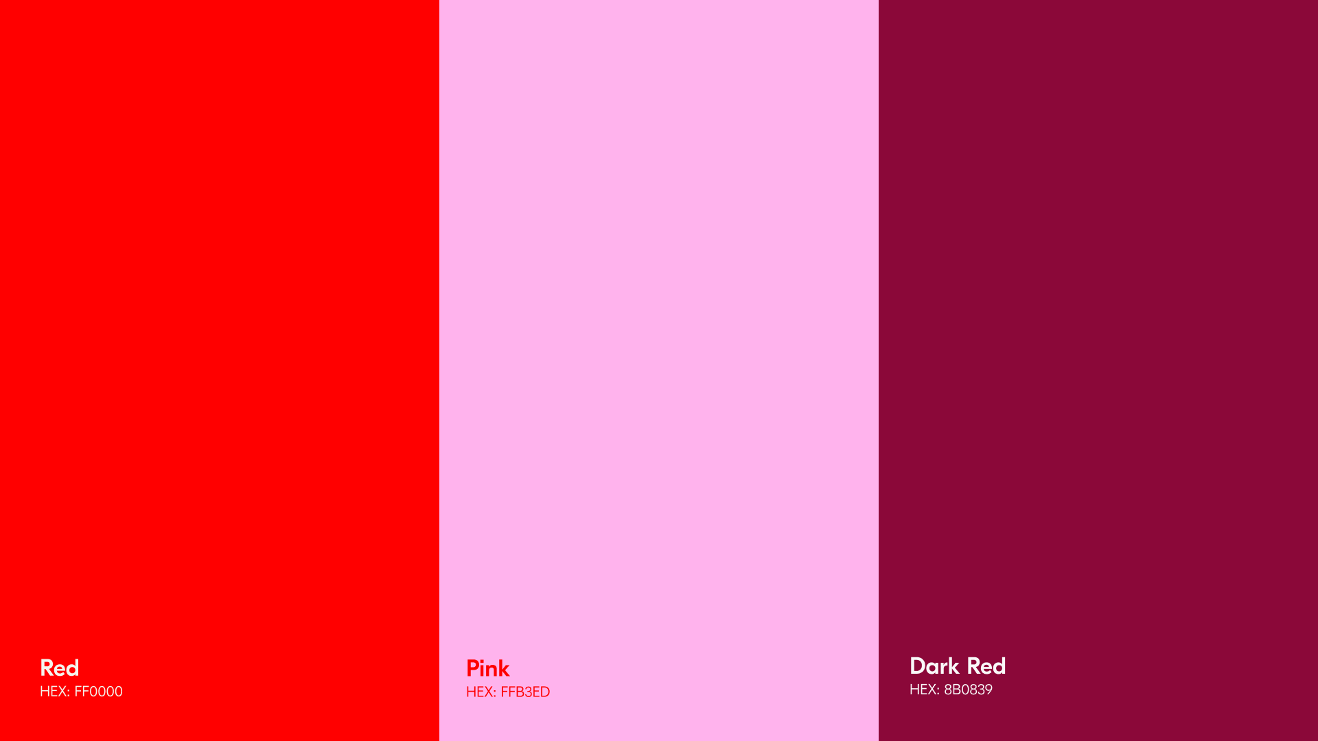
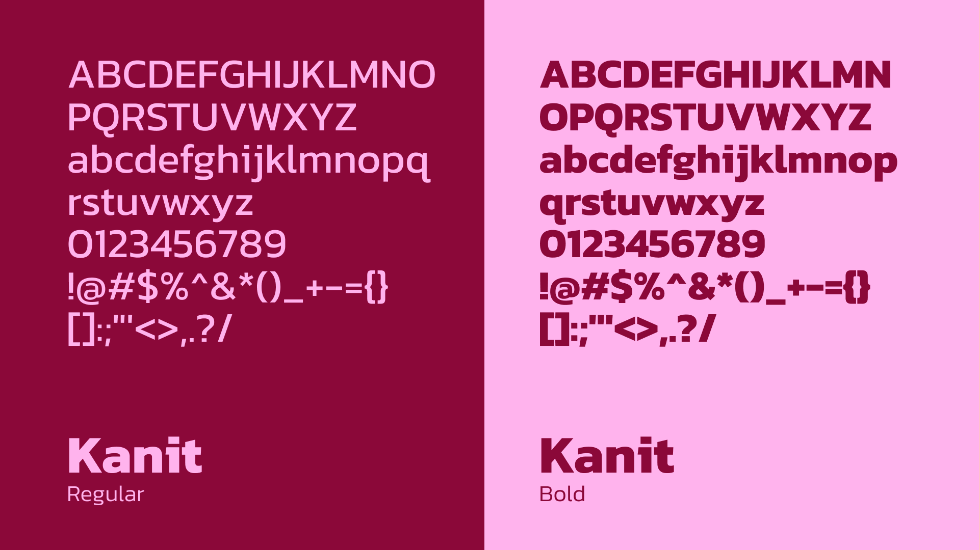
Vibrant reds and pinks dominate the palette, reinforcing a feminine-forward energy, while Kanit’s heavy typographic forms create strong graphic compositions across posters and digital content.

Together, these elements form a dynamic visual identity designed to express the power, visibility, and collective energy of the World of Women ecosystem.
About the project
WMN is the visual identity created for WoW Coin, the token powering the World of Women ecosystem, a global movement supporting women at the forefront of the digital economy. Originally launched as a generative art collection, World of Women has grown into a community connecting creators, collectors, and builders while advocating for greater representation in Web3.
With the launch of WoW Coin, the ecosystem introduces a token designed to unlock community perks, support women-led innovation, and help close the funding gap for female builders across the digital space.
The challenge was to design a visual identity that could capture the energy of a decentralized movement while expressing empowerment, voice, and collective participation.
At the center of the identity is a bold typographic logo framed by a distinctive sticker-like outline. The treatment draws inspiration from DIY graphic culture, direct, expressive, and unapologetically visible, while maintaining a sharp contemporary feel.
A defining element of the system is the mouth icon, slightly open to reveal a subtle sparkle. The symbol represents voice, expression, and presence, capturing the idea of women claiming space and visibility within the digital economy.
The colour palette amplifies this spirit. Vibrant reds and pinks dominate the visual language, creating a bold and feminine-forward identity, while deeper crimson tones add contrast and intensity.
Typography uses Kanit, a heavy sans-serif typeface chosen for its strength and graphic clarity. Repeated and stacked typographic compositions create an echo effect, reinforcing the idea of voices multiplying and messages spreading across the community.
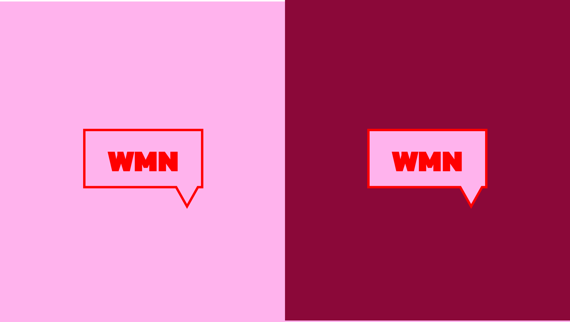
Speech bubbles extend the identity into a flexible graphic device. Layered like stickers, they can contain phrases and statements that emphasize communication, dialogue, and collective expression.
Together, these elements create a visual identity that reflects the spirit of the World of Women ecosystem, bold, expressive, and built around the power of community.
Credits
Creative Director
Design
Ilaria Antolini
Naomi Strinati
Marta Cubeddu