

Sensitive Content
Ad Campaign
2023
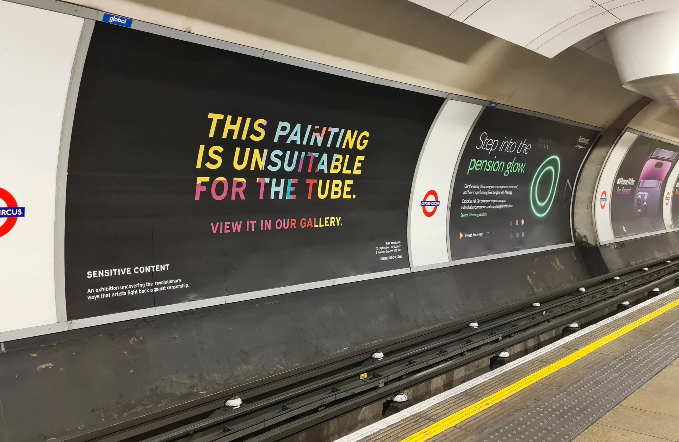
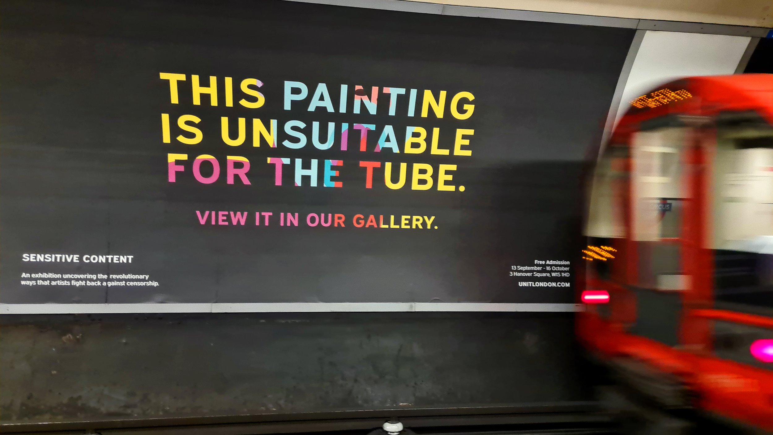
The campaign introduces a bold statement within the everyday visual landscape of the London Underground.
Rather than revealing the artwork itself, the design centers on the idea that the painting cannot be shown in public space.

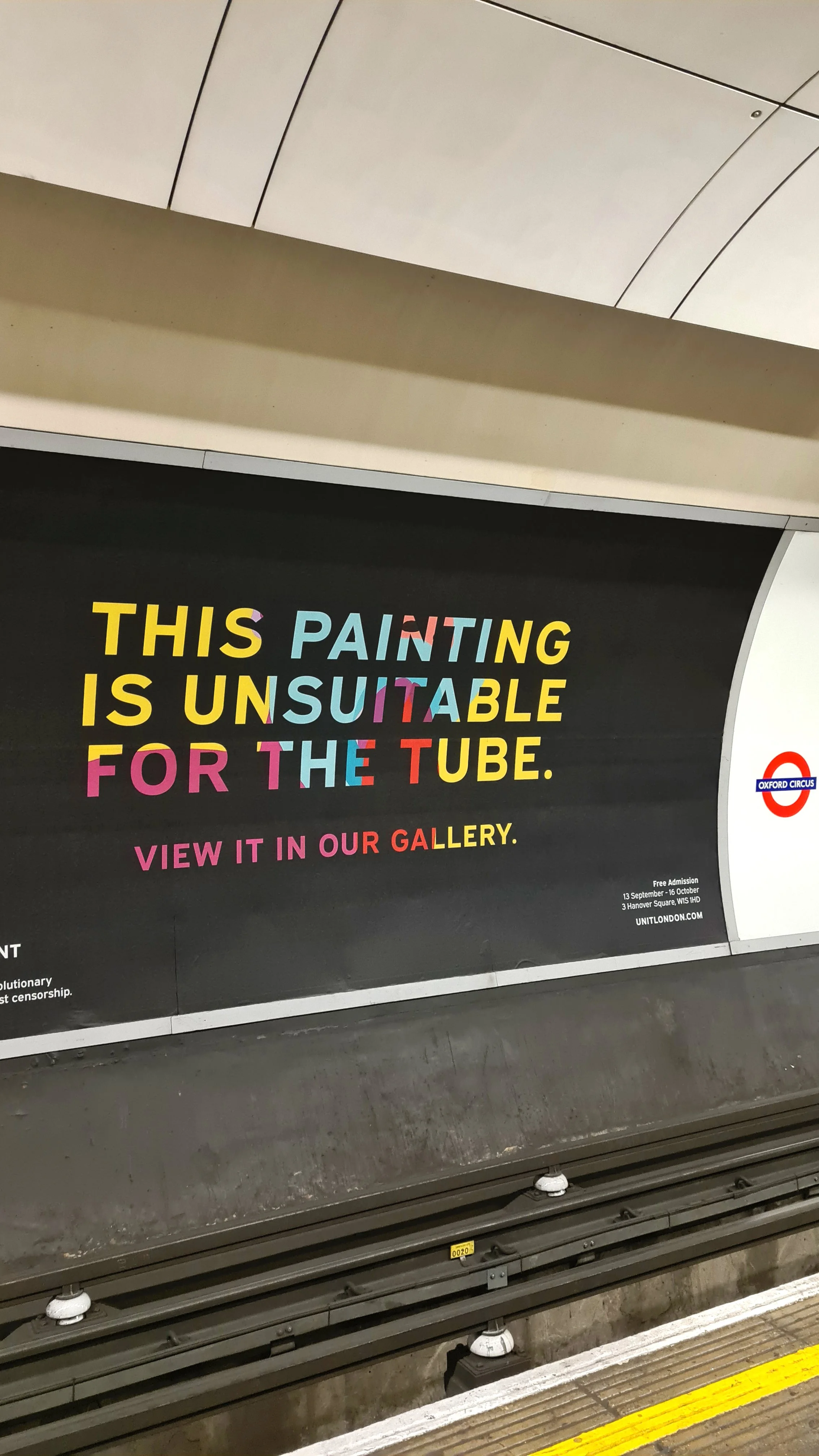

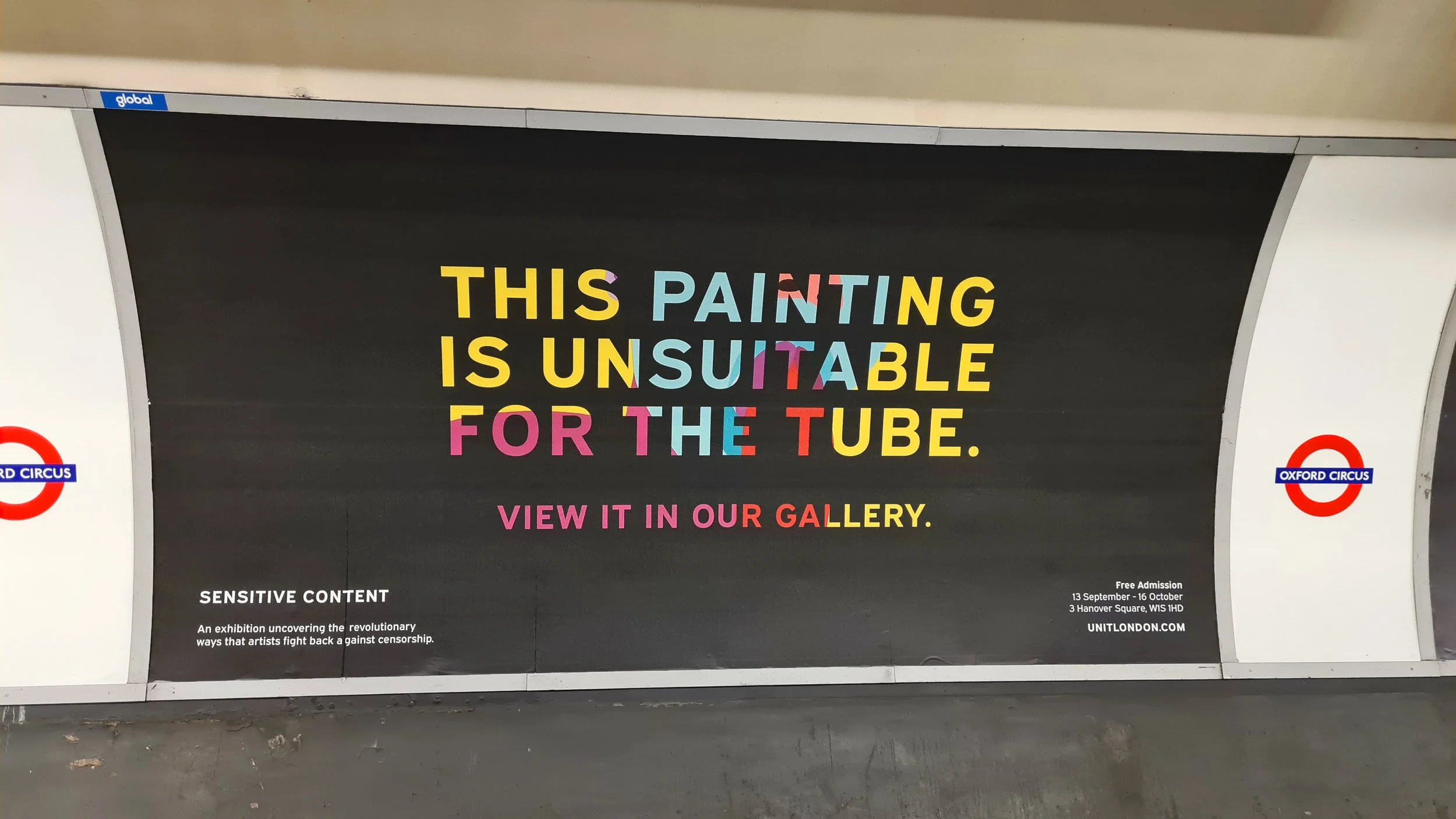
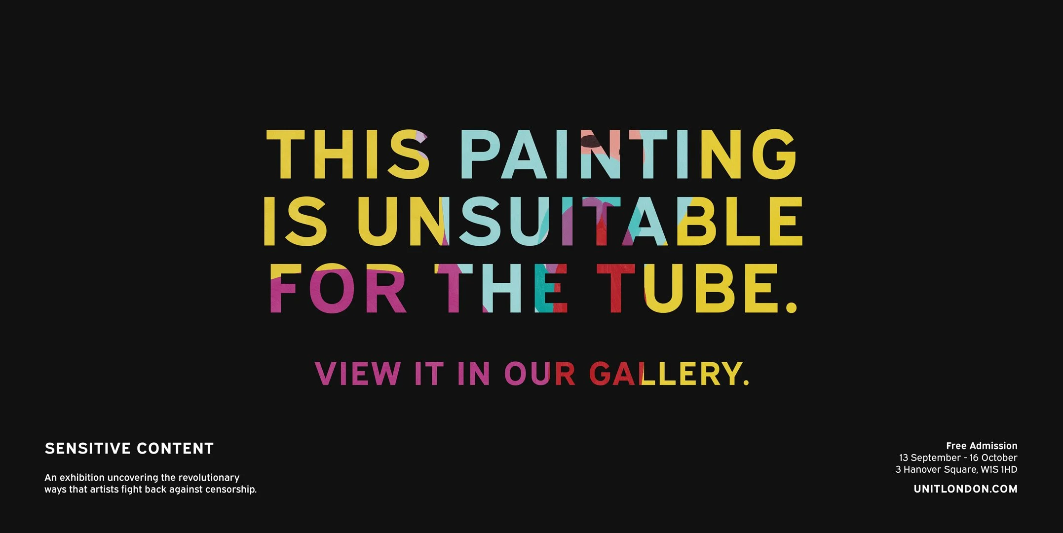
Large typographic compositions ensure the message remains clear and legible within the fast-moving environment of the Tube.
Fragments of vibrant colour embedded within the lettering suggest the unseen artwork behind the poster.
Installed across major Tube stations and bus routes, the campaign brings contemporary art into the daily rhythm of the city.

The posters invite viewers to step beyond the constraints of public advertising and discover the work inside the gallery.
Advertising campaign for Unit London exploring the boundaries of censorship in public space.
About the project
The TFL advertising campaign for Unit London was created to promote Sensitive Content, an exhibition exploring the impact of censorship in contemporary art. Positioned across key locations in London, including major Underground stations and bus routes, the campaign aimed to capture the attention of commuters and invite them into the provocative world of the exhibition.
Timed to coincide with Frieze London, Sensitive Content examined how artistic expression continues to challenge social and institutional boundaries. The exhibition brought together artists whose work confronts censorship and restrictions, highlighting a growing cultural tension between creative freedom and controlled public spaces.
The creative concept embraced this tension directly. Rather than displaying the artworks themselves, the campaign focused on the idea that certain works might be considered “unsuitable for the Tube.” Bold typographic messaging placed this statement at the center of the design, creating a moment of curiosity and disruption within the everyday environment of the London Underground.
The striking headline “THIS PAINTING IS UNSUITABLE FOR THE TUBE.” becomes both a provocation and an invitation. By suggesting that the artwork cannot be shown in the public transport network, the campaign encourages viewers to seek it out within the gallery space instead.
Visually, the campaign uses a restrained black background that allows the typography to stand out dramatically in the busy visual environment of the Underground. Vibrant, fragmented colours embedded within the lettering hint at the unseen artwork behind the message, suggesting that something vibrant and provocative lies just beyond what can be publicly displayed.
The design balances clarity with intrigue. Simple typography ensures legibility at scale within high-traffic transit spaces, while the colourful visual treatment introduces a subtle sense of disruption that reflects the themes of the exhibition.
Placed throughout London’s transport network, the campaign transforms everyday commuting spaces into moments of curiosity, inviting viewers to step beyond the constraints of the public environment and experience the full narrative of the exhibition within the gallery.
Together, the campaign mirrors the exhibition’s central theme: questioning where the boundaries of artistic expression are drawn, and who ultimately decides what can be seen.
Credits
Creative Director
Design
Ilaria Antolini
Ilaria Antolini
Art Director
Rafael Irimie