

Tezos Patronage Association
Branding
2026
A modular identity system designed to unify regional foundations and organisations across the Tezos ecosystem.

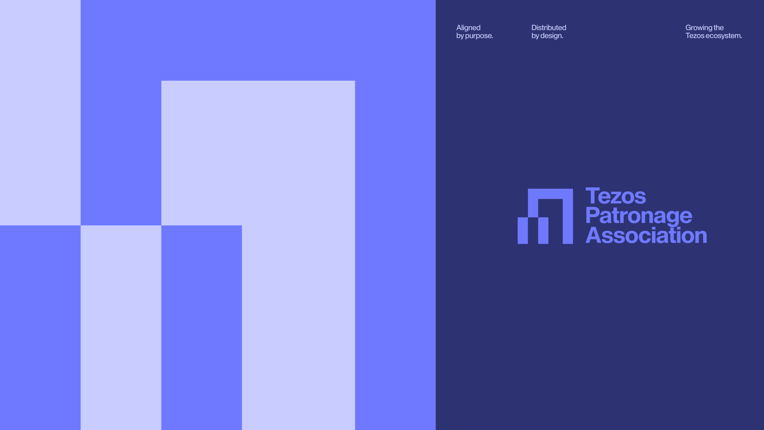
Tezos Patronage Association brings the ecosystem together through a bold geometric identity designed for governance, collaboration, and global coordination.
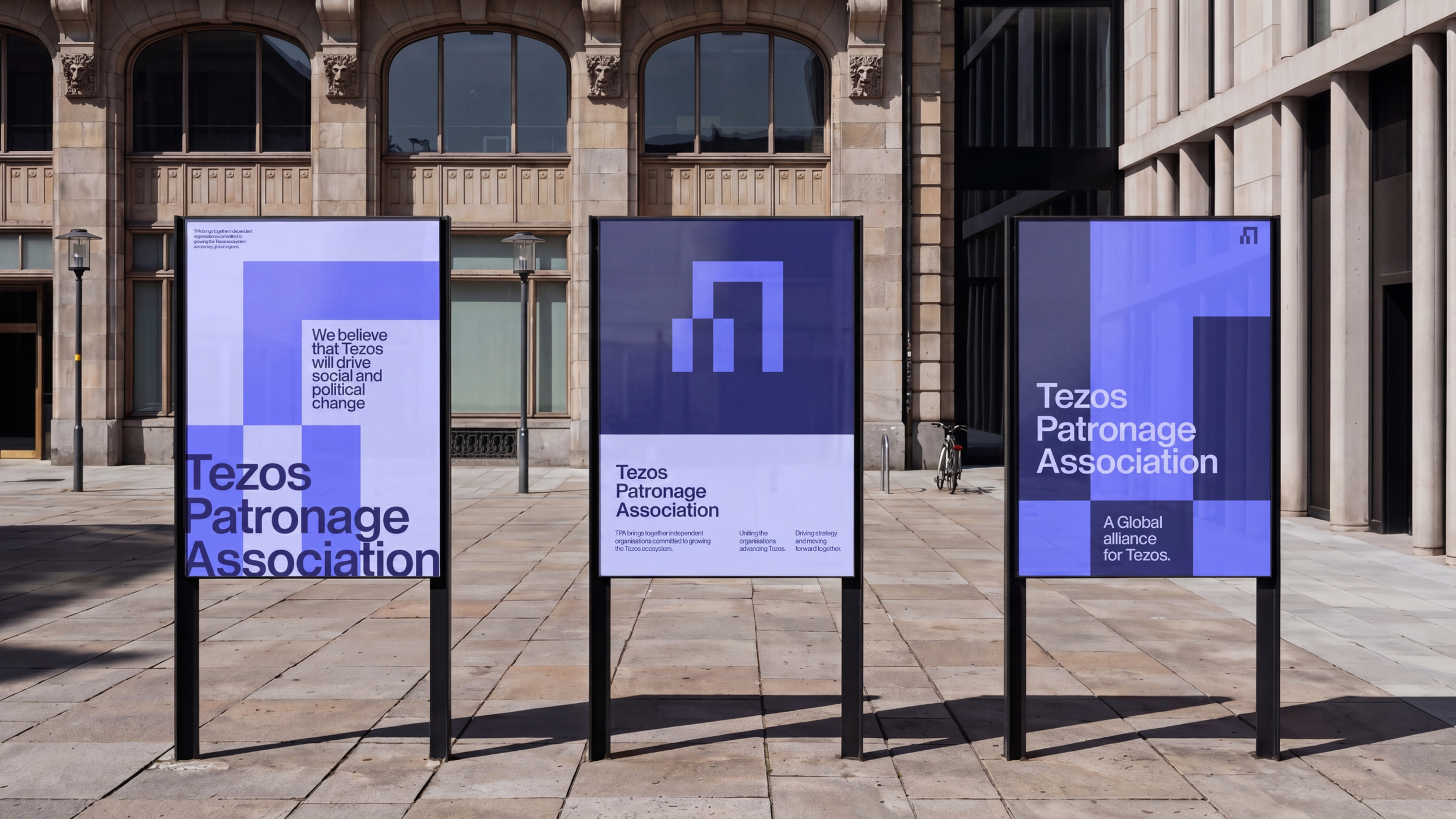
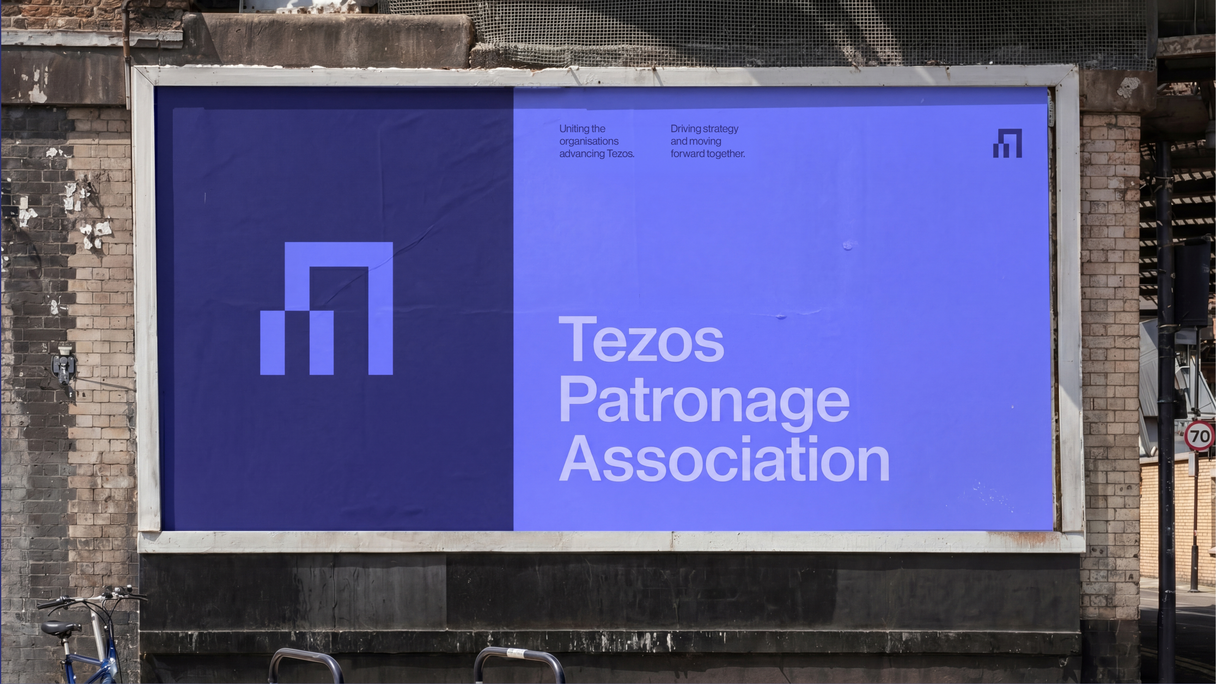
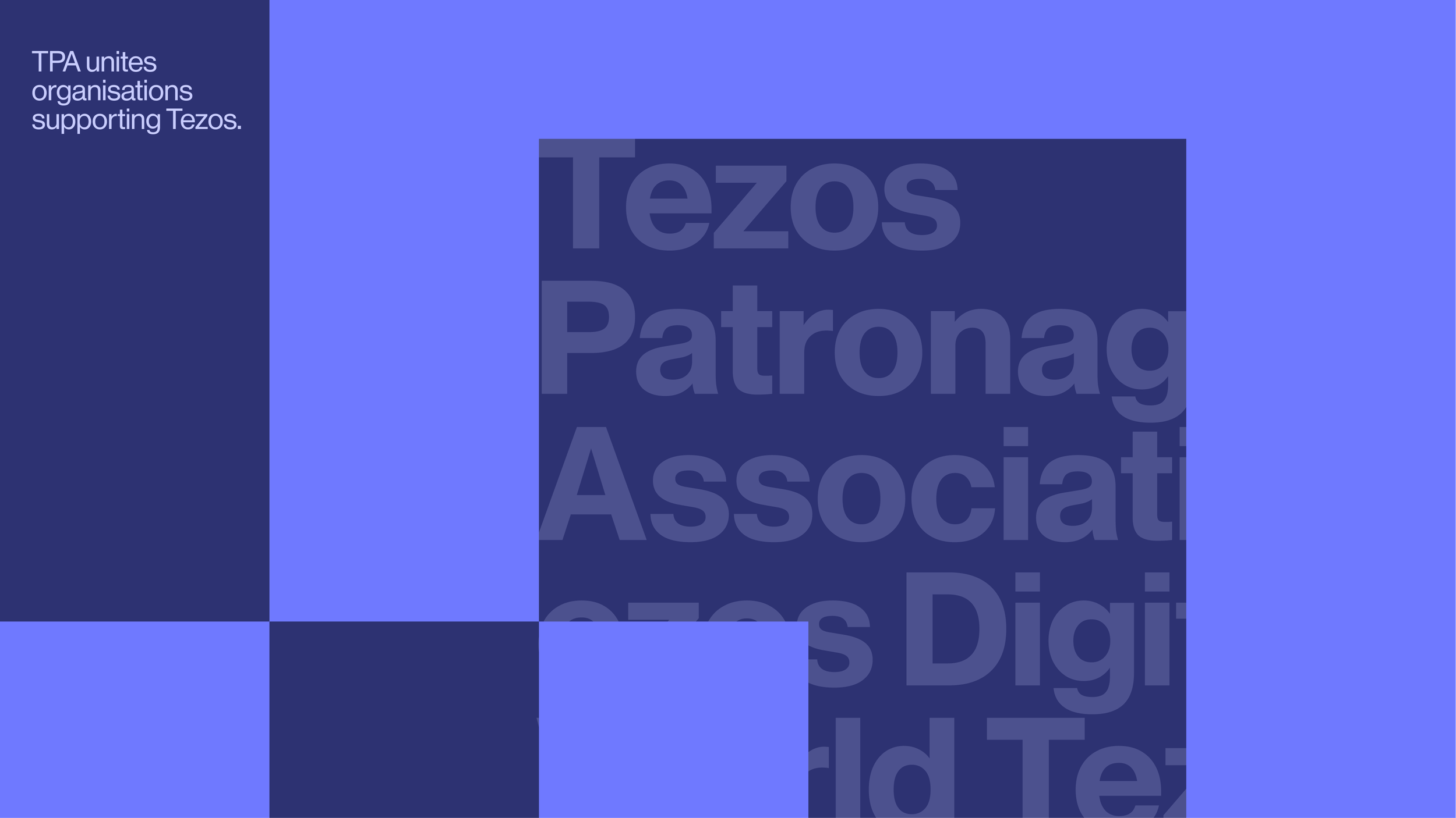

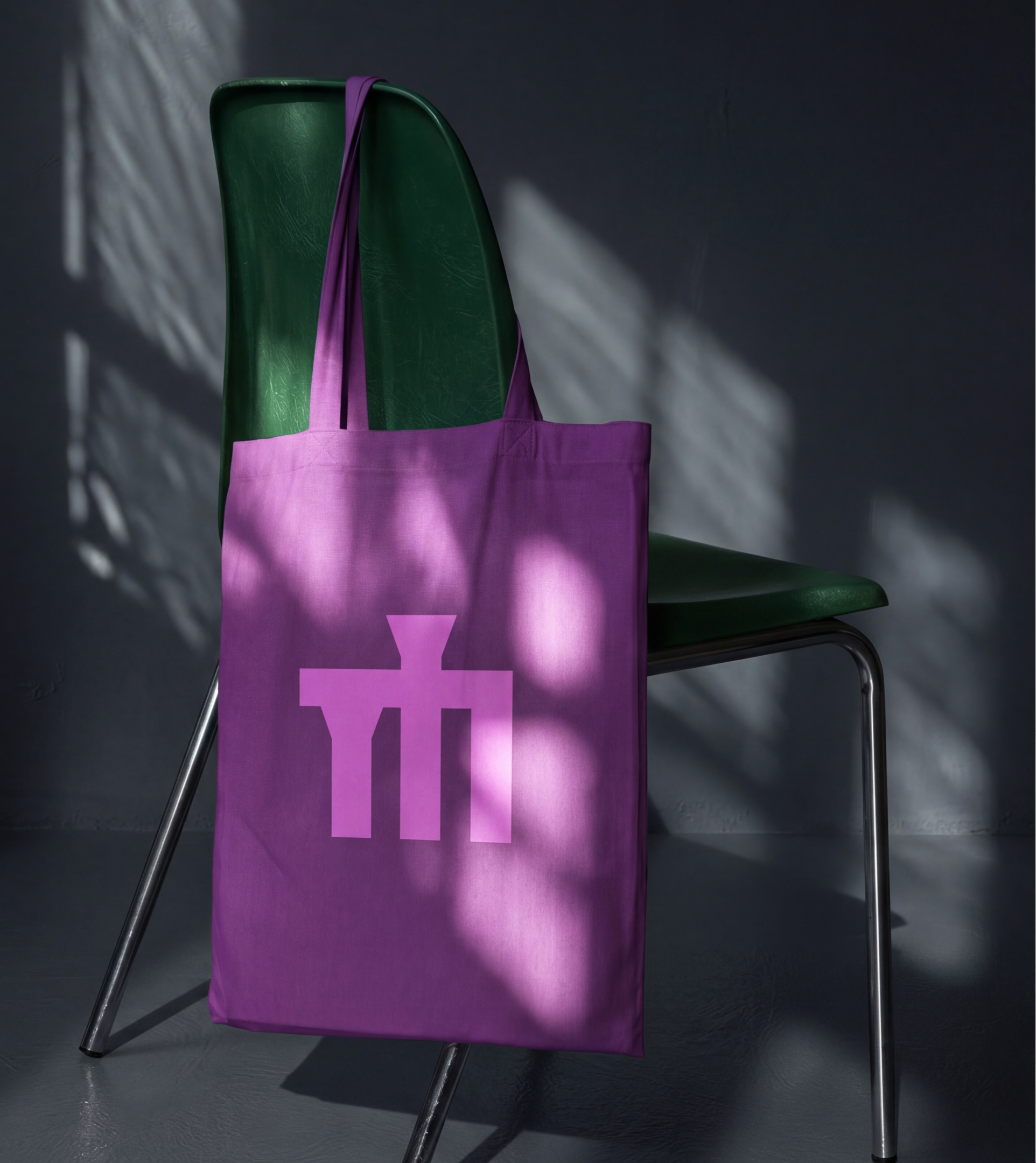
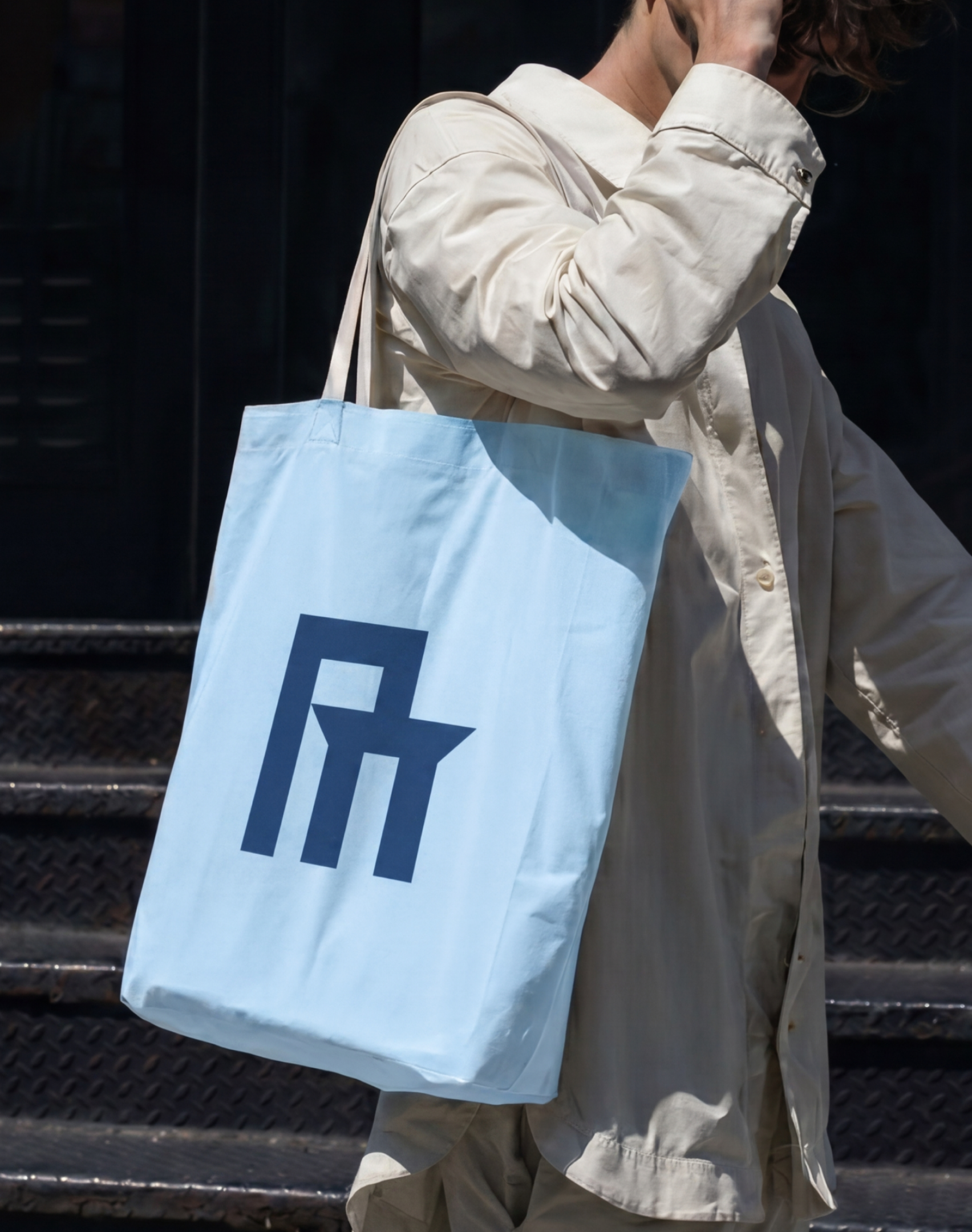
Custom logo lockups adapt the identity across regional and umbrella brands while maintaining a shared visual structure.

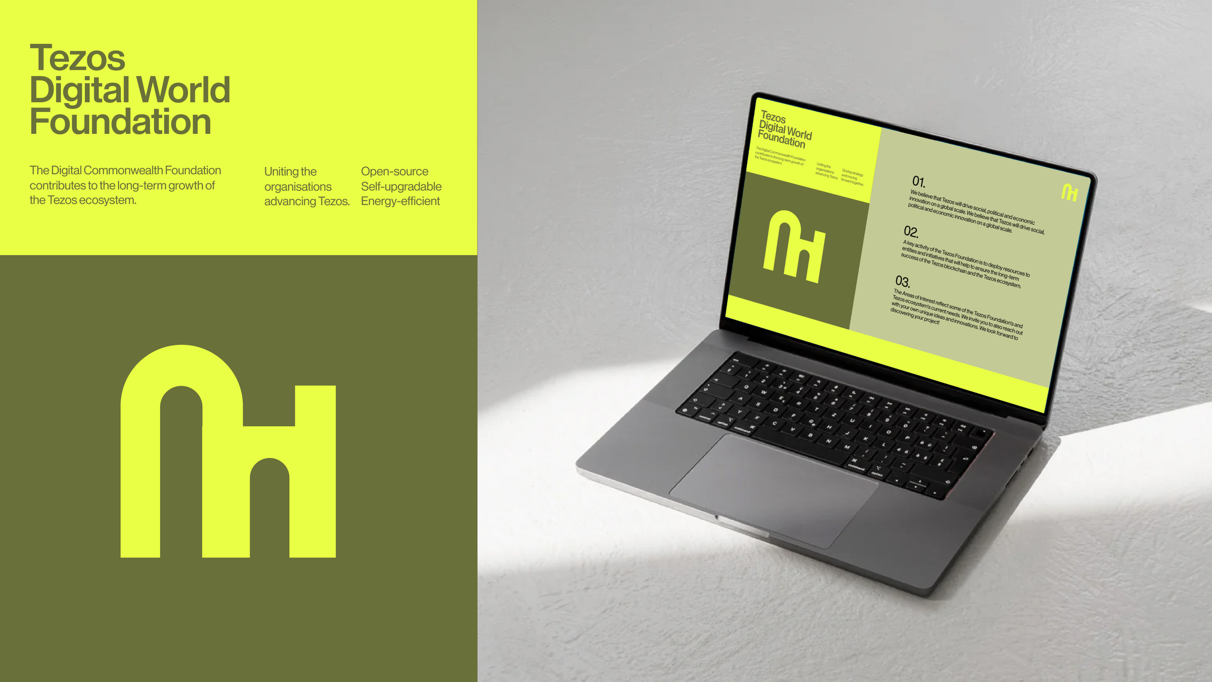
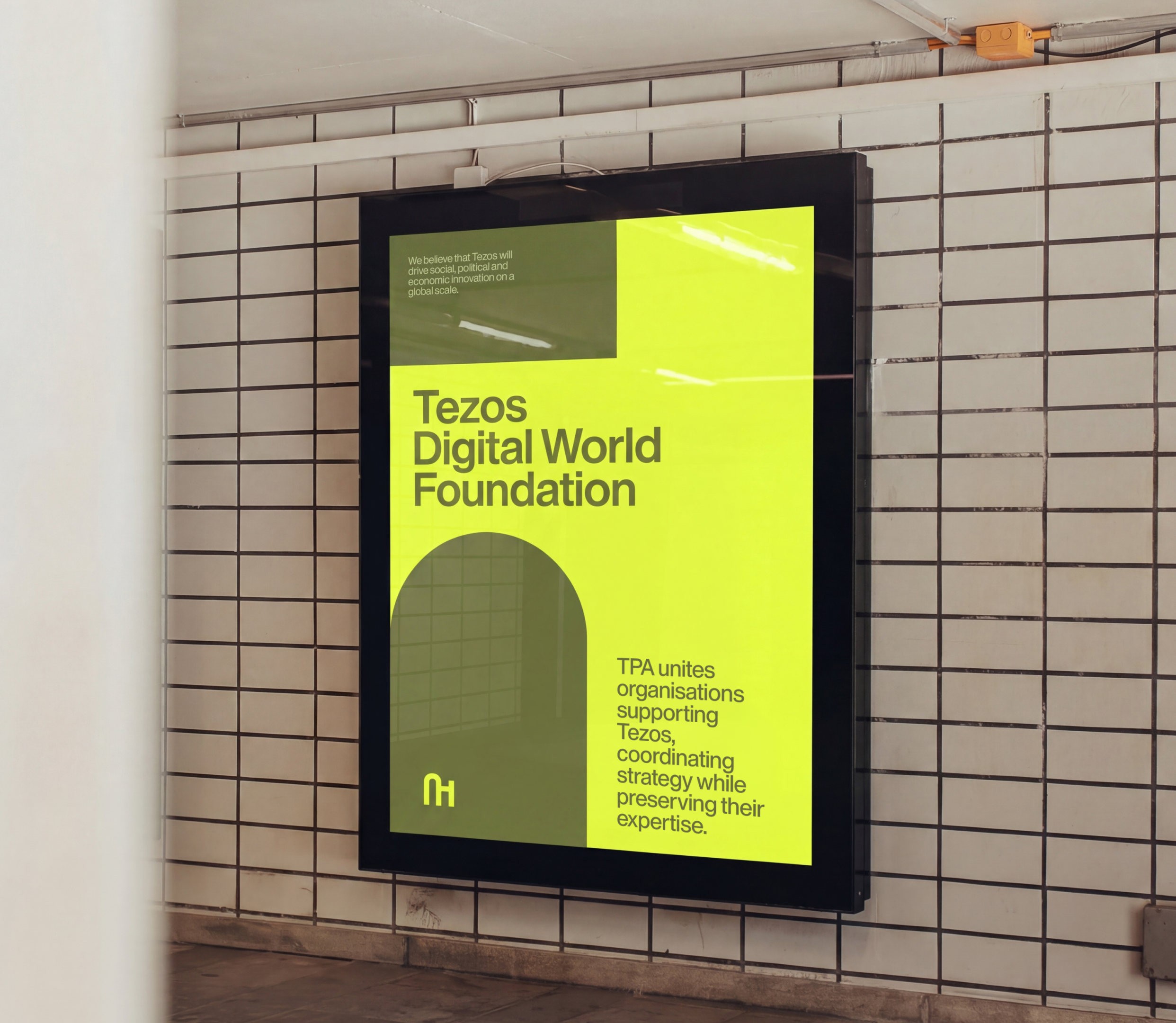
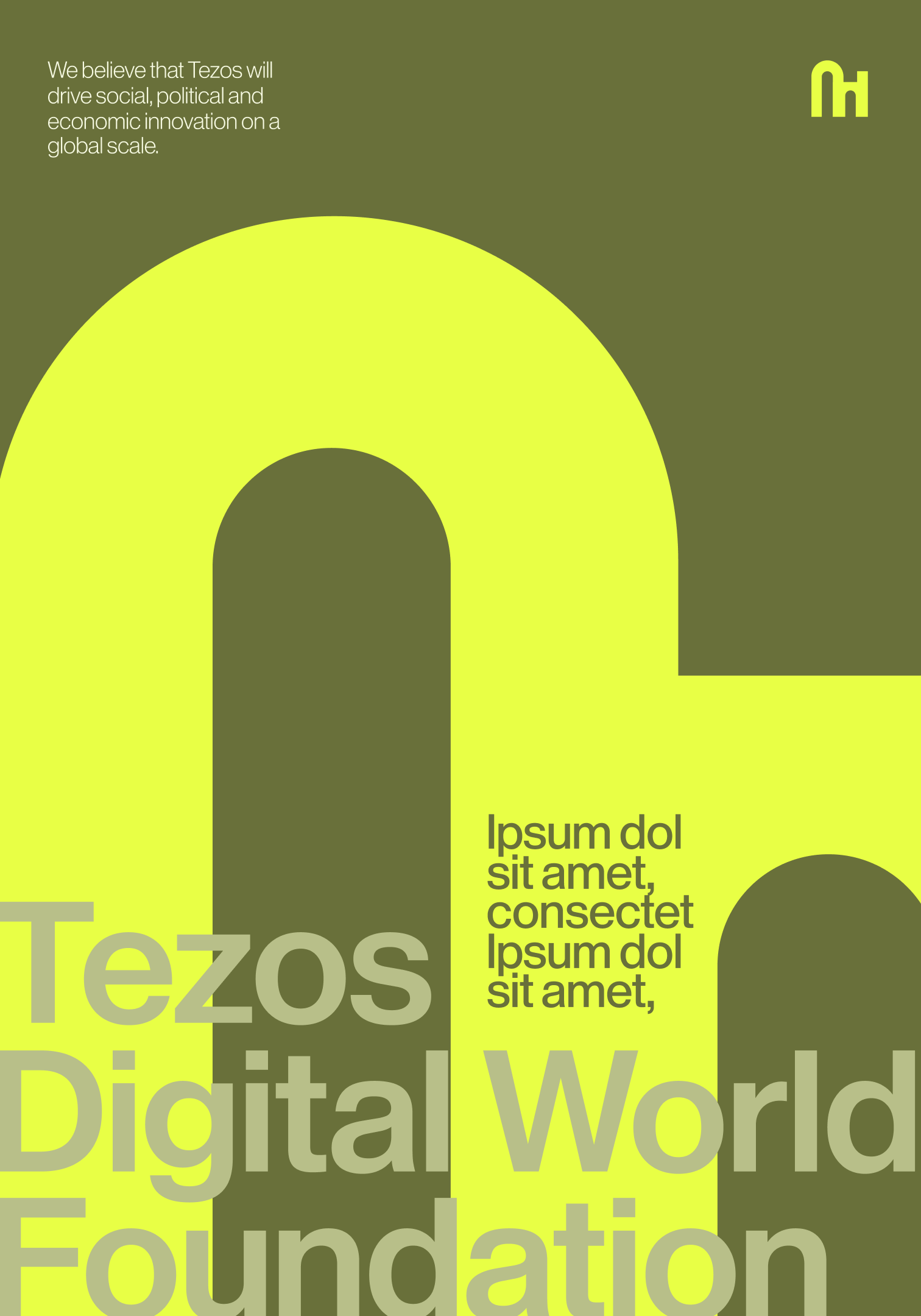
Tezos Digital World Foundation uses vibrant yellow tones and bold typographic compositions to express optimism, innovation, and global digital growth.
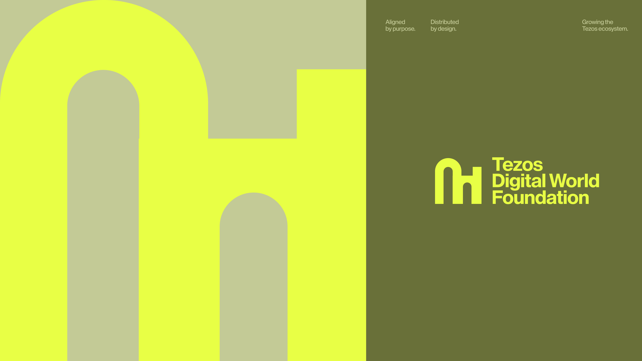

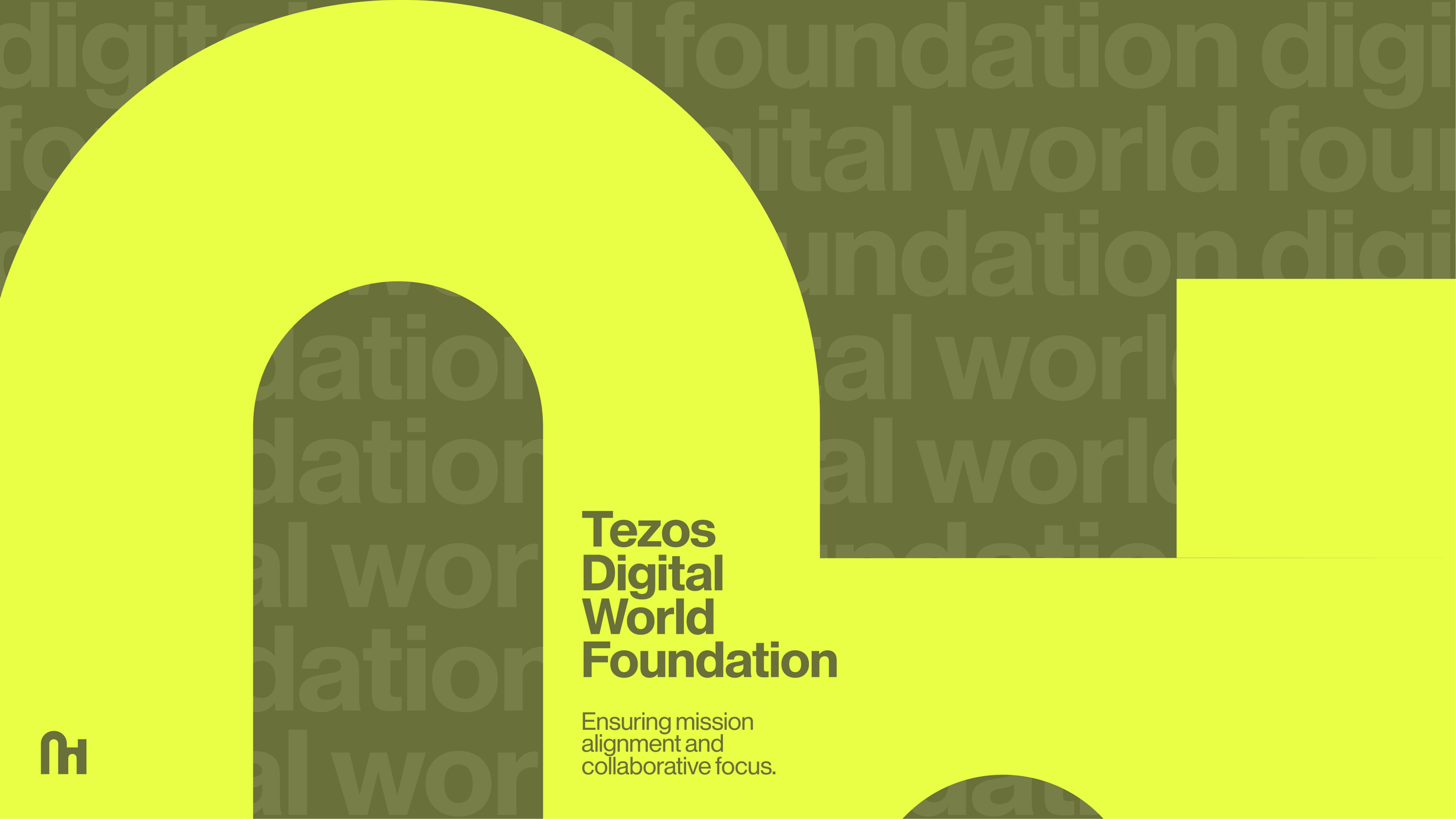

Large-scale typography and structured compositions create a visual language inspired by governance and decentralised infrastructure.
Tezos South East Asia Foundation identity uses vibrant colour and modular layouts to capture the energy and rapid evolution of the local ecosystem.

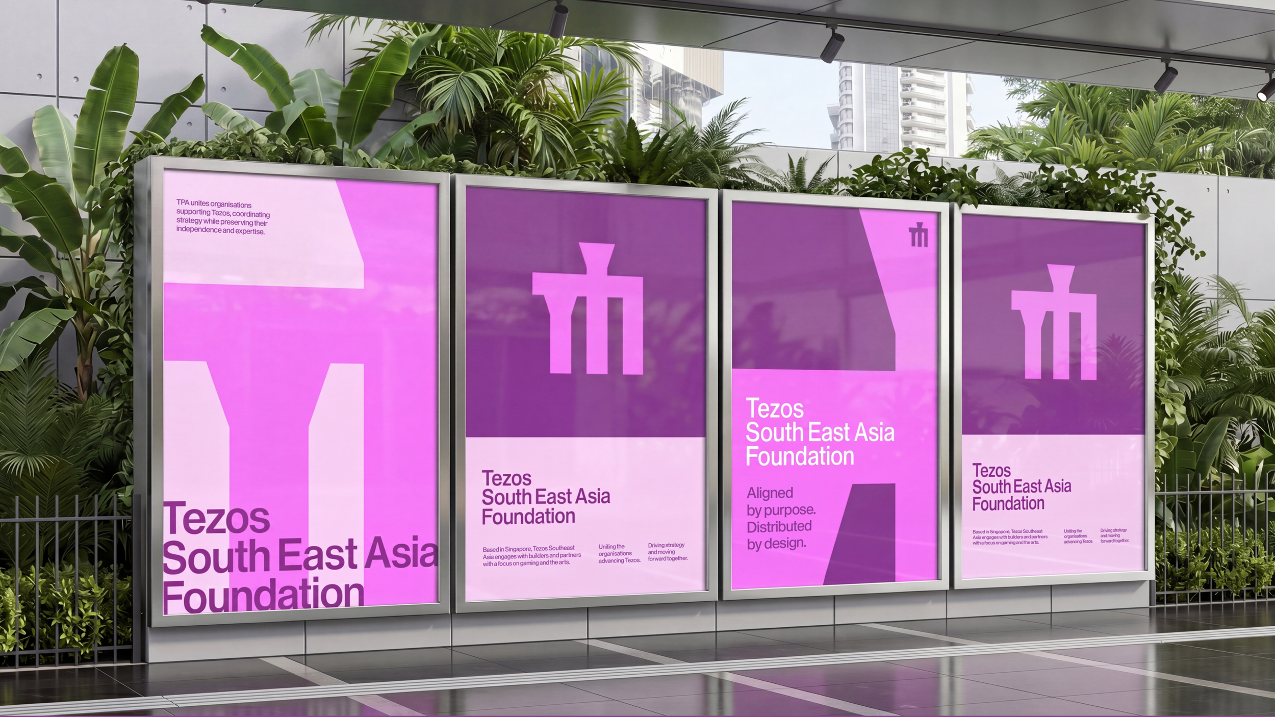
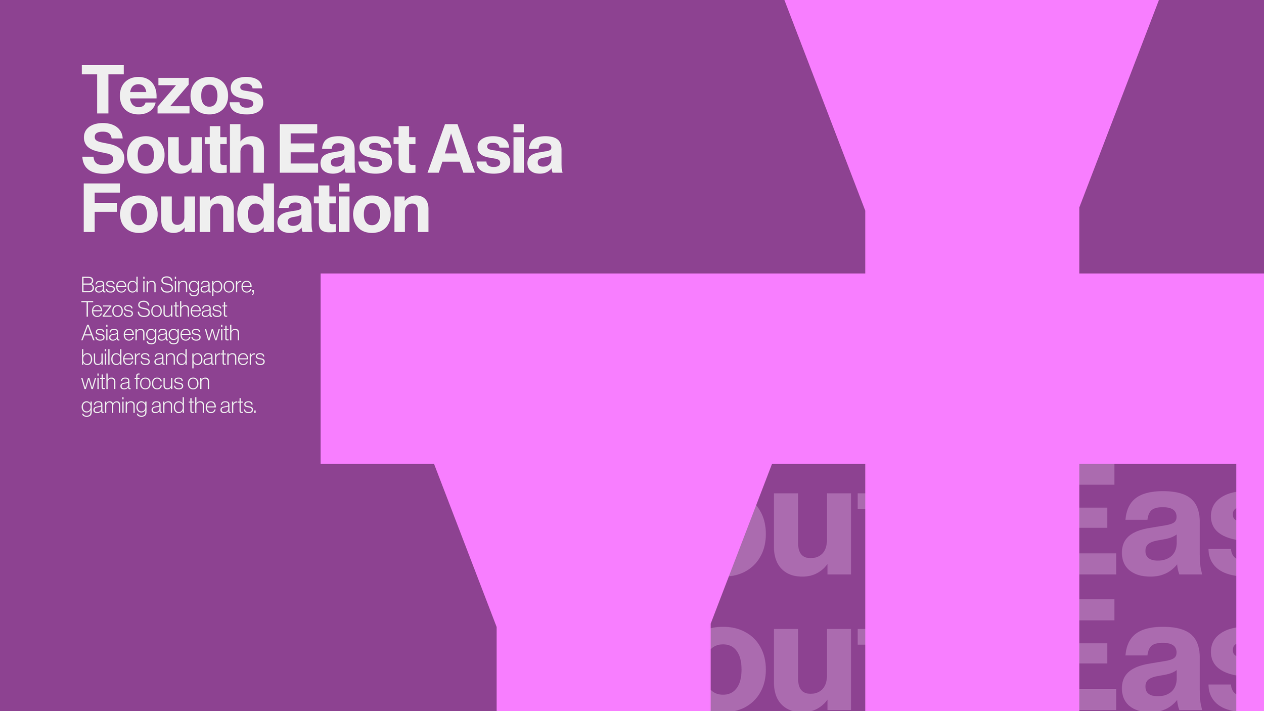

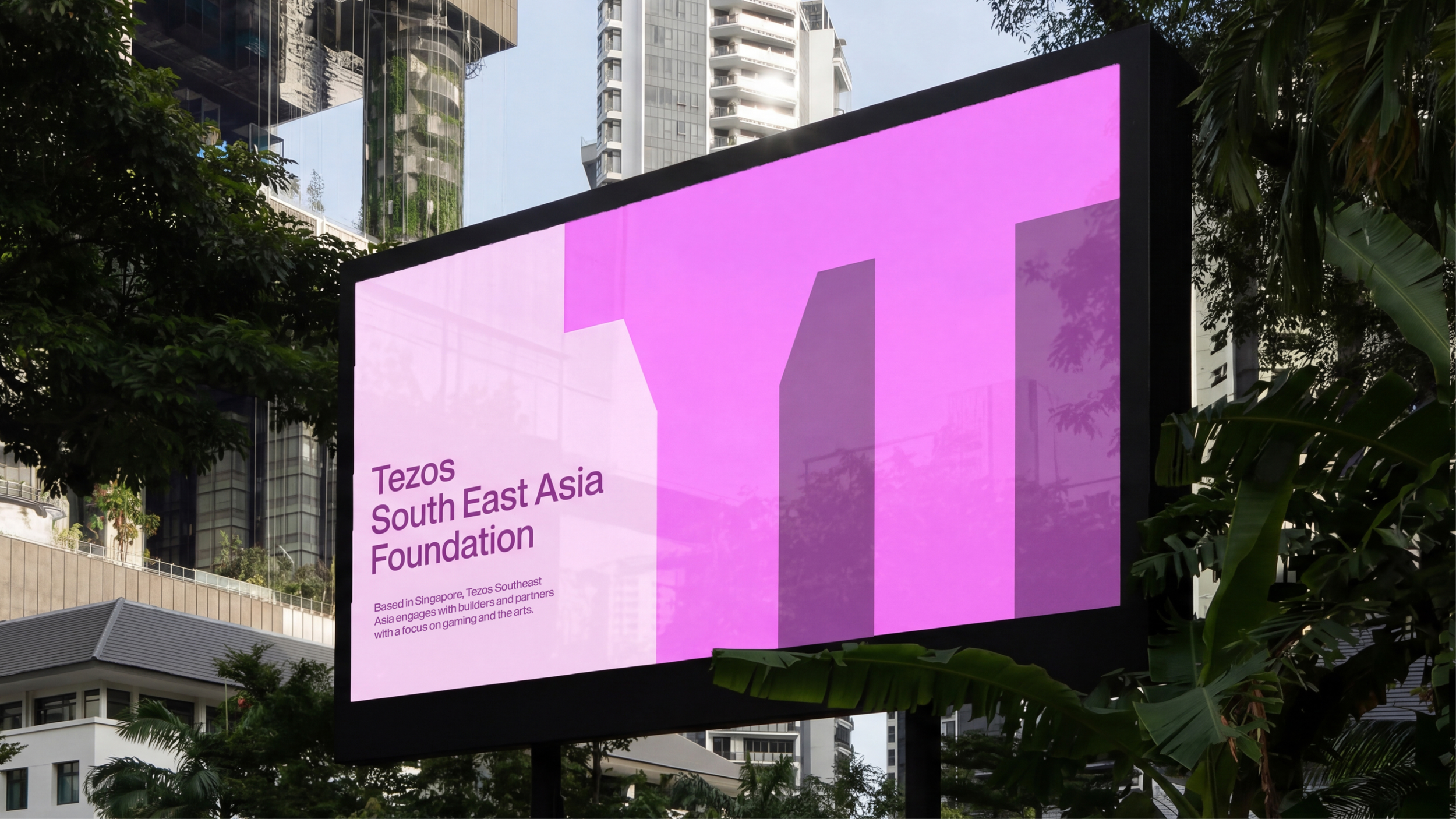
Distinct colour palettes give each organisation its own recognisable voice within the wider ecosystem.

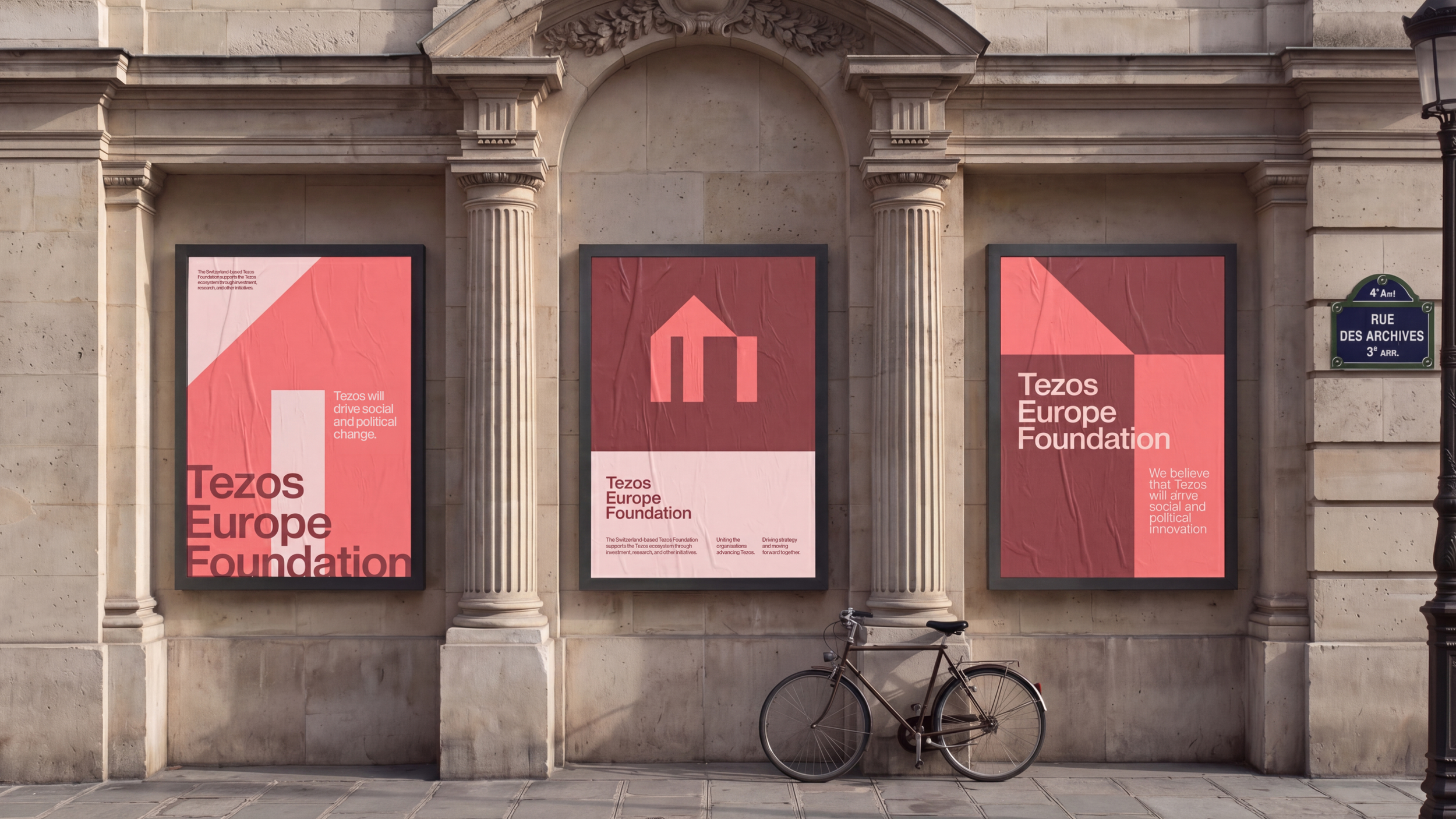
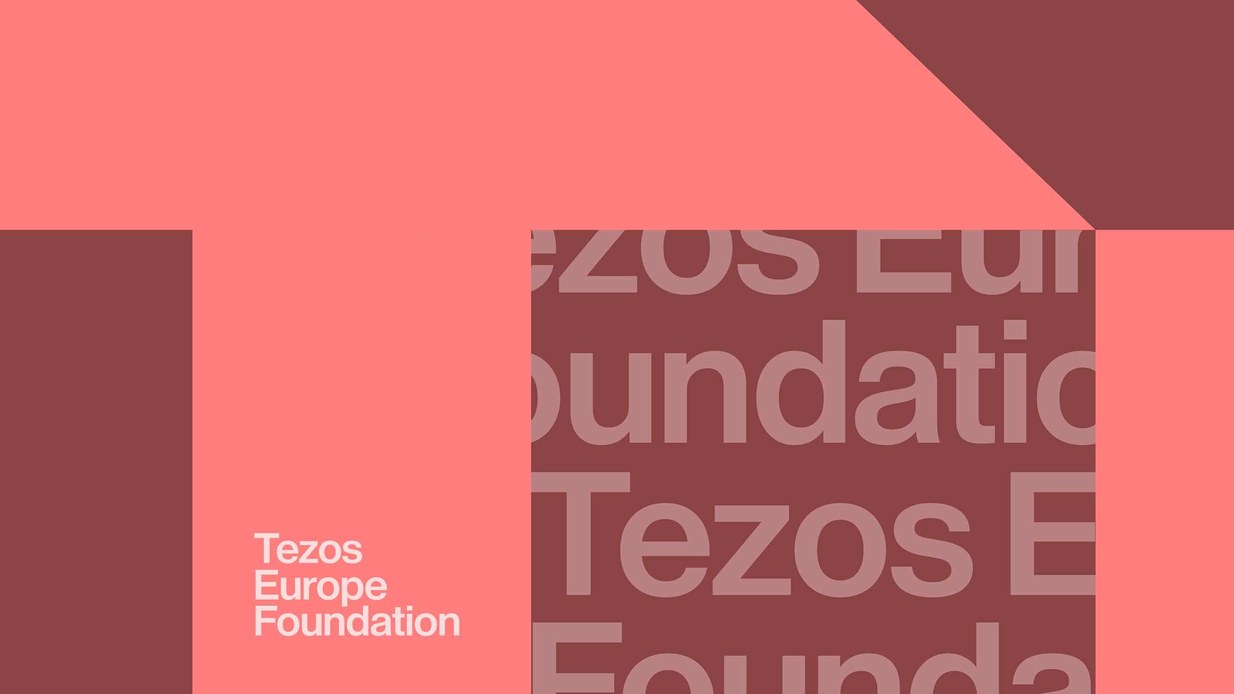
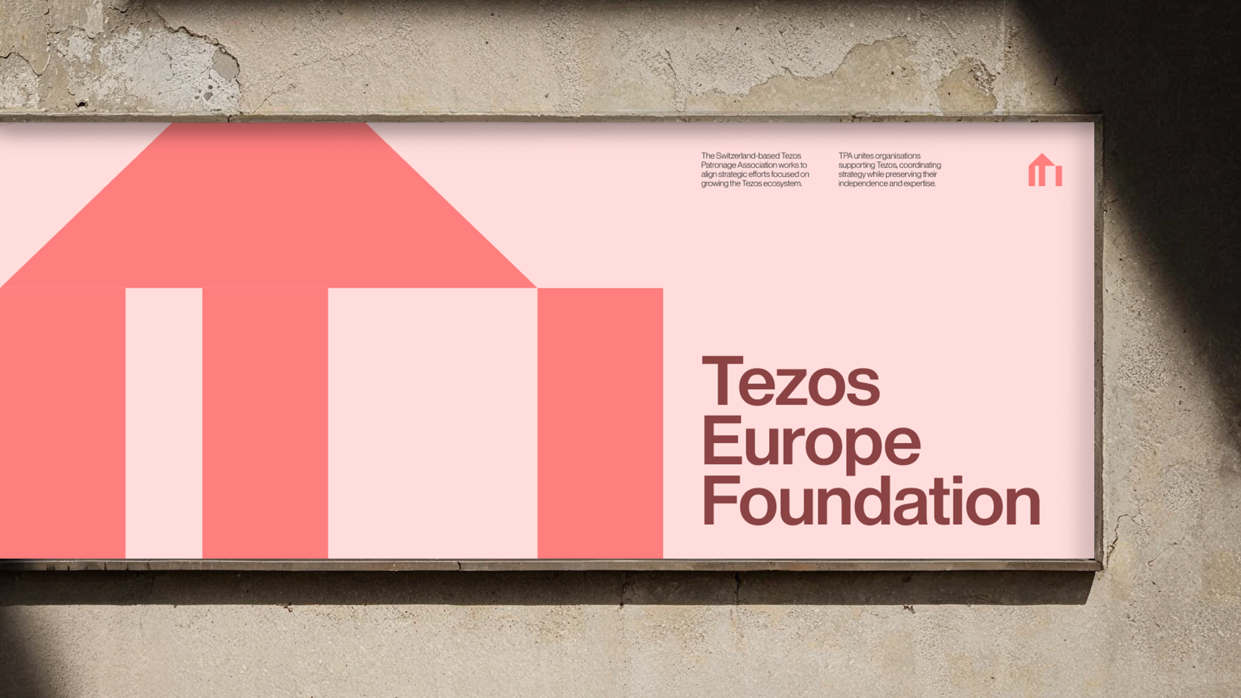
Tezos Europe Foundation adopts a restrained and institutional visual language balancing stability, clarity, and contemporary digital communication.


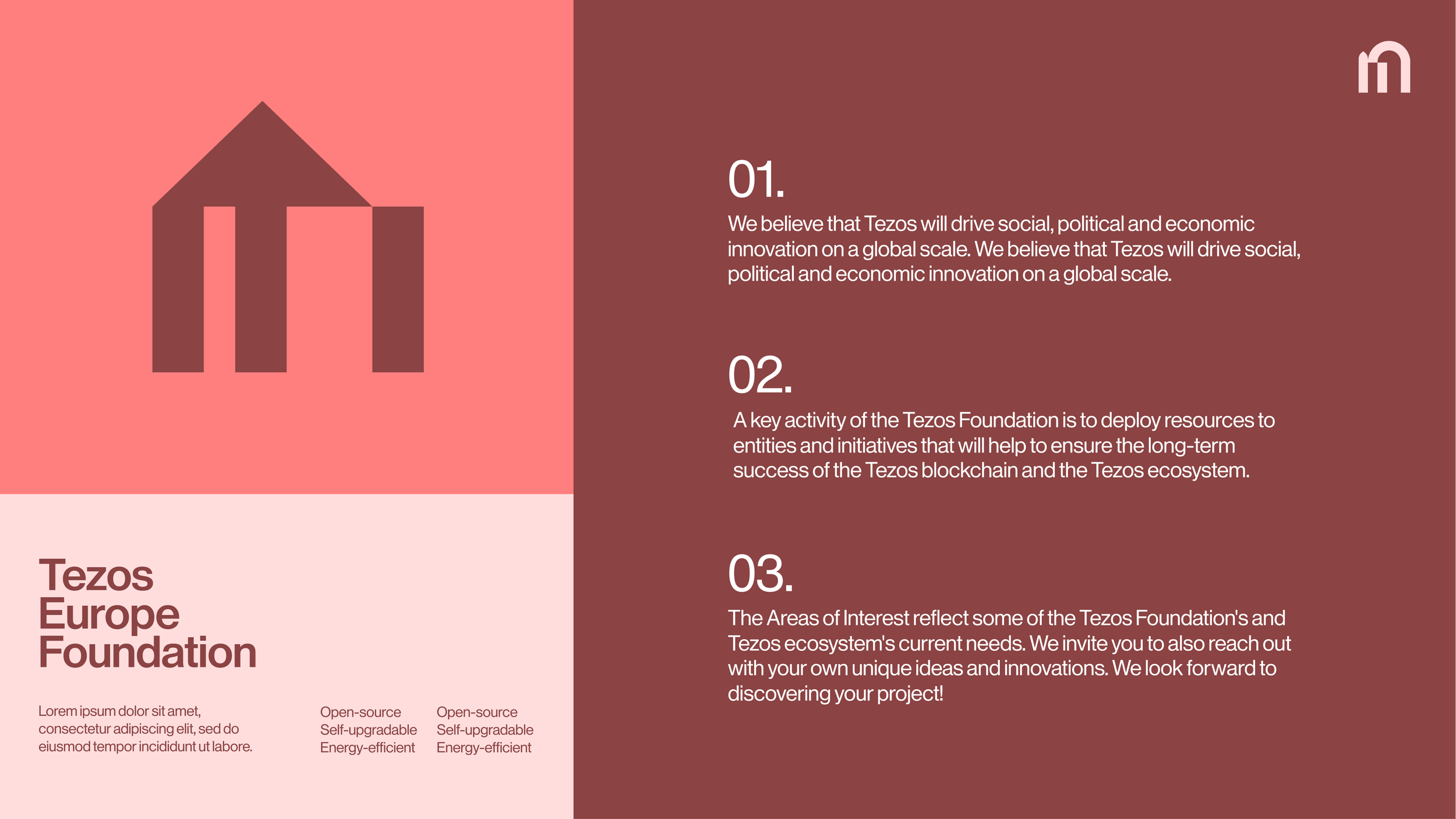
Modular grids and layered layouts reinforce ideas of interconnectedness, scale, and collaboration.


Tezos Middle East uses deep green tones and structured layouts to express stability, growth, and regional innovation within the Tezos ecosystem.

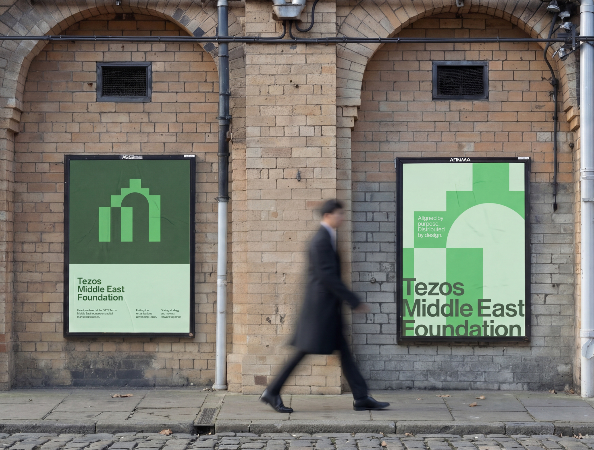
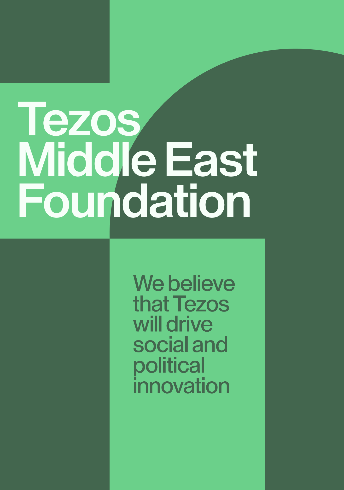

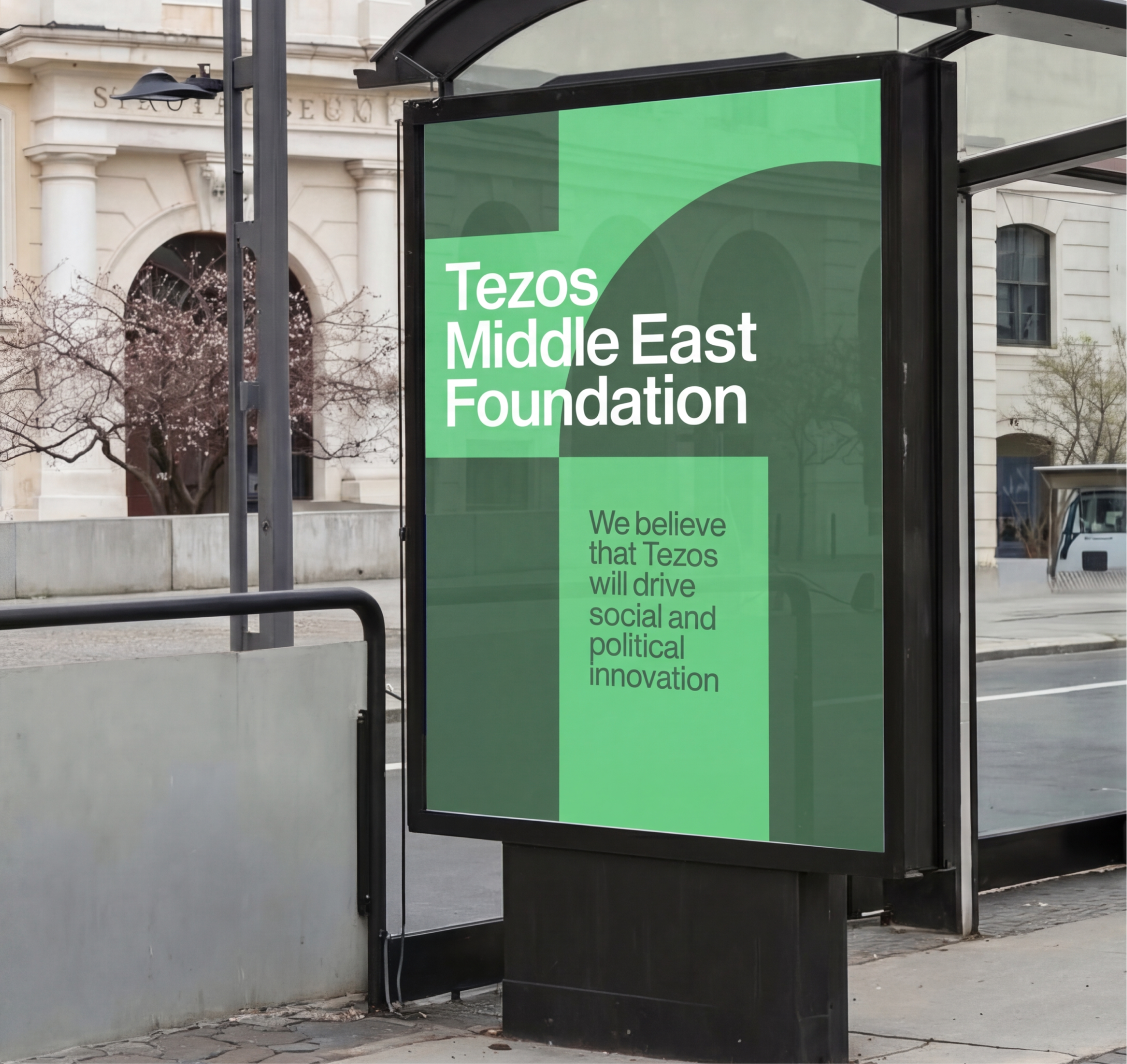
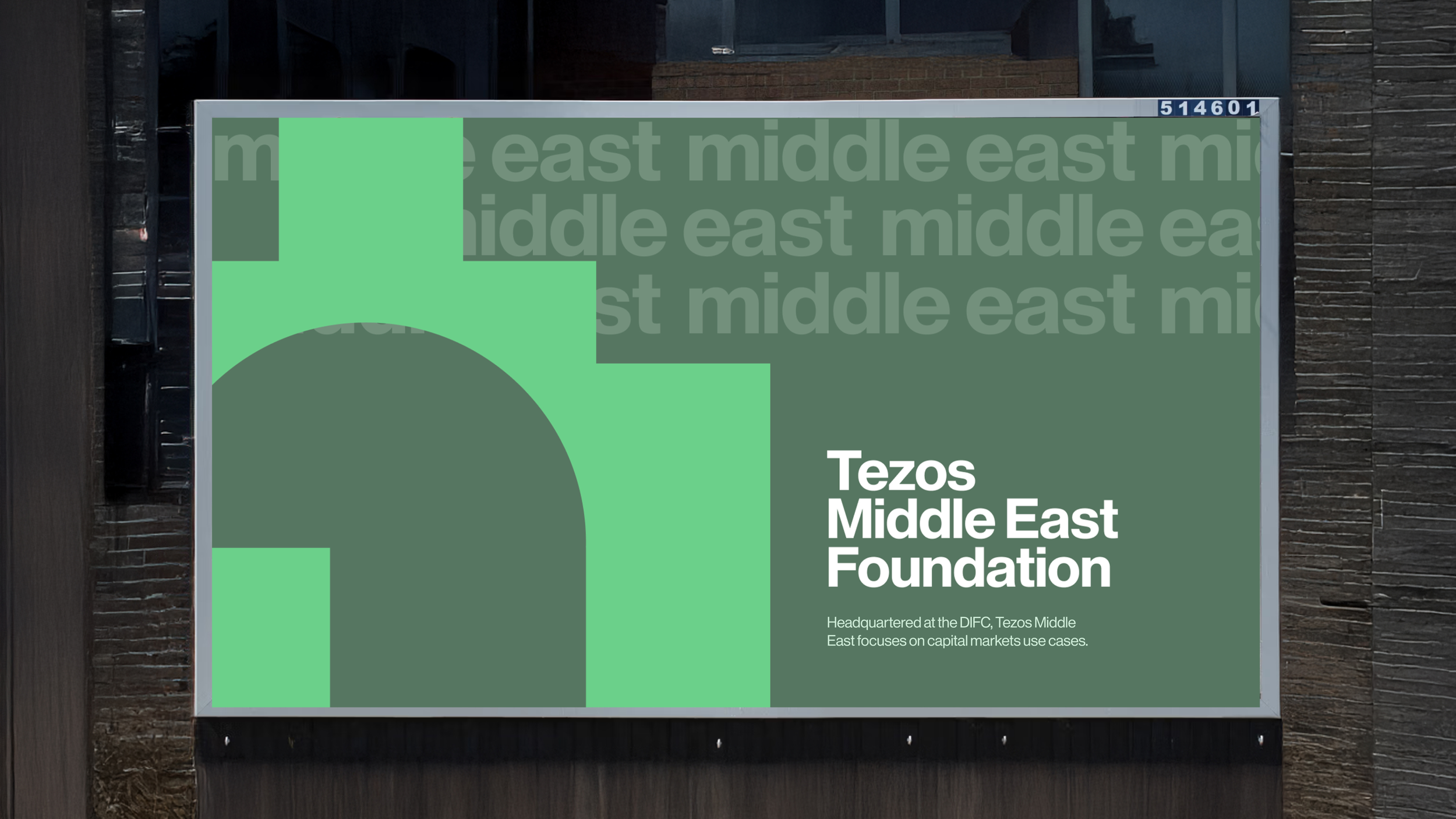

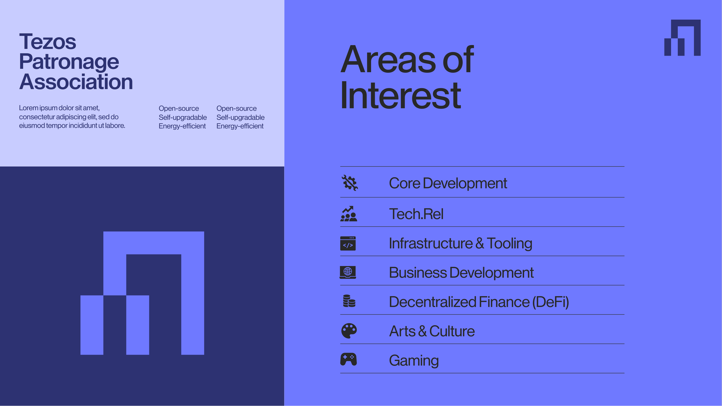
A scalable brand system built for governance platforms, digital communications, and institutional applications.

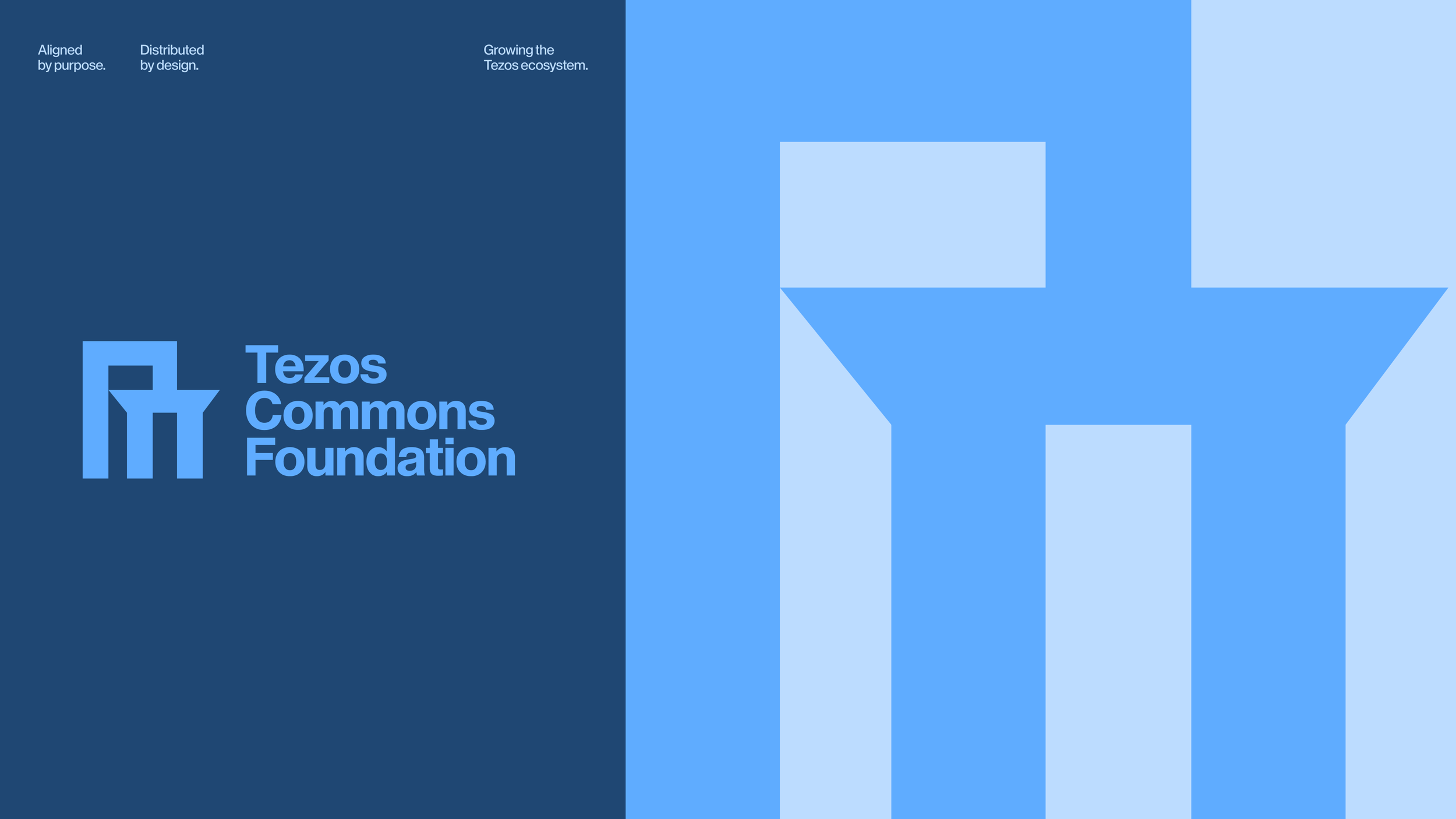
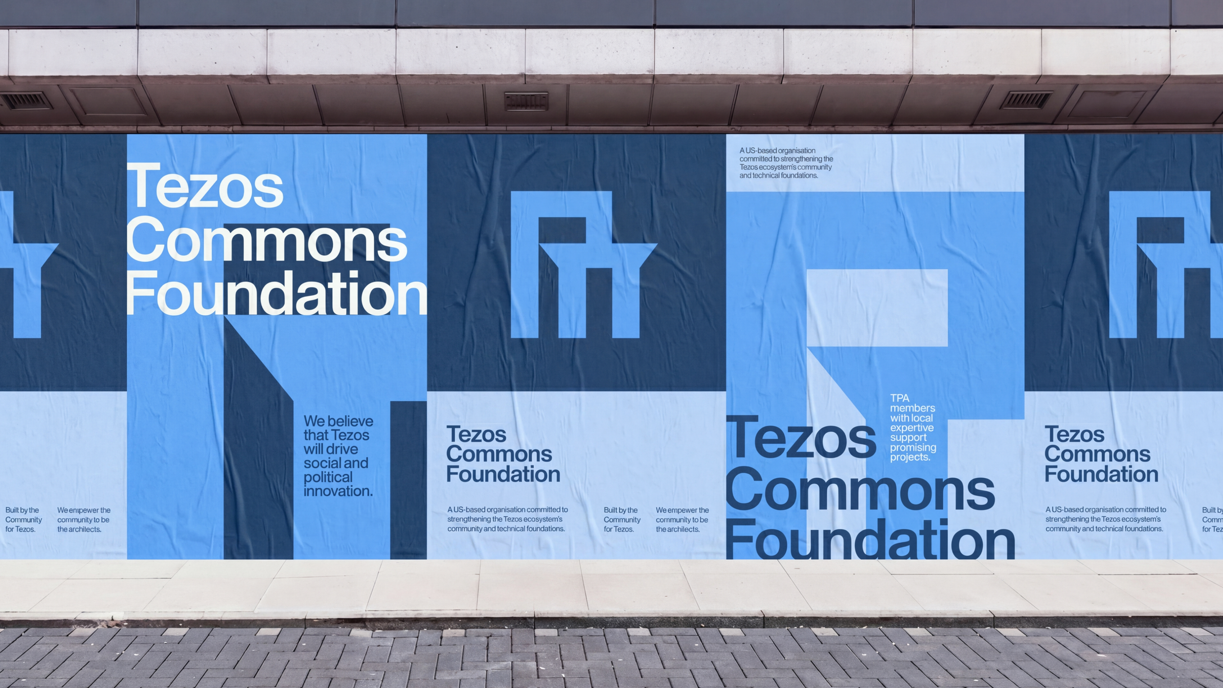
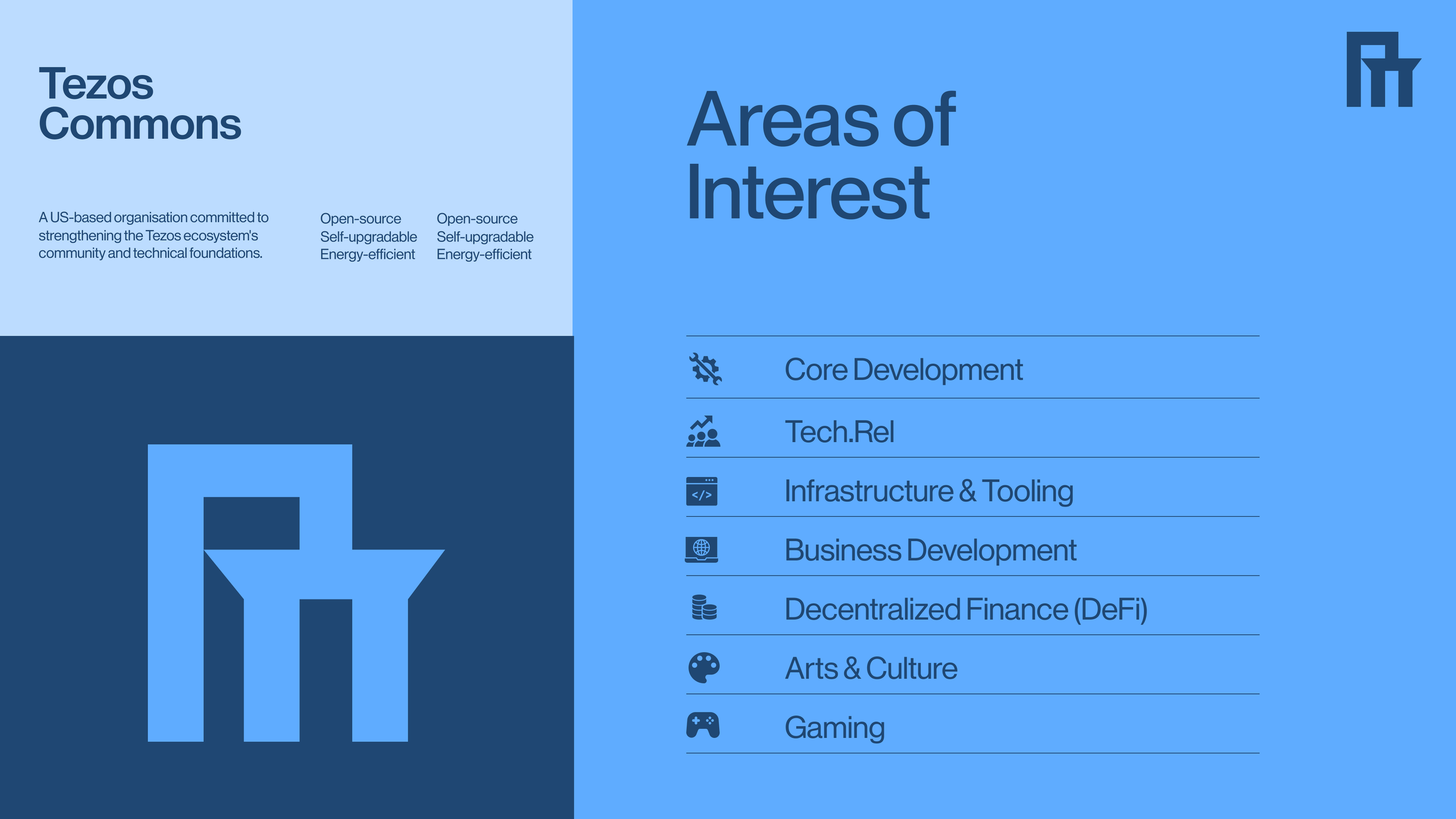
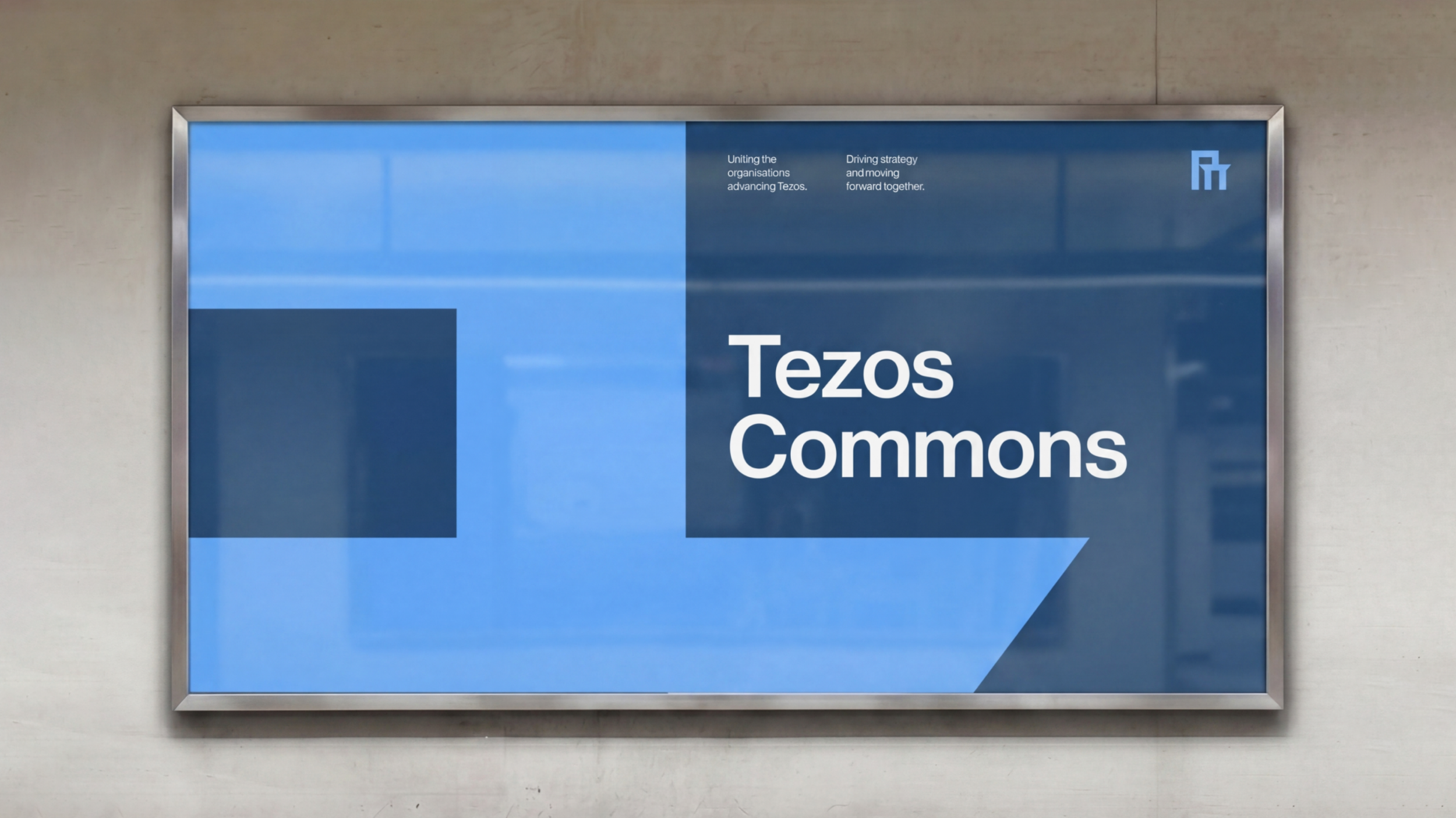
Tezos Commons Foundation combines electric blues and layered typography to express digital infrastructure and interconnected systems.


Together, these identities create a flexible visual system designed to unify and support the growing global Tezos ecosystem.

About the project
The Tezos Patronage Association was created to support governance, collaboration, and ecosystem growth across the Tezos network. The project involved designing a unified identity capable of connecting multiple foundations and initiatives under one coherent visual system while allowing each organisation to maintain its own distinct presence.
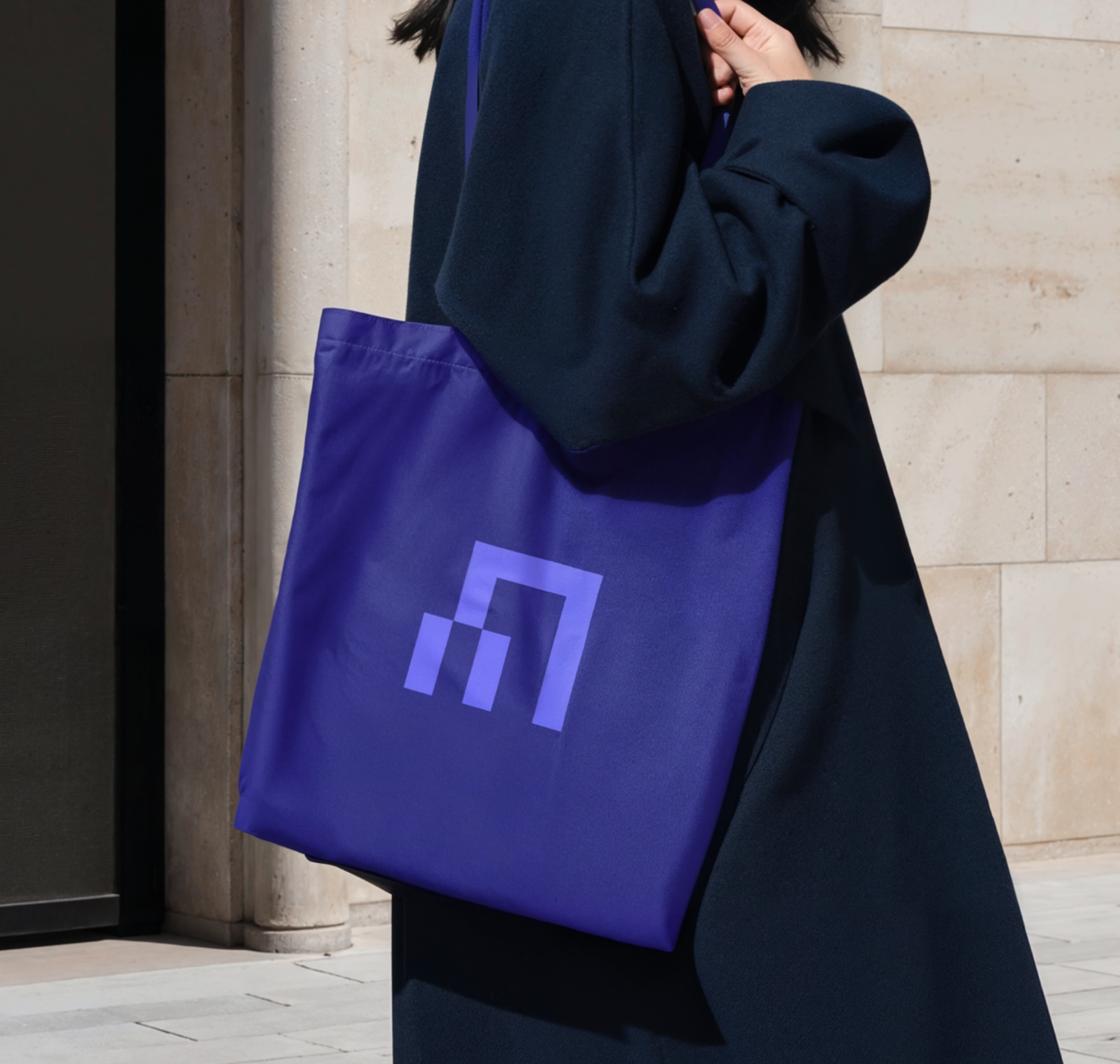
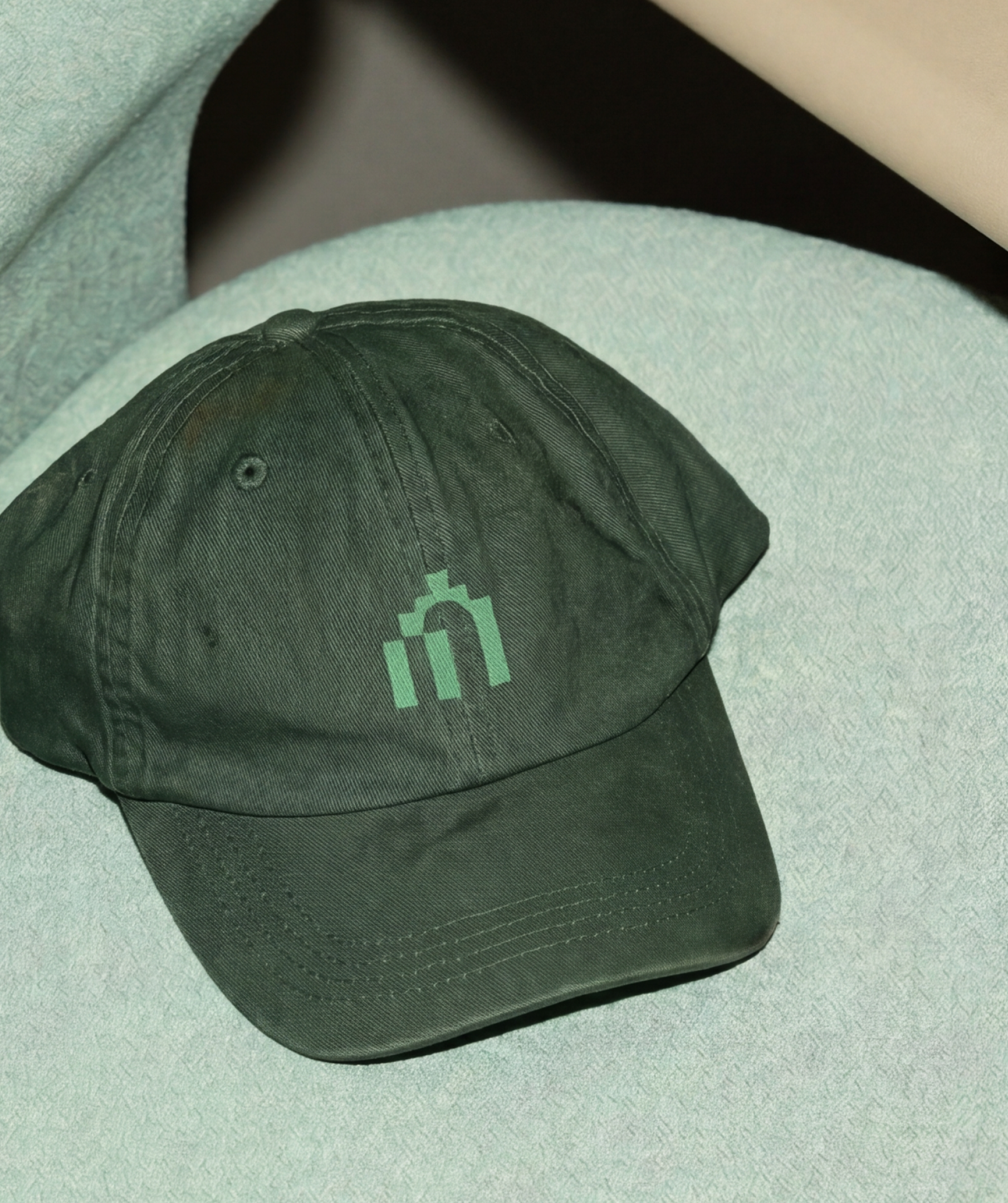
At the centre of the identity is a modular logo architecture built around a geometric monogram. The symbol acts as a shared foundation across the ecosystem, while custom wordmarks and lockups adapt to different regional and organisational entities including Tezos Middle East, Tezos South East Asia, Digital Commonwealth Foundation, and other umbrella brands. Each variation responds to its cultural and geographical context through its own colour palette and visual applications, while remaining connected through a consistent structural framework.
The system was designed to scale across governance platforms, digital communications, events, and institutional materials. Large typographic compositions, cropped layouts, and modular framing devices create a visual language that feels both contemporary and infrastructural, reflecting the decentralised nature of the Tezos ecosystem.
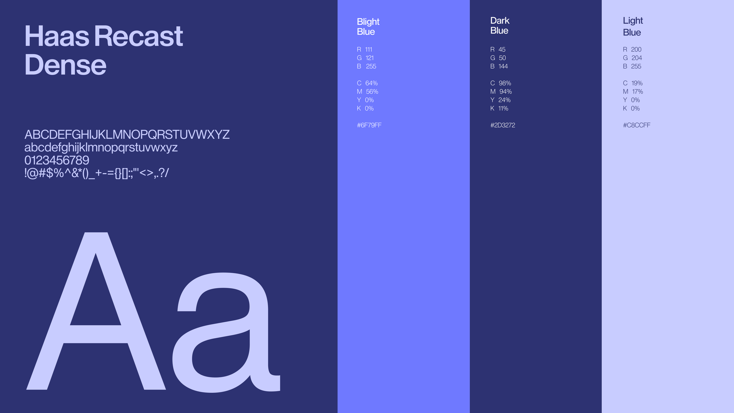
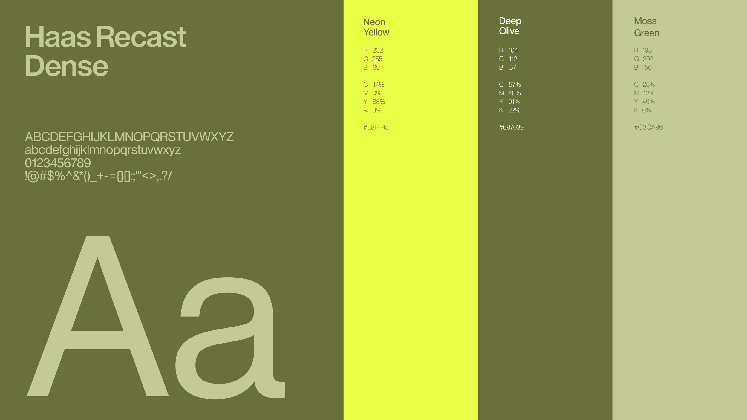
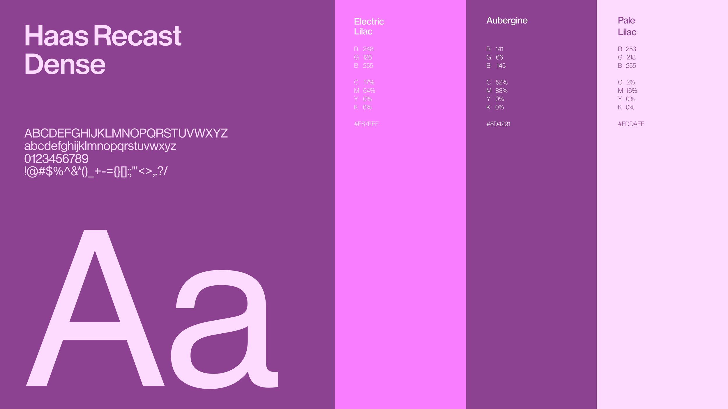
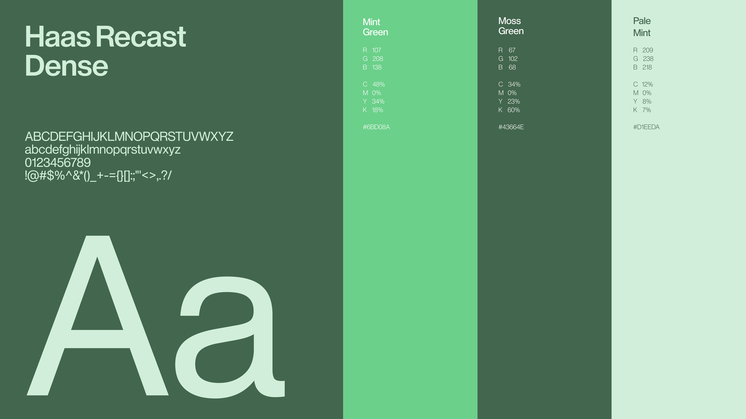
Typography uses Haas Recast Dense, a compact grotesque typeface whose angular geometry mirrors the architectural quality of the logo system. Oversized type becomes a compositional element throughout the identity, introducing rhythm, hierarchy, and scale across posters, social assets, and editorial layouts.
Each organisation within the system is supported by its own distinct colour palette, allowing sub-brands to develop recognisable identities while remaining part of the wider Tezos Patronage Association ecosystem. From deep greens and vibrant yellows to electric blues and monochromatic tones, the palettes introduce flexibility and individuality across regional foundations and communications.
Across the identity, modular grids and layered compositions reinforce ideas of interconnectedness, governance, and distributed infrastructure. The result is a scalable brand system designed to unify a growing global network while giving each organisation within the ecosystem its own recognisable voice.
Credits
Creative Direction
Design
Ilaria Antolini
Ilaria Antolini
Naomi Strinati