
Tezos Protocol Upgrades
Motion Design
2026
The challenge was to translate complex protocol upgrades into a clear and engaging visual language.
Motion design for Tezos protocol upgrades, translating complex blockchain updates into clear and engaging visual announcements.


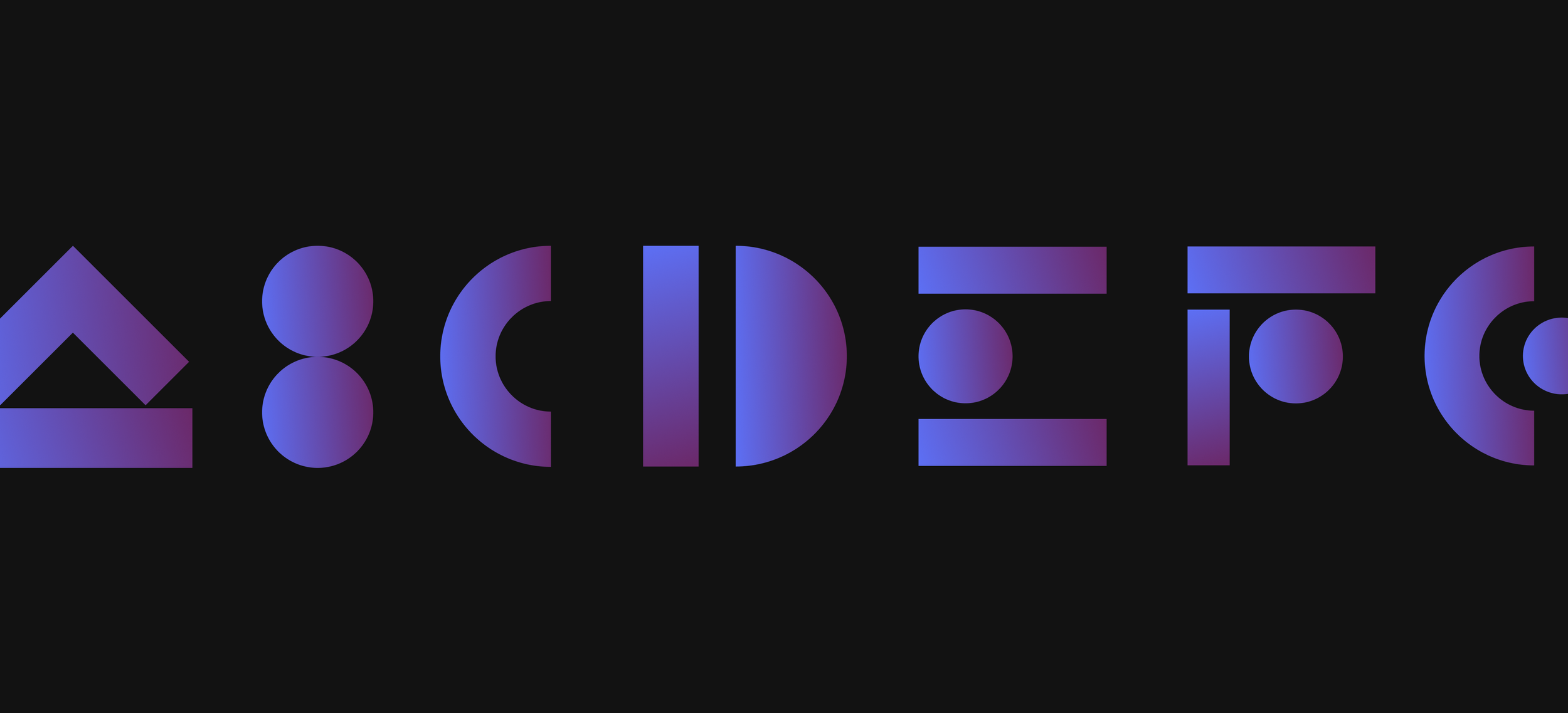
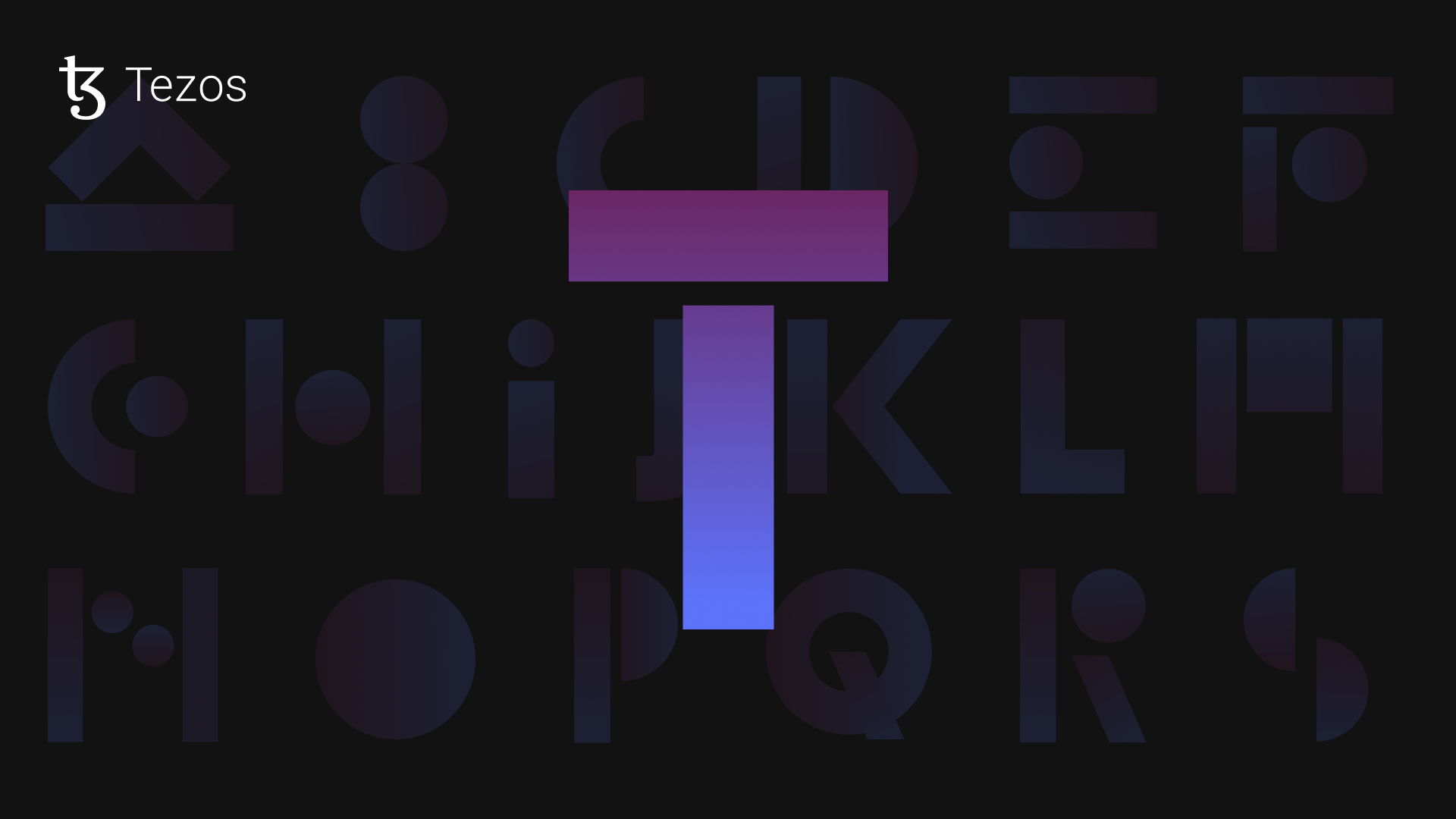
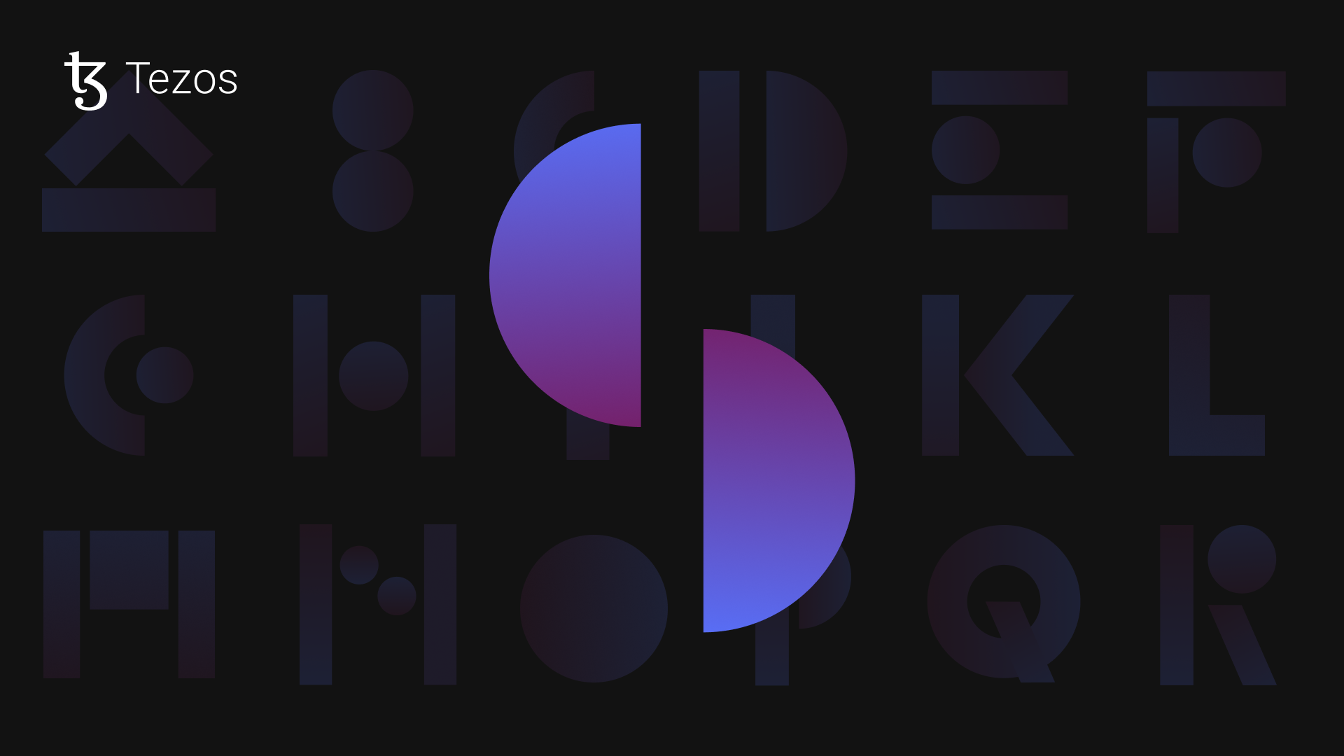
Abstract geometric forms evolve to create distinctive letterforms representing each upgrade.
Gradients and motion introduce depth and dynamism to the compositions. Shapes transform and assemble to reveal the final upgrade names.
Each animation reflects the idea of continuous protocol evolution.


About the project
Tezos is a self-amending blockchain that evolves through a unique governance process allowing the protocol to upgrade without requiring disruptive hard forks. This mechanism enables continuous improvement while maintaining network stability, making Tezos one of the most adaptable blockchain ecosystems.
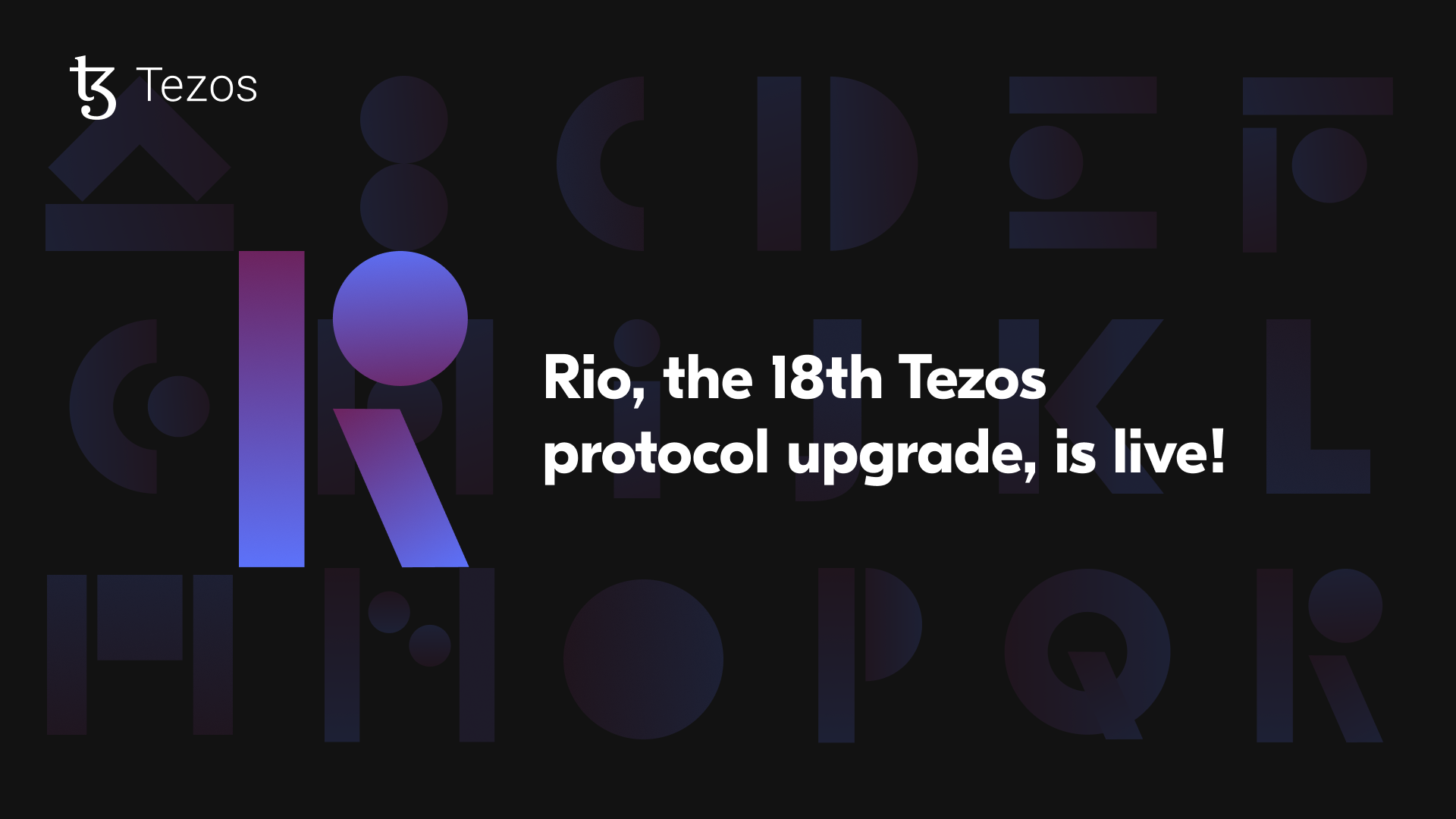
Recent upgrades have focused on improving performance, security, and scalability across the network. The Rio, Seoul, and Tallinn upgrades introduced major technical improvements, including enhanced network resilience, stronger institutional-grade security features, and significantly faster block times.
The challenge was to translate these complex technical developments into a clear and engaging visual language that could communicate the significance of each upgrade to the wider Tezos community.
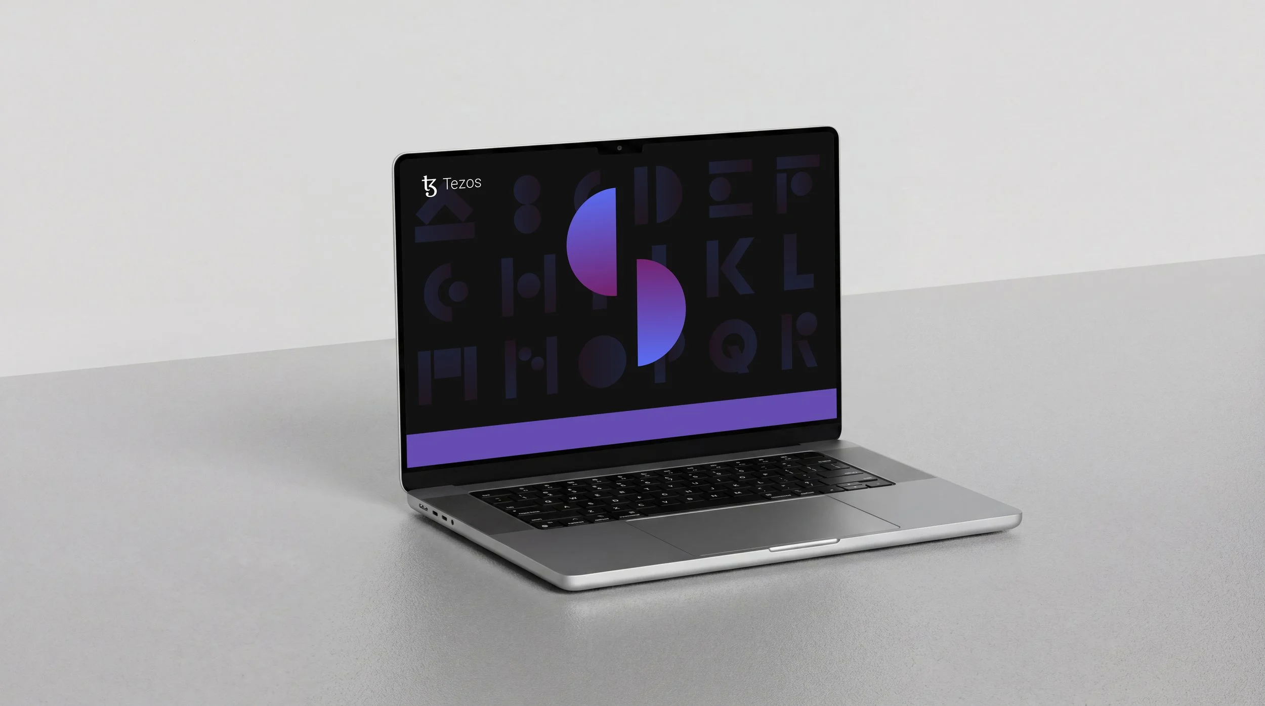
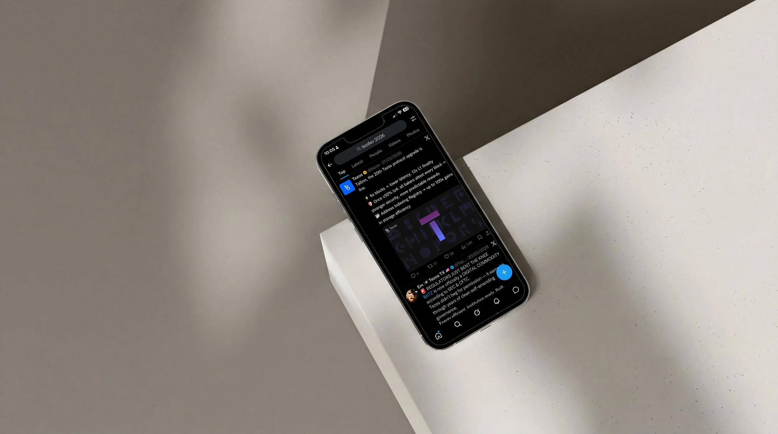
A visual system was developed to support the launch of each protocol upgrade across social media and digital platforms. The design uses a set of abstract geometric forms that evolve and combine to create distinctive letterforms representing the names of each upgrade. Subtle gradients and motion bring depth and dynamism to the compositions, reflecting the continuous evolution of the protocol.
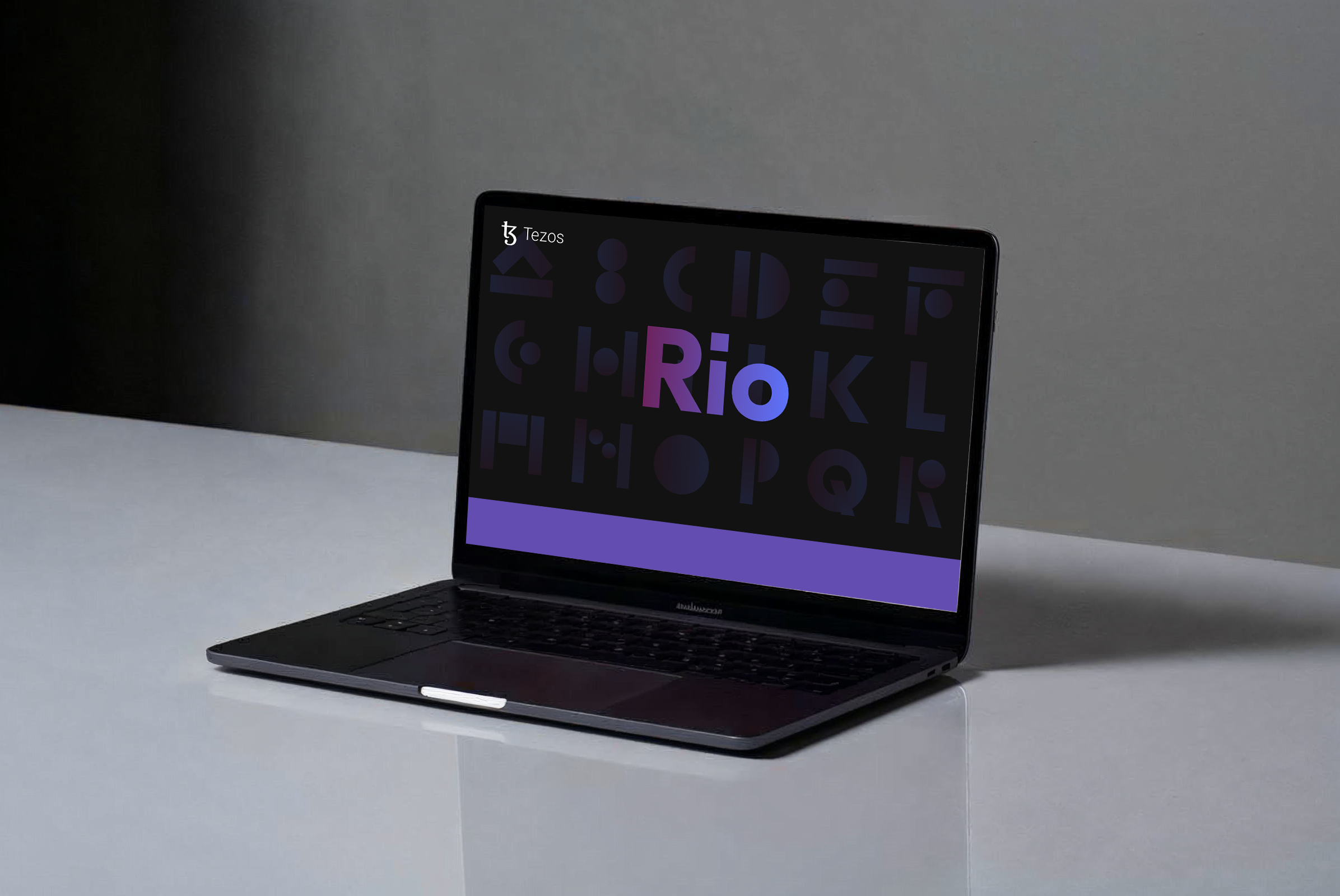
Three animated launch assets were created for the Rio, Seoul, and Tallinn upgrades. Each animation introduces the upgrade through a series of transforming shapes that assemble into the final letterforms, reinforcing the idea of transformation and technological progress.
The visual language balances clarity with abstraction. A dark background provides a calm foundation while vibrant gradients highlight the evolving shapes, ensuring the animations remain striking and legible across social platforms.
Through motion, geometry, and minimal typography, the project communicates the ongoing evolution of the Tezos protocol while creating a consistent visual presence for upgrade announcements across the ecosystem.
Credits
Creative Direction
Design
Ilaria Antolini
Ilaria Antolini
Naomi Strinati
Rafael Irimie
Motion Design